人気フォント セクションへようこそ。ここでは「よくダウンロードされ、よく使われている」実績ある書体をまとめています。 ロゴ、Web、SNS のどれにも使いやすい、外さない選択肢が見つかります。
どの トップフォント も、バランス・可読性・汎用性で高評価です。 モダン・サンセリフ、エレガントなスクリプト、ヴィンテージなセリフ、ミニマルなディスプレイなどを厳選しています。
-
 ダウンロード 2862 ダウンロード数@WebFont
 -
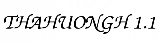
![ThaHuongH 1.1 フリーフォントのダウンロード]() ダウンロード 2862 ダウンロード数
ダウンロード 2862 ダウンロード数 -
( Fonts by Graham Meade - GemFonts )
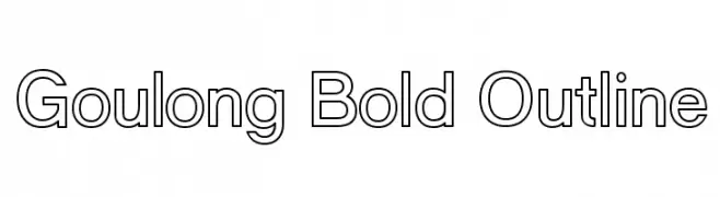
A bold outlined sans-serif font with a modern and clean design.
![Goulong Bold Outline フリーフォントのダウンロード]() ダウンロード 2861 ダウンロード数@WebFont
ダウンロード 2861 ダウンロード数@WebFont -
![Broken Glass フリーフォントのダウンロード]() ダウンロード 2861 ダウンロード数@WebFont
ダウンロード 2861 ダウンロード数@WebFont -
( Copyright (c) 2012-2015, The Mozilla Foundation and Telefonica S.A. )
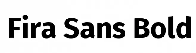
A bold, modern sans-serif font with excellent legibility and versatility.
![Fira Sans Bold フリーフォントのダウンロード]() ダウンロード 2860 ダウンロード数@WebFont
ダウンロード 2860 ダウンロード数@WebFont -
-
フォント by Qbotype. For commercial use please contact the owner.
( Fonts by www.phuxerdesigns.com.ar - Non-commercial use of any typeface free version, only buying the full version )
A geometric, double-line font with a modern and structured appearance.
![2 Lines フリーフォントのダウンロード]() ダウンロード 2860 ダウンロード数@WebFont
ダウンロード 2860 ダウンロード数@WebFont -
( Fonts by Blue Vinyl - Jess Latham - www.bvfonts.com )
A cursive, handwritten font with elegant, flowing lines.
![LearningCurvePro フリーフォントのダウンロード]() ダウンロード 2860 ダウンロード数@WebFont
ダウンロード 2860 ダウンロード数@WebFont -
( Copyright (c) 2014, Indian Type Foundry (info@indiantypefoundry.com). )
A clean, modern sans-serif font with medium weight and excellent legibility.
![Hind Medium フリーフォントのダウンロード]() ダウンロード 2859 ダウンロード数@WebFont
ダウンロード 2859 ダウンロード数@WebFont -
![BA Wet Paint 1980 フリーフォントのダウンロード]() ダウンロード 2859 ダウンロード数@WebFont
ダウンロード 2859 ダウンロード数@WebFont -
![Matiz フリーフォントのダウンロード]() ダウンロード 2859 ダウンロード数@WebFont
ダウンロード 2859 ダウンロード数@WebFont


今のトップフォントは?
は、クリーンな造形と広い適用範囲で支持を集めています。 ブランディングからランディングページ、ポスターまで活躍します。
ロゴで人気のフォントは?
幾何学系の サンセリフ(例: Poppins、Gotham 系のファミリー)は、スケーラブルでクリーンな印象に最適。 親しみやすさを出すなら スクリプト や手書き系も定番です。 見出しは力強く、本文はニュートラルに──この組み合わせが認知とバランスを高めます。
人気リストはどのくらいの頻度で更新される?
ダウンロード数やエンゲージメントに基づき定期的に更新します。 こまめにチェックして、次に流行るフォントを先取りしましょう。
💡 ヒント: このページをブックマークしておくと便利です。トレンドは速く、今のトップが明日のリブランディングを導くこともあります。