人気フォント セクションへようこそ。ここでは「よくダウンロードされ、よく使われている」実績ある書体をまとめています。 ロゴ、Web、SNS のどれにも使いやすい、外さない選択肢が見つかります。
どの トップフォント も、バランス・可読性・汎用性で高評価です。 モダン・サンセリフ、エレガントなスクリプト、ヴィンテージなセリフ、ミニマルなディスプレイなどを厳選しています。
-
( Please check the owner website: http://www.billie.grosse.is-a-geek.com )
A bold, geometric font with a modern, futuristic style.
 ダウンロード 173 ダウンロード数@WebFont
 -
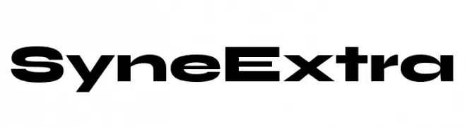
( Fonts by Bonjour Monde )
A bold, modern font with geometric shapes and strong visual impact.
![Syne Extra フリーフォントのダウンロード]() ダウンロード 173 ダウンロード数@WebFont
ダウンロード 173 ダウンロード数@WebFont -
( Fonts by Iconian Fonts )
A bold, modern font with sharp angles and an expanded width, perfect for impactful designs.
![Indigo Demon Expanded フリーフォントのダウンロード]() ダウンロード 173 ダウンロード数@WebFont
ダウンロード 173 ダウンロード数@WebFont -
( Fonts by Fonts of Chaos - www.fontsofchaos.com - check the website before use the fonts! )
A bold, modern font with a stencil-like, industrial design.
![Opium Roadie Regular フリーフォントのダウンロード]() ダウンロード 173 ダウンロード数@WebFont
ダウンロード 173 ダウンロード数@WebFont -
![Irish Blessing フリーフォントのダウンロード]() ダウンロード 173 ダウンロード数@WebFont
ダウンロード 173 ダウンロード数@WebFont -
-
![ImInvisible フリーフォントのダウンロード]() ダウンロード 173 ダウンロード数@WebFont
ダウンロード 173 ダウンロード数@WebFont -
( Rengga Eka Zulkarnaen - www.behance.net/kamigawietd2f7 )
A sophisticated handwritten script with fluid, cursive strokes.
![Blenheim Signature フリーフォントのダウンロード]() ダウンロード 173 ダウンロード数@WebFont
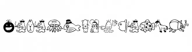
ダウンロード 173 ダウンロード数@WebFont -
![SakabeAnimal02 フリーフォントのダウンロード]() ダウンロード 173 ダウンロード数@WebFont
ダウンロード 173 ダウンロード数@WebFont -
![SF Florencesans Shaded Italic フリーフォントのダウンロード]() ダウンロード 173 ダウンロード数@WebFont
ダウンロード 173 ダウンロード数@WebFont -
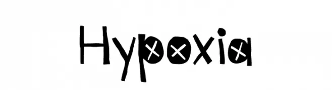
( Fonts by Kyle Hathcoat )
A playful, hand-drawn font with bold, irregular characters and whimsical details.
![Hypoxia フリーフォントのダウンロード]() ダウンロード 173 ダウンロード数@WebFont
ダウンロード 173 ダウンロード数@WebFont


今のトップフォントは?
は、クリーンな造形と広い適用範囲で支持を集めています。 ブランディングからランディングページ、ポスターまで活躍します。
ロゴで人気のフォントは?
幾何学系の サンセリフ(例: Poppins、Gotham 系のファミリー)は、スケーラブルでクリーンな印象に最適。 親しみやすさを出すなら スクリプト や手書き系も定番です。 見出しは力強く、本文はニュートラルに──この組み合わせが認知とバランスを高めます。
人気リストはどのくらいの頻度で更新される?
ダウンロード数やエンゲージメントに基づき定期的に更新します。 こまめにチェックして、次に流行るフォントを先取りしましょう。
💡 ヒント: このページをブックマークしておくと便利です。トレンドは速く、今のトップが明日のリブランディングを導くこともあります。