人気フォント セクションへようこそ。ここでは「よくダウンロードされ、よく使われている」実績ある書体をまとめています。 ロゴ、Web、SNS のどれにも使いやすい、外さない選択肢が見つかります。
どの トップフォント も、バランス・可読性・汎用性で高評価です。 モダン・サンセリフ、エレガントなスクリプト、ヴィンテージなセリフ、ミニマルなディスプレイなどを厳選しています。
-
フォント by danny91194. For commercial use please contact the owner.
( Pat, Hipimp, Pilian and Hamilt )
A bold, angular font with sharp, geometric edges and a futuristic style.
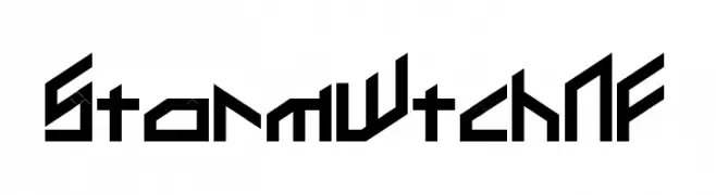 ダウンロード 172 ダウンロード数@WebFont
 -
( Fonts by Vladimir Nikolic - https://www.creativefabrica.com/product/educated-deers/ref/144265/ - Personal-use only. For commercial use please contact owner. )
A bold, 3D hollow italic font with a dynamic and modern style.
![Magia 3D Hollow Italic フリーフォントのダウンロード]() ダウンロード 172 ダウンロード数@WebFont
ダウンロード 172 ダウンロード数@WebFont -
( Fonts by a Max Infeld - XEROGRAPHER FONTS - xerographer.blogspot.com . Personal-use only. For commercial use please contact owner. )
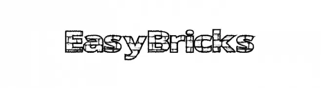
A playful, brick-patterned font with a bold, three-dimensional effect.
![EasyBricks フリーフォントのダウンロード]() ダウンロード 172 ダウンロード数@WebFont
ダウンロード 172 ダウンロード数@WebFont -
( Fonts by Mans Greback - Personal-use only. For commercial use please contact owner. )
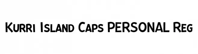
A bold, playful font with a hand-drawn, dynamic style.
![Kurri Island Caps PERSONAL Reg フリーフォントのダウンロード]() ダウンロード 172 ダウンロード数@WebFont
ダウンロード 172 ダウンロード数@WebFont -
( Fonts by Xerographer Fonts )
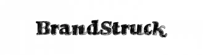
A bold, textured font with a vintage, distressed appearance.
![BrandStruck フリーフォントのダウンロード]() ダウンロード 172 ダウンロード数@WebFont
ダウンロード 172 ダウンロード数@WebFont -
-
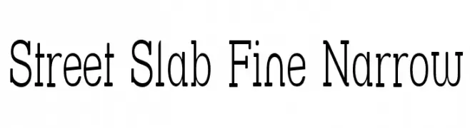
( Fonts by Apostrophic Lab )
A fine, narrow slab serif font with a modern and elegant style.
![Street Slab Fine Narrow フリーフォントのダウンロード]() ダウンロード 172 ダウンロード数@WebFont
ダウンロード 172 ダウンロード数@WebFont -
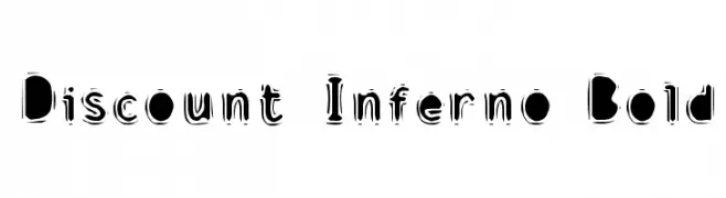
( Fonts by Dave Kellam - Brian Stuparyk - www.eightface.com )
A bold, distressed font with a fiery, energetic style.
![Discount Inferno Bold フリーフォントのダウンロード]() ダウンロード 172 ダウンロード数@WebFont
ダウンロード 172 ダウンロード数@WebFont -
フォント by twinletter. For commercial use please contact the owner.
( This font is free for PERSONAL USE only. My fonts for free use allowed only in personal project , non-profit and charity use. But any donation are very appreciated. PayPal account for donation : https://paypal.me/abahrozi Download Commercial License If )
A whimsical, handwritten font with thin, elongated strokes and playful curves.
![Angle Rose Regular フリーフォントのダウンロード]() ダウンロード 172 ダウンロード数@WebFont
ダウンロード 172 ダウンロード数@WebFont -
![Shirtsy フリーフォントのダウンロード]() ダウンロード 172 ダウンロード数@WebFont
ダウンロード 172 ダウンロード数@WebFont -
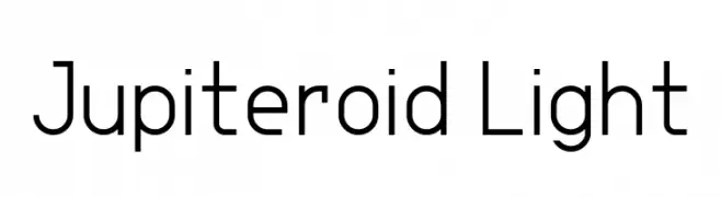
( Fonts by GGBotNet )
A modern, geometric sans-serif font with clean lines and balanced spacing.
![Jupiteroid Light フリーフォントのダウンロード]() ダウンロード 172 ダウンロード数@WebFont
ダウンロード 172 ダウンロード数@WebFont


今のトップフォントは?
は、クリーンな造形と広い適用範囲で支持を集めています。 ブランディングからランディングページ、ポスターまで活躍します。
ロゴで人気のフォントは?
幾何学系の サンセリフ(例: Poppins、Gotham 系のファミリー)は、スケーラブルでクリーンな印象に最適。 親しみやすさを出すなら スクリプト や手書き系も定番です。 見出しは力強く、本文はニュートラルに──この組み合わせが認知とバランスを高めます。
人気リストはどのくらいの頻度で更新される?
ダウンロード数やエンゲージメントに基づき定期的に更新します。 こまめにチェックして、次に流行るフォントを先取りしましょう。
💡 ヒント: このページをブックマークしておくと便利です。トレンドは速く、今のトップが明日のリブランディングを導くこともあります。