人気フォント セクションへようこそ。ここでは「よくダウンロードされ、よく使われている」実績ある書体をまとめています。 ロゴ、Web、SNS のどれにも使いやすい、外さない選択肢が見つかります。
どの トップフォント も、バランス・可読性・汎用性で高評価です。 モダン・サンセリフ、エレガントなスクリプト、ヴィンテージなセリフ、ミニマルなディスプレイなどを厳選しています。
-
( Fonts by Adien Gunarta - naraaksara.com - Personal-use only. For commercial use please contact owner. )
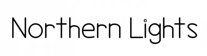
An elegant script font with flowing curves and sophisticated style.
 ダウンロード 754 ダウンロード数@WebFont
 -
![Northern Lights フリーフォントのダウンロード]() ダウンロード 754 ダウンロード数@WebFont
ダウンロード 754 ダウンロード数@WebFont -
( Demo font. To purchase the full version, you can order it online at www.schoolhousefonts.com )
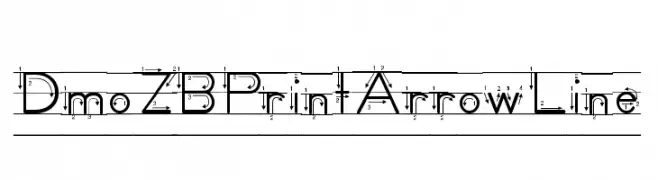
A geometric, blueprint-style font with a modern and technical look.
![DmoZBPrintArrowLine フリーフォントのダウンロード]() ダウンロード 754 ダウンロード数@WebFont
ダウンロード 754 ダウンロード数@WebFont -
( Fonts by www.peter-wiegel.de. Personal-use only. For commercial use please contact owner. )
A bold, strong font with thick strokes and a commanding presence.
![Men Nefer Black Bold フリーフォントのダウンロード]() ダウンロード 754 ダウンロード数@WebFont
ダウンロード 754 ダウンロード数@WebFont -
( Copyright (c) 2011, Ana Sanfelippo (anasanfe@gmail.com) )
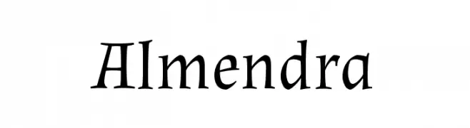
A classic serif font with calligraphic influences and elegant, flowing forms.
![Almendra フリーフォントのダウンロード]() ダウンロード 754 ダウンロード数@WebFont
ダウンロード 754 ダウンロード数@WebFont -
( Fonts by Ingo Zimmermann - www.ingofonts.com )
A bold, italic sans-serif font with a modern and dynamic style.
![FaberSansPro-SchwerKursiv フリーフォントのダウンロード]() ダウンロード 754 ダウンロード数@WebFont
ダウンロード 754 ダウンロード数@WebFont -
( Fonts by www.blambot.com )
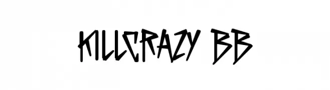
A bold, angular font with sharp, jagged lines and a rebellious style.
![KillCrazy BB フリーフォントのダウンロード]() ダウンロード 754 ダウンロード数@WebFont
ダウンロード 754 ダウンロード数@WebFont -
![LovelyCapsules フリーフォントのダウンロード]() ダウンロード 754 ダウンロード数@WebFont
ダウンロード 754 ダウンロード数@WebFont -
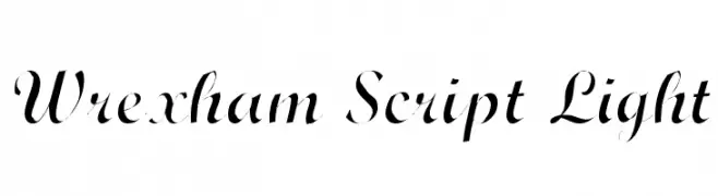
![Wrexham Script Light フリーフォントのダウンロード]() ダウンロード 754 ダウンロード数@WebFont
ダウンロード 754 ダウンロード数@WebFont -
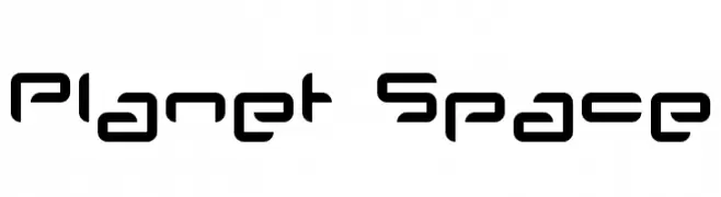
( Fonts by www.planet.dk )
A futuristic, geometric font with rounded edges and consistent line thickness.
![Planet Space フリーフォントのダウンロード]() ダウンロード 754 ダウンロード数@WebFont
ダウンロード 754 ダウンロード数@WebFont -
![Pomcute フリーフォントのダウンロード]() ダウンロード 754 ダウンロード数@WebFont
ダウンロード 754 ダウンロード数@WebFont -
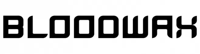
![BloodWax フリーフォントのダウンロード]() ダウンロード 754 ダウンロード数@WebFont
ダウンロード 754 ダウンロード数@WebFont -
( Fonts by www.koenhachmang.com - Glitch )
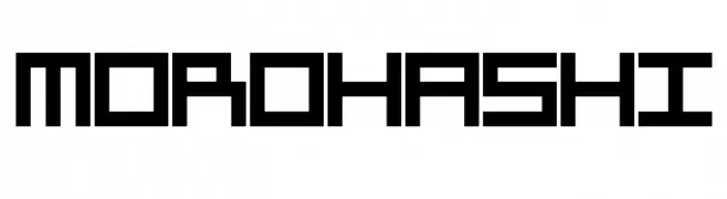
A bold, geometric font with a pixelated, retro digital style.
![Morohashi フリーフォントのダウンロード]() ダウンロード 754 ダウンロード数@WebFont
ダウンロード 754 ダウンロード数@WebFont -
![homeblock フリーフォントのダウンロード]() ダウンロード 754 ダウンロード数@WebFont
ダウンロード 754 ダウンロード数@WebFont -
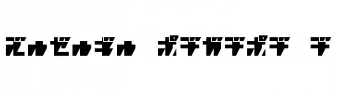
![R.P.G. KATAKANA フリーフォントのダウンロード]() ダウンロード 754 ダウンロード数@WebFont
ダウンロード 754 ダウンロード数@WebFont -
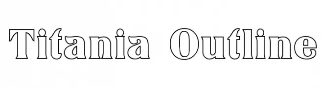
![Titania Outline フリーフォントのダウンロード]() ダウンロード 754 ダウンロード数@WebFont
ダウンロード 754 ダウンロード数@WebFont -
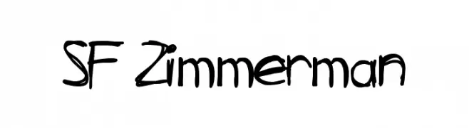
( Fonts by ShyFonts )
A bold, handwritten font with a casual and playful style.
![SF Zimmerman フリーフォントのダウンロード]() ダウンロード 754 ダウンロード数@WebFont
ダウンロード 754 ダウンロード数@WebFont -
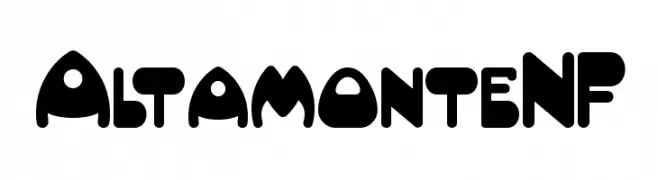
( Fonts by Nick Curtis - www.nicksfonts.com )
A bold, playful font with thick, rounded characters and a whimsical style.
![AltamonteNF フリーフォントのダウンロード]() ダウンロード 754 ダウンロード数@WebFont
ダウンロード 754 ダウンロード数@WebFont -
( Fonts by Levi Halmos )
A modern, geometric font with elongated, narrow letterforms and consistent stroke width.
![Sulphur フリーフォントのダウンロード]() ダウンロード 754 ダウンロード数@WebFont
ダウンロード 754 ダウンロード数@WebFont -
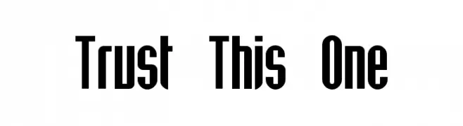
( Fonts by Levi Halmos )
A bold, narrow font with a modern and dynamic appearance.
![Trust This One フリーフォントのダウンロード]() ダウンロード 754 ダウンロード数@WebFont
ダウンロード 754 ダウンロード数@WebFont -
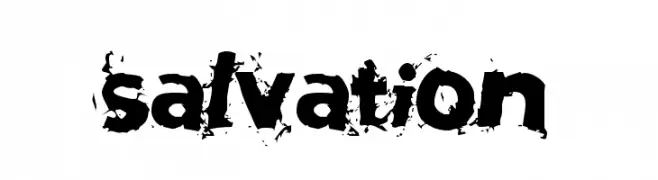
( Fonts by Rob Dobi - Toxic Type - www.dobi.nu )
A bold, distressed font with a grungy, textured style.
![Salvation フリーフォントのダウンロード]() ダウンロード 754 ダウンロード数@WebFont
ダウンロード 754 ダウンロード数@WebFont -
( Fonts by Abstract Type Design - Patrick Durr )
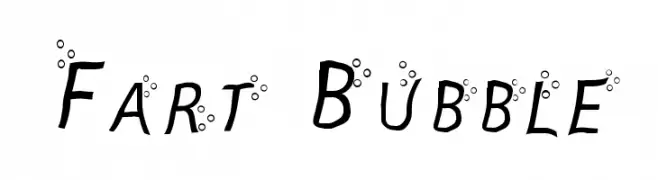
A playful font with bubble embellishments and a lively, tilted design.
![Fart Bubble フリーフォントのダウンロード]() ダウンロード 754 ダウンロード数@WebFont
ダウンロード 754 ダウンロード数@WebFont -
( Fonts by www.fontalicious.com )
A bold, playful font with rounded, whimsical characters.
![Chachie フリーフォントのダウンロード]() ダウンロード 754 ダウンロード数@WebFont
ダウンロード 754 ダウンロード数@WebFont -
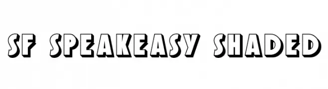
![SF Speakeasy Shaded フリーフォントのダウンロード]() ダウンロード 754 ダウンロード数@WebFont
ダウンロード 754 ダウンロード数@WebFont -
( Fonts by www.houseoflime.com )
A decorative Halloween-themed font featuring cartoonish monster illustrations.
![Scream フリーフォントのダウンロード]() ダウンロード 754 ダウンロード数@WebFont
ダウンロード 754 ダウンロード数@WebFont -
( Fonts by Wahyu Eka Prasetya - wepfont.com - Personal-use only. For commercial use please contact owner. )
A playful, bold script font with a handwritten style.
![Fabrice フリーフォントのダウンロード]() ダウンロード 753 ダウンロード数@WebFont
ダウンロード 753 ダウンロード数@WebFont -
( Fonts by Perspectype Studio - Letterena.com - Personal-use only. For commercial use please contact owner. )
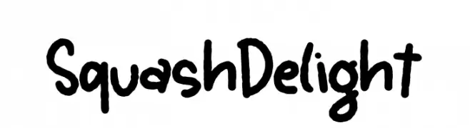
A bold, hand-drawn font with a playful and casual style.
![Squash Delight フリーフォントのダウンロード]() ダウンロード 753 ダウンロード数@WebFont
ダウンロード 753 ダウンロード数@WebFont -
( Fonts by Octotype - www.foundmyfont.com - Personal-use only. For commercial use please contact owner. )
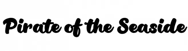
A bold, playful script font with rounded strokes and a dynamic, casual style.
![Pirate of the Seaside フリーフォントのダウンロード]() ダウンロード 753 ダウンロード数@WebFont
ダウンロード 753 ダウンロード数@WebFont -
( Fonts by Typhoon Type - Suthi Srisopha - www.typhoontype.net - Personal-use only. For commercial use please contact owner. )
A playful, snowy-themed font with a hand-drawn, textured appearance.
![SnowyChristmas フリーフォントのダウンロード]() ダウンロード 753 ダウンロード数@WebFont
ダウンロード 753 ダウンロード数@WebFont -
( Fonts by Wei Huang - Personal-use only. For commercial use please contact owner. )
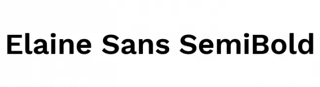
A clean, modern sans-serif font with a semi-bold weight and excellent legibility.
![Elaine Sans SemiBold フリーフォントのダウンロード]() ダウンロード 753 ダウンロード数@WebFont
ダウンロード 753 ダウンロード数@WebFont -
( Fonts by Darrell Flood )
A bold, playful typeface with cartoonish, exaggerated letterforms.
![Comic Queens フリーフォントのダウンロード]() ダウンロード 753 ダウンロード数@WebFont
ダウンロード 753 ダウンロード数@WebFont -
( maja.mint - Jana - creativemarket.com/maja.mint )
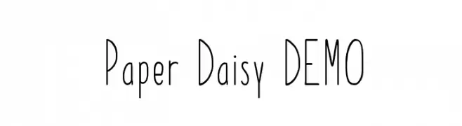
A tall, slender, and whimsical font with a hand-drawn appearance.
![Paper Daisy DEMO フリーフォントのダウンロード]() ダウンロード 753 ダウンロード数@WebFont
ダウンロード 753 ダウンロード数@WebFont -
( Zetafonts - www.zetafonts.com )
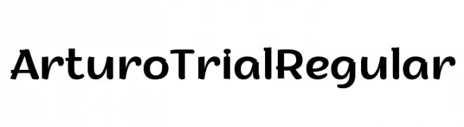
A bold, modern font with a playful yet professional style.
![Arturo Trial Regular フリーフォントのダウンロード]() ダウンロード 753 ダウンロード数@WebFont
ダウンロード 753 ダウンロード数@WebFont -
( Vladimir Nikolic - www.coroflot.com/vladimirnikolic )
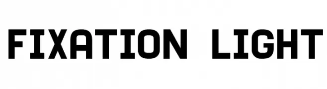
A bold, geometric font with a modern and structured design.
![Fixation Light フリーフォントのダウンロード]() ダウンロード 753 ダウンロード数@WebFont
ダウンロード 753 ダウンロード数@WebFont -
( Dichi - Rizky Andyno Ramadhan )
A modern, geometric sans-serif font with balanced strokes and versatile design.
![Acephimere フリーフォントのダウンロード]() ダウンロード 753 ダウンロード数@WebFont
ダウンロード 753 ダウンロード数@WebFont


今のトップフォントは?
は、クリーンな造形と広い適用範囲で支持を集めています。 ブランディングからランディングページ、ポスターまで活躍します。
ロゴで人気のフォントは?
幾何学系の サンセリフ(例: Poppins、Gotham 系のファミリー)は、スケーラブルでクリーンな印象に最適。 親しみやすさを出すなら スクリプト や手書き系も定番です。 見出しは力強く、本文はニュートラルに──この組み合わせが認知とバランスを高めます。
人気リストはどのくらいの頻度で更新される?
ダウンロード数やエンゲージメントに基づき定期的に更新します。 こまめにチェックして、次に流行るフォントを先取りしましょう。
💡 ヒント: このページをブックマークしておくと便利です。トレンドは速く、今のトップが明日のリブランディングを導くこともあります。