人気フォント セクションへようこそ。ここでは「よくダウンロードされ、よく使われている」実績ある書体をまとめています。 ロゴ、Web、SNS のどれにも使いやすい、外さない選択肢が見つかります。
どの トップフォント も、バランス・可読性・汎用性で高評価です。 モダン・サンセリフ、エレガントなスクリプト、ヴィンテージなセリフ、ミニマルなディスプレイなどを厳選しています。
-
 ダウンロード 2787 ダウンロード数@WebFont
 -
![Raider Crusader Straight フリーフォントのダウンロード]() ダウンロード 2786 ダウンロード数@WebFont
ダウンロード 2786 ダウンロード数@WebFont -
![Art Dystopia フリーフォントのダウンロード]() ダウンロード 2786 ダウンロード数@WebFont
ダウンロード 2786 ダウンロード数@WebFont -
( Copyright (c) 2010, Danh Hong (khmertype.blogspot.com) )
A modern sans-serif font with clean lines and geometric shapes.
![Hanuman フリーフォントのダウンロード]() ダウンロード 2786 ダウンロード数@WebFont
ダウンロード 2786 ダウンロード数@WebFont -
![TPF Janus フリーフォントのダウンロード]() ダウンロード 2785 ダウンロード数@WebFont
ダウンロード 2785 ダウンロード数@WebFont -
-
( Fonts by Rebekka Marleaux - Personal-use only. For commercial use please contact owner. )
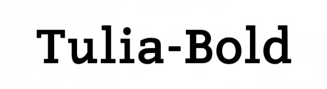
A bold, robust font with strong strokes and a confident presence.
![Tulia-Bold フリーフォントのダウンロード]() ダウンロード 2784 ダウンロード数@WebFont
ダウンロード 2784 ダウンロード数@WebFont -
( Fonts by Castcraft Software - opti.netii.net - check the website before use )
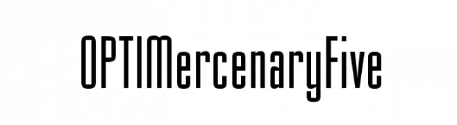
A modern, condensed font with medium contrast and sleek design.
![OPTIMercenaryFive フリーフォントのダウンロード]() ダウンロード 2784 ダウンロード数@WebFont
ダウンロード 2784 ダウンロード数@WebFont -
( Copyright (c) 2012, Eduardo Tunni (http://www.tipo.net.ar), with Reserved Font Name 'Faster' )
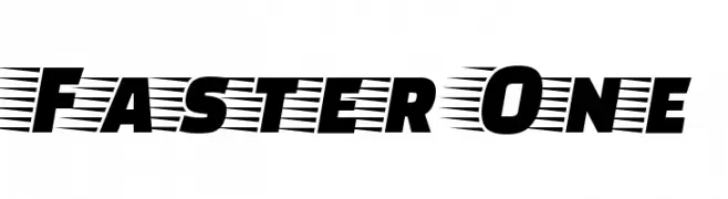
A bold, slanted font with a dynamic, speedy appearance.
![Faster One フリーフォントのダウンロード]() ダウンロード 2784 ダウンロード数@WebFont
ダウンロード 2784 ダウンロード数@WebFont -
( Copyright (c) 2011, Andres Torresi (www.andrestorresi.com.ar|info@andrestorresi.com.ar) )
A modern, clean sans-serif font with excellent readability.
![Telex フリーフォントのダウンロード]() ダウンロード 2784 ダウンロード数@WebFont
ダウンロード 2784 ダウンロード数@WebFont -
( Fonts by billyargel.blogspot.com - Billy Argel )
A bold, hand-drawn font with a textured, sketch-like appearance.
![BUTECO フリーフォントのダウンロード]() ダウンロード 2784 ダウンロード数@WebFont
ダウンロード 2784 ダウンロード数@WebFont


今のトップフォントは?
は、クリーンな造形と広い適用範囲で支持を集めています。 ブランディングからランディングページ、ポスターまで活躍します。
ロゴで人気のフォントは?
幾何学系の サンセリフ(例: Poppins、Gotham 系のファミリー)は、スケーラブルでクリーンな印象に最適。 親しみやすさを出すなら スクリプト や手書き系も定番です。 見出しは力強く、本文はニュートラルに──この組み合わせが認知とバランスを高めます。
人気リストはどのくらいの頻度で更新される?
ダウンロード数やエンゲージメントに基づき定期的に更新します。 こまめにチェックして、次に流行るフォントを先取りしましょう。
💡 ヒント: このページをブックマークしておくと便利です。トレンドは速く、今のトップが明日のリブランディングを導くこともあります。