人気フォント セクションへようこそ。ここでは「よくダウンロードされ、よく使われている」実績ある書体をまとめています。 ロゴ、Web、SNS のどれにも使いやすい、外さない選択肢が見つかります。
どの トップフォント も、バランス・可読性・汎用性で高評価です。 モダン・サンセリフ、エレガントなスクリプト、ヴィンテージなセリフ、ミニマルなディスプレイなどを厳選しています。
-
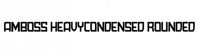
( Andreas Siess - www.andi-siess.de/ )
A bold, heavy, and condensed font with rounded edges and a modern, industrial feel.
 ダウンロード 164 ダウンロード数@WebFont
 -
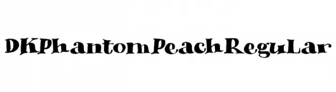
( Fonts by Hanoded )
A playful, spooky font with bold, irregular letterforms and thematic elements.
![DK Phantom Peach Regular フリーフォントのダウンロード]() ダウンロード 164 ダウンロード数@WebFont
ダウンロード 164 ダウンロード数@WebFont -
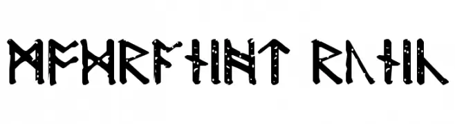
( Fonts by David Kerkhoff - www.hanodedphotography.com )
A decorative runic-inspired font with angular, geometric shapes and bold, uniform strokes.
![Modraniht Runic フリーフォントのダウンロード]() ダウンロード 164 ダウンロード数@WebFont
ダウンロード 164 ダウンロード数@WebFont -
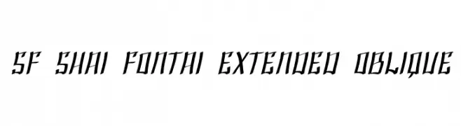
( Fonts by ShyFonts )
A bold, oblique font with sharp, angular edges and a dynamic style.
![SF Shai Fontai Extended Oblique フリーフォントのダウンロード]() ダウンロード 164 ダウンロード数@WebFont
ダウンロード 164 ダウンロード数@WebFont -
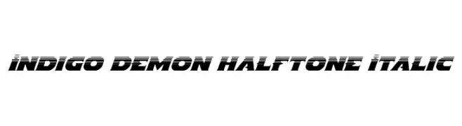
( Fonts by Iconian Fonts )
A bold, italicized font with a dynamic halftone effect and modern appeal.
![Indigo Demon Halftone Italic フリーフォントのダウンロード]() ダウンロード 164 ダウンロード数@WebFont
ダウンロード 164 ダウンロード数@WebFont -
-
( Vladimir Nikolic - www.coroflot.com/vladimirnikolic )
A bold, geometric font with sharp angles and a futuristic feel.
![Suggested Regular フリーフォントのダウンロード]() ダウンロード 164 ダウンロード数@WebFont
ダウンロード 164 ダウンロード数@WebFont -
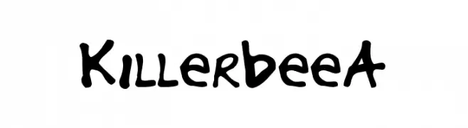
![KillerbeeA フリーフォントのダウンロード]() ダウンロード 164 ダウンロード数@WebFont
ダウンロード 164 ダウンロード数@WebFont -
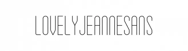
![Lovely Jeanne Sans フリーフォントのダウンロード]() ダウンロード 164 ダウンロード数@WebFont
ダウンロード 164 ダウンロード数@WebFont -
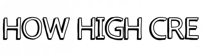
( Fonts by Fred Cre )
A bold, outlined font with a playful and dynamic style.
![how high cre フリーフォントのダウンロード]() ダウンロード 164 ダウンロード数@WebFont
ダウンロード 164 ダウンロード数@WebFont -
( Fonts by Canoute Creative - Canoute - Personal-use only. For commercial use please contact owner. )
A bold, elegant script font with flowing, cursive letterforms.
![Athena フリーフォントのダウンロード]() ダウンロード 164 ダウンロード数@WebFont
ダウンロード 164 ダウンロード数@WebFont

今のトップフォントは?
は、クリーンな造形と広い適用範囲で支持を集めています。 ブランディングからランディングページ、ポスターまで活躍します。
ロゴで人気のフォントは?
幾何学系の サンセリフ(例: Poppins、Gotham 系のファミリー)は、スケーラブルでクリーンな印象に最適。 親しみやすさを出すなら スクリプト や手書き系も定番です。 見出しは力強く、本文はニュートラルに──この組み合わせが認知とバランスを高めます。
人気リストはどのくらいの頻度で更新される?
ダウンロード数やエンゲージメントに基づき定期的に更新します。 こまめにチェックして、次に流行るフォントを先取りしましょう。
💡 ヒント: このページをブックマークしておくと便利です。トレンドは速く、今のトップが明日のリブランディングを導くこともあります。