人気フォント セクションへようこそ。ここでは「よくダウンロードされ、よく使われている」実績ある書体をまとめています。 ロゴ、Web、SNS のどれにも使いやすい、外さない選択肢が見つかります。
どの トップフォント も、バランス・可読性・汎用性で高評価です。 モダン・サンセリフ、エレガントなスクリプト、ヴィンテージなセリフ、ミニマルなディスプレイなどを厳選しています。
-
( Fonts by Docallisme HAS - Ryal - docallisme.blogspot.com - Personal-use only. For commercial use please contact owner. )
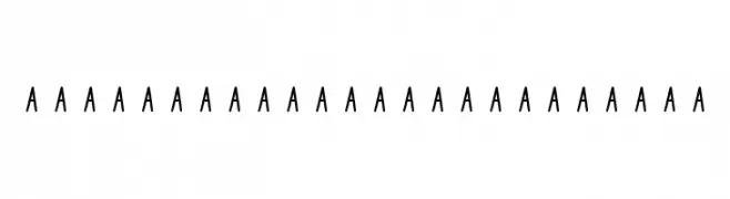
A clean, modern sans-serif font with uniform stroke width and balanced spacing.
 ダウンロード 163 ダウンロード数@WebFont
 -
( Fonts by www.blambot.com )
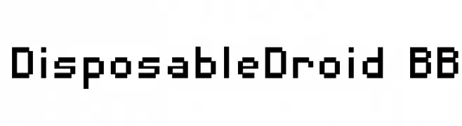
A pixelated, retro-style font with a geometric, digital appearance.
![DisposableDroid BB フリーフォントのダウンロード]() ダウンロード 163 ダウンロード数@WebFont
ダウンロード 163 ダウンロード数@WebFont -
( Fonts by weknow - Wino S Kadir )
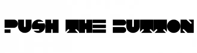
A bold, geometric font with a futuristic and industrial style.
![PUSH THE BUTTON フリーフォントのダウンロード]() ダウンロード 163 ダウンロード数@WebFont
ダウンロード 163 ダウンロード数@WebFont -
( Fonts by a Alberto Villanueva - www.av.nixiweb.com. Personal-use only. For commercial use please contact owner. )
A bold, modern font with vintage flair and high contrast strokes.
![Cintia フリーフォントのダウンロード]() ダウンロード 163 ダウンロード数@WebFont
ダウンロード 163 ダウンロード数@WebFont -
![special product フリーフォントのダウンロード]() ダウンロード 163 ダウンロード数@WebFont
ダウンロード 163 ダウンロード数@WebFont -
-
( Fonts by Edric Studio www.creativefabrica.com/designer/edricstudio/ - Personal-use only. For commercial use please contact owner. )
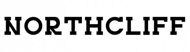
A bold slab serif font with strong, block-like serifs and a cohesive design.
![NORTHCLIFF フリーフォントのダウンロード]() ダウンロード 163 ダウンロード数@WebFont
ダウンロード 163 ダウンロード数@WebFont -
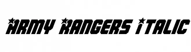
( Fonts by Daniel Zadorozny - www.iconian.com )
A bold, angular font with a military-inspired, star-adorned design.
![Army Rangers Italic フリーフォントのダウンロード]() ダウンロード 163 ダウンロード数@WebFont
ダウンロード 163 ダウンロード数@WebFont -
( Fonts by Iconian Fonts )
A bold, textured, and condensed font with a rugged, grunge style.
![Wolf Brothers Condensed フリーフォントのダウンロード]() ダウンロード 163 ダウンロード数@WebFont
ダウンロード 163 ダウンロード数@WebFont -
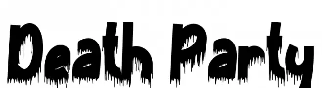
( Fonts by Yoga Letter )
A bold, dripping font ideal for horror and Halloween themes.
![Death Party フリーフォントのダウンロード]() ダウンロード 163 ダウンロード数@WebFont
ダウンロード 163 ダウンロード数@WebFont -
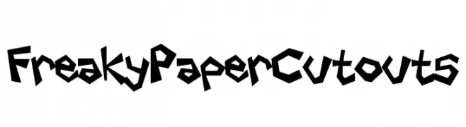
( Fonts by Darrell Flood )
A playful, edgy font with a paper cutout style and jagged edges.
![Freaky Paper Cutouts フリーフォントのダウンロード]() ダウンロード 163 ダウンロード数@WebFont
ダウンロード 163 ダウンロード数@WebFont


今のトップフォントは?
は、クリーンな造形と広い適用範囲で支持を集めています。 ブランディングからランディングページ、ポスターまで活躍します。
ロゴで人気のフォントは?
幾何学系の サンセリフ(例: Poppins、Gotham 系のファミリー)は、スケーラブルでクリーンな印象に最適。 親しみやすさを出すなら スクリプト や手書き系も定番です。 見出しは力強く、本文はニュートラルに──この組み合わせが認知とバランスを高めます。
人気リストはどのくらいの頻度で更新される?
ダウンロード数やエンゲージメントに基づき定期的に更新します。 こまめにチェックして、次に流行るフォントを先取りしましょう。
💡 ヒント: このページをブックマークしておくと便利です。トレンドは速く、今のトップが明日のリブランディングを導くこともあります。