人気フォント セクションへようこそ。ここでは「よくダウンロードされ、よく使われている」実績ある書体をまとめています。 ロゴ、Web、SNS のどれにも使いやすい、外さない選択肢が見つかります。
どの トップフォント も、バランス・可読性・汎用性で高評価です。 モダン・サンセリフ、エレガントなスクリプト、ヴィンテージなセリフ、ミニマルなディスプレイなどを厳選しています。
-
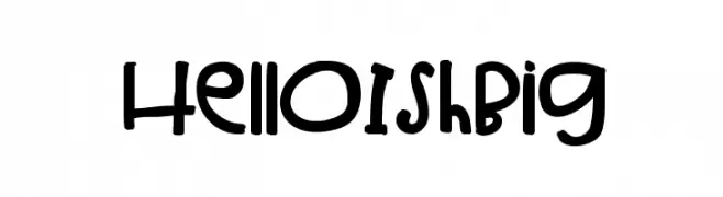
( Fonts by Jen Jones )
A playful, handwritten font with a bold and whimsical style.
 ダウンロード 163 ダウンロード数@WebFont
 -
![Groove Machine Upright フリーフォントのダウンロード]() ダウンロード 163 ダウンロード数@WebFont
ダウンロード 163 ダウンロード数@WebFont -
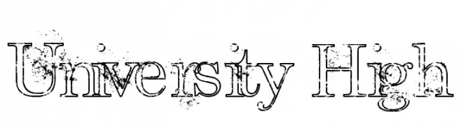
( Fonts by Pi Luo Chiu - thisisallenchiu.tumblr.com )
A distressed serif font with a vintage, weathered look.
![University High フリーフォントのダウンロード]() ダウンロード 163 ダウンロード数@WebFont
ダウンロード 163 ダウンロード数@WebFont -
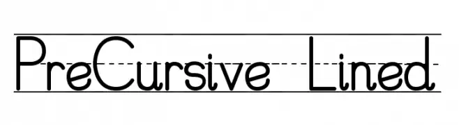
( RaseOne Full Time Artists - www.graffitifonts.com )
A structured, easy-to-read font ideal for educational use, featuring lined guidance for handwriting practice.
![PreCursive_Lined フリーフォントのダウンロード]() ダウンロード 163 ダウンロード数@WebFont
ダウンロード 163 ダウンロード数@WebFont -
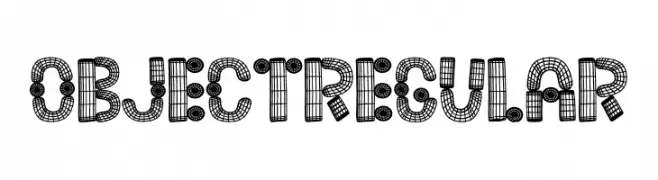
( Fonts by Vladimir Nikolic )
A 3D grid-style font with a mechanical, industrial look.
![Object Regular フリーフォントのダウンロード]() ダウンロード 163 ダウンロード数@WebFont
ダウンロード 163 ダウンロード数@WebFont -
-
( Fonts by Kong Font - https://fontkong.com/ - Personal-use only. For commercial use please contact owner. )
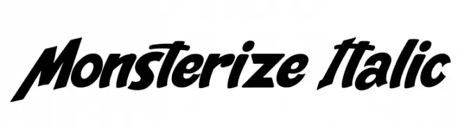
A bold, italic, and dynamic font with a strong sense of movement.
![Monsterize Italic フリーフォントのダウンロード]() ダウンロード 163 ダウンロード数@WebFont
ダウンロード 163 ダウンロード数@WebFont -
( Fonts by The Northern Block - Jonathan Hill - Personal-use only. For commercial use please contact owner. )
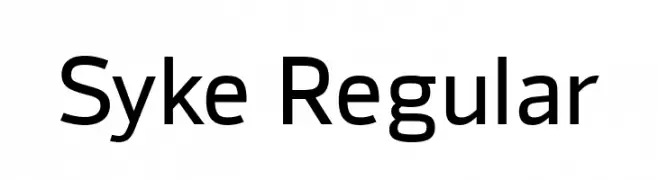
A modern, geometric sans-serif font with clean lines and balanced proportions.
![Syke Regular フリーフォントのダウンロード]() ダウンロード 163 ダウンロード数@WebFont
ダウンロード 163 ダウンロード数@WebFont -
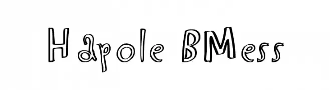
![Hapole BMess フリーフォントのダウンロード]() ダウンロード 163 ダウンロード数@WebFont
ダウンロード 163 ダウンロード数@WebFont -
( Scott Byrne - graphicriver.net/user/SByrne?ref=SByrne )
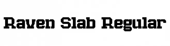
A bold slab serif font with a modern, industrial aesthetic.
![Raven Slab Regular フリーフォントのダウンロード]() ダウンロード 163 ダウンロード数@WebFont
ダウンロード 163 ダウンロード数@WebFont -
( London's Letters - www.londonsletters.com/ )
A bold, decorative font featuring embedded Olympic-themed icons within each character.
![LMS Olympic Icons フリーフォントのダウンロード]() ダウンロード 163 ダウンロード数@WebFont
ダウンロード 163 ダウンロード数@WebFont

今のトップフォントは?
は、クリーンな造形と広い適用範囲で支持を集めています。 ブランディングからランディングページ、ポスターまで活躍します。
ロゴで人気のフォントは?
幾何学系の サンセリフ(例: Poppins、Gotham 系のファミリー)は、スケーラブルでクリーンな印象に最適。 親しみやすさを出すなら スクリプト や手書き系も定番です。 見出しは力強く、本文はニュートラルに──この組み合わせが認知とバランスを高めます。
人気リストはどのくらいの頻度で更新される?
ダウンロード数やエンゲージメントに基づき定期的に更新します。 こまめにチェックして、次に流行るフォントを先取りしましょう。
💡 ヒント: このページをブックマークしておくと便利です。トレンドは速く、今のトップが明日のリブランディングを導くこともあります。