人気フォント セクションへようこそ。ここでは「よくダウンロードされ、よく使われている」実績ある書体をまとめています。 ロゴ、Web、SNS のどれにも使いやすい、外さない選択肢が見つかります。
どの トップフォント も、バランス・可読性・汎用性で高評価です。 モダン・サンセリフ、エレガントなスクリプト、ヴィンテージなセリフ、ミニマルなディスプレイなどを厳選しています。
-
( Fonts by Daniel Gauthier )
A bold, handwritten font with a playful and casual style.
 ダウンロード 162 ダウンロード数@WebFont
 -
( Fonts by Seung Kim - Personal-use only. For commercial use please contact owner. )
A modern, geometric sans-serif font with a clean and minimalist style.
![Cosmic フリーフォントのダウンロード]() ダウンロード 162 ダウンロード数@WebFont
ダウンロード 162 ダウンロード数@WebFont -
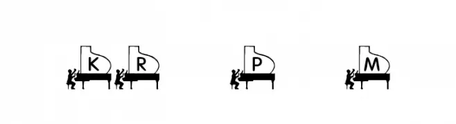
( Fonts by Kat`s Fun Fonts - Personal-use only. For commercial use please contact owner. )
A decorative font with letters styled as grand pianos and pianist silhouettes.
![KR Piano Man フリーフォントのダウンロード]() ダウンロード 162 ダウンロード数@WebFont
ダウンロード 162 ダウンロード数@WebFont -
( Fonts by Daniel Zadorozny - www.iconian.com - Free for personal use )
A bold, futuristic 3D italic font with angular, geometric shapes and a dynamic appearance.
![War Eagle 3D Italic フリーフォントのダウンロード]() ダウンロード 162 ダウンロード数@WebFont
ダウンロード 162 ダウンロード数@WebFont -
( Fonts by Hendrick Rolandez - www.moinzek.com - Personal-use only. For commercial use please contact owner. )
A sophisticated, high-contrast serif font with a condensed and elegant design.
![Glamor Condensed フリーフォントのダウンロード]() ダウンロード 162 ダウンロード数@WebFont
ダウンロード 162 ダウンロード数@WebFont -
-
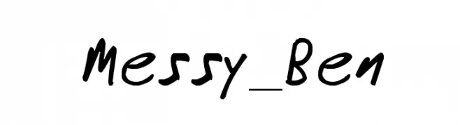
( www.affordabledesignsolutions.com )
A bold, playful handwritten font with a lively and informal style.
![Messy_Ben フリーフォントのダウンロード]() ダウンロード 162 ダウンロード数@WebFont
ダウンロード 162 ダウンロード数@WebFont -
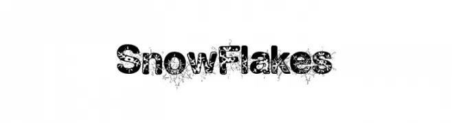
( Fonts by a Max Infeld - XEROGRAPHER FONTS - xerographer.blogspot.com . Personal-use only. For commercial use please contact owner. )
A decorative font with intricate snowflake patterns within bold characters.
![SnowFlakes フリーフォントのダウンロード]() ダウンロード 162 ダウンロード数@WebFont
ダウンロード 162 ダウンロード数@WebFont -
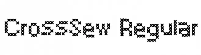
( Fonts by Bård Oskar Angelskår )
A decorative font with a cross-stitch embroidery style.
![CrossSew Regular フリーフォントのダウンロード]() ダウンロード 162 ダウンロード数@WebFont
ダウンロード 162 ダウンロード数@WebFont -
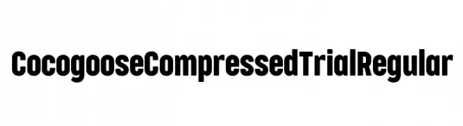
( Zetafonts - www.zetafonts.com )
A bold, compressed typeface with a modern and cohesive design.
![Cocogoose Compressed Trial Regular フリーフォントのダウンロード]() ダウンロード 162 ダウンロード数@WebFont
ダウンロード 162 ダウンロード数@WebFont -
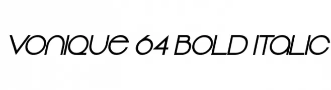
( Fonts by Sharkshock Productions----www.sharkshock.com. Personal-use only. For commercial use please contact owner. )
A bold, italic, modern font with geometric shapes and high contrast.
![Vonique 64 Bold Italic フリーフォントのダウンロード]() ダウンロード 162 ダウンロード数@WebFont
ダウンロード 162 ダウンロード数@WebFont


今のトップフォントは?
は、クリーンな造形と広い適用範囲で支持を集めています。 ブランディングからランディングページ、ポスターまで活躍します。
ロゴで人気のフォントは?
幾何学系の サンセリフ(例: Poppins、Gotham 系のファミリー)は、スケーラブルでクリーンな印象に最適。 親しみやすさを出すなら スクリプト や手書き系も定番です。 見出しは力強く、本文はニュートラルに──この組み合わせが認知とバランスを高めます。
人気リストはどのくらいの頻度で更新される?
ダウンロード数やエンゲージメントに基づき定期的に更新します。 こまめにチェックして、次に流行るフォントを先取りしましょう。
💡 ヒント: このページをブックマークしておくと便利です。トレンドは速く、今のトップが明日のリブランディングを導くこともあります。