人気フォント セクションへようこそ。ここでは「よくダウンロードされ、よく使われている」実績ある書体をまとめています。 ロゴ、Web、SNS のどれにも使いやすい、外さない選択肢が見つかります。
どの トップフォント も、バランス・可読性・汎用性で高評価です。 モダン・サンセリフ、エレガントなスクリプト、ヴィンテージなセリフ、ミニマルなディスプレイなどを厳選しています。
-
( Andrew Bulhak - dev.null.org/fonts/ )
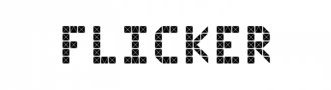
A bold, geometric font with a mosaic-like pattern.
 ダウンロード 155 ダウンロード数@WebFont
 -
( Fonts by ibeydesign - Personal-use only. For commercial use please contact owner. )
A bold, cursive font with a fluid, handwritten style.
![Kaysan Signature フリーフォントのダウンロード]() ダウンロード 155 ダウンロード数@WebFont
ダウンロード 155 ダウンロード数@WebFont -
![Annapolis Laser Italic フリーフォントのダウンロード]() ダウンロード 155 ダウンロード数@WebFont
ダウンロード 155 ダウンロード数@WebFont -
![KatsHandwriting フリーフォントのダウンロード]() ダウンロード 155 ダウンロード数@WebFont
ダウンロード 155 ダウンロード数@WebFont -
( Fonts by Iconian Fonts )
A bold, angular, and condensed italic font with a modern, edgy style.
![Winter Solstice Condensed Italic フリーフォントのダウンロード]() ダウンロード 155 ダウンロード数@WebFont
ダウンロード 155 ダウンロード数@WebFont -
-
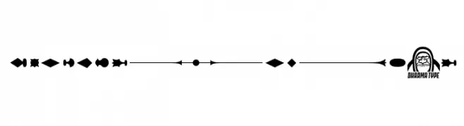
( This font are Copyrighted by Ryoichi Tsunekawa. www.dharmatype.com )
A collection of gothic decorative elements with intricate patterns and bold lines.
![GothicExtras-E フリーフォントのダウンロード]() ダウンロード 155 ダウンロード数@WebFont
ダウンロード 155 ダウンロード数@WebFont -
![HandyWesternSerif Medium フリーフォントのダウンロード]() ダウンロード 155 ダウンロード数@WebFont
ダウンロード 155 ダウンロード数@WebFont -
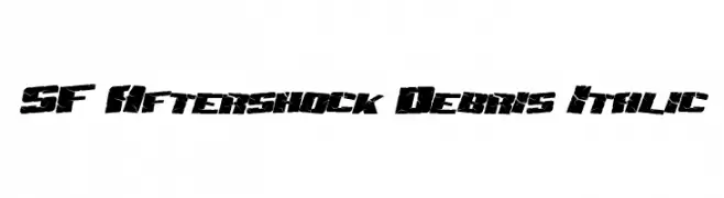
( Fonts by ShyFonts )
A bold, fragmented font with an italic slant, perfect for dramatic and impactful designs.
![SF Aftershock Debris Italic フリーフォントのダウンロード]() ダウンロード 155 ダウンロード数@WebFont
ダウンロード 155 ダウンロード数@WebFont -
( Fonts by www.haroldsfonts.com )
A decorative font inspired by maritime flags with bold geometric shapes.
![Maritime Flags Yellow フリーフォントのダウンロード]() ダウンロード 155 ダウンロード数@WebFont
ダウンロード 155 ダウンロード数@WebFont -
![Oh_Snap フリーフォントのダウンロード]() ダウンロード 155 ダウンロード数@WebFont
ダウンロード 155 ダウンロード数@WebFont


今のトップフォントは?
は、クリーンな造形と広い適用範囲で支持を集めています。 ブランディングからランディングページ、ポスターまで活躍します。
ロゴで人気のフォントは?
幾何学系の サンセリフ(例: Poppins、Gotham 系のファミリー)は、スケーラブルでクリーンな印象に最適。 親しみやすさを出すなら スクリプト や手書き系も定番です。 見出しは力強く、本文はニュートラルに──この組み合わせが認知とバランスを高めます。
人気リストはどのくらいの頻度で更新される?
ダウンロード数やエンゲージメントに基づき定期的に更新します。 こまめにチェックして、次に流行るフォントを先取りしましょう。
💡 ヒント: このページをブックマークしておくと便利です。トレンドは速く、今のトップが明日のリブランディングを導くこともあります。