人気フォント セクションへようこそ。ここでは「よくダウンロードされ、よく使われている」実績ある書体をまとめています。 ロゴ、Web、SNS のどれにも使いやすい、外さない選択肢が見つかります。
どの トップフォント も、バランス・可読性・汎用性で高評価です。 モダン・サンセリフ、エレガントなスクリプト、ヴィンテージなセリフ、ミニマルなディスプレイなどを厳選しています。
-
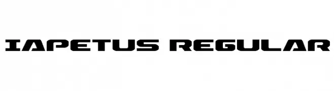
( Fonts by Daniel Zadorozny - www.iconian.com - Free for personal use )
A bold, futuristic font with geometric and angular design elements.
 ダウンロード 150 ダウンロード数@WebFont
 -
( Fonts by Kreative Korporation - www.kreativekorp.com )
A casual handwritten font with fluid, slightly irregular characters.
![Kawakimi フリーフォントのダウンロード]() ダウンロード 150 ダウンロード数@WebFont
ダウンロード 150 ダウンロード数@WebFont -
( Fonts by Lekker Studio )
A fluid and expressive handwritten font with elongated strokes.
![athens_free フリーフォントのダウンロード]() ダウンロード 150 ダウンロード数@WebFont
ダウンロード 150 ダウンロード数@WebFont -
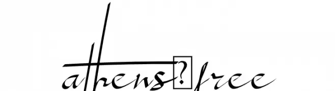
( SDFonts. http://www.angelfire.com/scifi2/sdfonts/index.html )
A bold, modern font with wide, impactful characters ideal for headlines.
![Paolo Extented フリーフォントのダウンロード]() ダウンロード 150 ダウンロード数@WebFont
ダウンロード 150 ダウンロード数@WebFont -
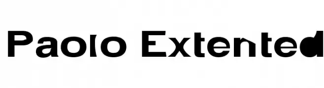
( Fonts by www.fontpanda.com. Personal-use only. For commercial use please contact owner. )
A bold, hand-drawn font with dynamic, brush-like strokes.
![Black Beauty フリーフォントのダウンロード]() ダウンロード 150 ダウンロード数@WebFont
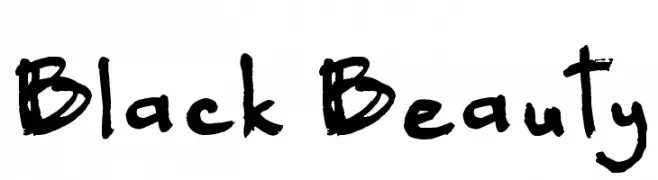
ダウンロード 150 ダウンロード数@WebFont -
-
( Fonts by Daniel Zadorozny - www.iconian.com - Free for personal use )
A bold, rugged font with jagged edges and a distressed, organic appearance.
![Marsh Thing Rotated フリーフォントのダウンロード]() ダウンロード 150 ダウンロード数@WebFont
ダウンロード 150 ダウンロード数@WebFont -
( Fonts by a Neale Davidson - www.pixelsagas.com. Personal-use only. For commercial use please contact owner. )
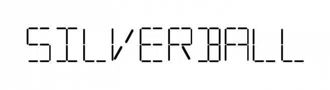
A segmented, digital-inspired font with a futuristic and technical style.
![Silverball フリーフォントのダウンロード]() ダウンロード 150 ダウンロード数@WebFont
ダウンロード 150 ダウンロード数@WebFont -
( Blue Sky - Savana X - www.facebook.com/pages/Blue-Sky-Design/1401031006827361 )
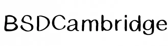
A playful, handwritten font with bold strokes and an informal style.
![BSDCambridge フリーフォントのダウンロード]() ダウンロード 150 ダウンロード数@WebFont
ダウンロード 150 ダウンロード数@WebFont -
( Fonts by Daniel Zadorozny - www.iconian.com - Free for personal use )
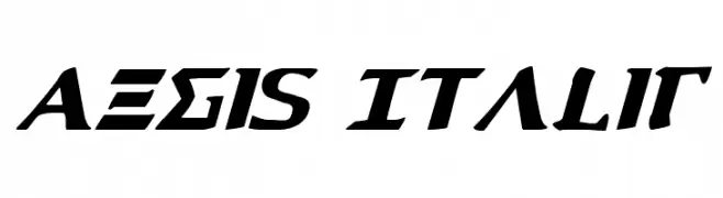
A bold, italicized font with sharp, angular features.
![Aegis Italic フリーフォントのダウンロード]() ダウンロード 150 ダウンロード数@WebFont
ダウンロード 150 ダウンロード数@WebFont -
( Fonts by www.selawetype.com - Personal-use only. FOR DONATION https://www.paypal.me/selawe . For commercial use please contact owner. )
A playful handwritten font with smooth, rounded strokes and a casual style.
![kidson フリーフォントのダウンロード]() ダウンロード 150 ダウンロード数@WebFont
ダウンロード 150 ダウンロード数@WebFont


今のトップフォントは?
は、クリーンな造形と広い適用範囲で支持を集めています。 ブランディングからランディングページ、ポスターまで活躍します。
ロゴで人気のフォントは?
幾何学系の サンセリフ(例: Poppins、Gotham 系のファミリー)は、スケーラブルでクリーンな印象に最適。 親しみやすさを出すなら スクリプト や手書き系も定番です。 見出しは力強く、本文はニュートラルに──この組み合わせが認知とバランスを高めます。
人気リストはどのくらいの頻度で更新される?
ダウンロード数やエンゲージメントに基づき定期的に更新します。 こまめにチェックして、次に流行るフォントを先取りしましょう。
💡 ヒント: このページをブックマークしておくと便利です。トレンドは速く、今のトップが明日のリブランディングを導くこともあります。