人気フォント セクションへようこそ。ここでは「よくダウンロードされ、よく使われている」実績ある書体をまとめています。 ロゴ、Web、SNS のどれにも使いやすい、外さない選択肢が見つかります。
どの トップフォント も、バランス・可読性・汎用性で高評価です。 モダン・サンセリフ、エレガントなスクリプト、ヴィンテージなセリフ、ミニマルなディスプレイなどを厳選しています。
-
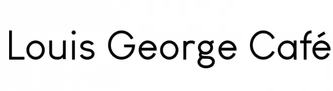
( Chen Yining )
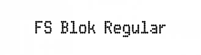
A modern, geometric sans-serif font with clean lines and uniform strokes.
 ダウンロード 2579 ダウンロード数@WebFont
 -
![FS Blok Regular フリーフォントのダウンロード]() ダウンロード 2579 ダウンロード数@WebFont
ダウンロード 2579 ダウンロード数@WebFont -
( Fonts by www.fontalicious.com )
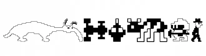
A decorative font inspired by classic arcade game graphics, featuring pixelated, nostalgic symbols.
![Arcade フリーフォントのダウンロード]() ダウンロード 2579 ダウンロード数@WebFont
ダウンロード 2579 ダウンロード数@WebFont -
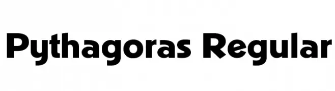
![Pythagoras Regular フリーフォントのダウンロード]() ダウンロード 2578 ダウンロード数@WebFont
ダウンロード 2578 ダウンロード数@WebFont -
( Fonts by Tom Lowe )
A bold, hand-drawn font with a rugged and dynamic style.
![Ripple フリーフォントのダウンロード]() ダウンロード 2577 ダウンロード数@WebFont
ダウンロード 2577 ダウンロード数@WebFont -
-
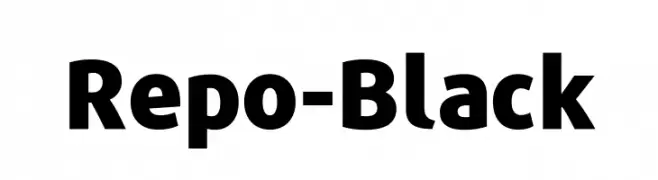
( Fonts by Stefan Peev - Personal-use only. For commercial use please contact owner. )
A bold, modern sans-serif font with uniform strokes and a strong presence.
![Repo-Black フリーフォントのダウンロード]() ダウンロード 2576 ダウンロード数@WebFont
ダウンロード 2576 ダウンロード数@WebFont -
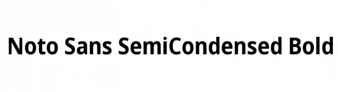
( Fonts by Google - Personal-use only. For commercial use please contact owner. )
A modern, bold, semi-condensed sans-serif font with clean lines and balanced spacing.
![Noto Sans SemiCondensed Bold フリーフォントのダウンロード]() ダウンロード 2576 ダウンロード数@WebFont
ダウンロード 2576 ダウンロード数@WebFont -
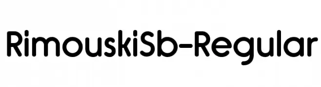
( Typodermic Fonts - Ray Larabie - www.typodermicfonts.com/ )
A clean, rounded sans-serif font with a modern and approachable style.
![RimouskiSb-Regular フリーフォントのダウンロード]() ダウンロード 2576 ダウンロード数@WebFont
ダウンロード 2576 ダウンロード数@WebFont -
![Lido STF Cond CE Bold フリーフォントのダウンロード]() ダウンロード 2576 ダウンロード数@WebFont
ダウンロード 2576 ダウンロード数@WebFont -
( Fonts by Dieter Schumacher )
A bold, geometric outline font with a modern and futuristic style.
![FM University フリーフォントのダウンロード]() ダウンロード 2576 ダウンロード数@WebFont
ダウンロード 2576 ダウンロード数@WebFont


今のトップフォントは?
は、クリーンな造形と広い適用範囲で支持を集めています。 ブランディングからランディングページ、ポスターまで活躍します。
ロゴで人気のフォントは?
幾何学系の サンセリフ(例: Poppins、Gotham 系のファミリー)は、スケーラブルでクリーンな印象に最適。 親しみやすさを出すなら スクリプト や手書き系も定番です。 見出しは力強く、本文はニュートラルに──この組み合わせが認知とバランスを高めます。
人気リストはどのくらいの頻度で更新される?
ダウンロード数やエンゲージメントに基づき定期的に更新します。 こまめにチェックして、次に流行るフォントを先取りしましょう。
💡 ヒント: このページをブックマークしておくと便利です。トレンドは速く、今のトップが明日のリブランディングを導くこともあります。