人気フォント セクションへようこそ。ここでは「よくダウンロードされ、よく使われている」実績ある書体をまとめています。 ロゴ、Web、SNS のどれにも使いやすい、外さない選択肢が見つかります。
どの トップフォント も、バランス・可読性・汎用性で高評価です。 モダン・サンセリフ、エレガントなスクリプト、ヴィンテージなセリフ、ミニマルなディスプレイなどを厳選しています。
-
( Fonts by Billy Argel - www.billyargel.com - Personal-use only. For commercial use please contact owner. )
A bold, condensed font with high contrast and a modern, geometric style.
 ダウンロード 145 ダウンロード数@WebFont
 -
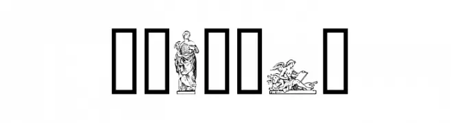
( Fonts by Klaus Johansen - www.listemageren.dK )
Font made from intricate classical statue illustrations.
![Statuer フリーフォントのダウンロード]() ダウンロード 145 ダウンロード数@WebFont
ダウンロード 145 ダウンロード数@WebFont -
![Angelshand フリーフォントのダウンロード]() ダウンロード 145 ダウンロード数@WebFont
ダウンロード 145 ダウンロード数@WebFont -
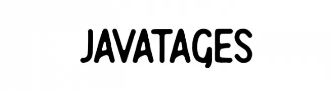
( Fonts by Sarah Robbaniyyah - Good Java Studio - Personal-use only. For commercial use please contact owner. )
A playful, bold font with rounded, hand-drawn characters.
![Javatages フリーフォントのダウンロード]() ダウンロード 145 ダウンロード数@WebFont
ダウンロード 145 ダウンロード数@WebFont -
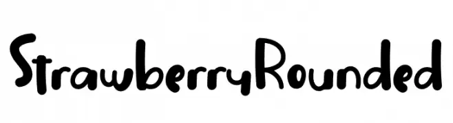
( Fonts by Nuryanto Dwi )
A playful, rounded font with a hand-drawn, friendly appearance.
![Strawberry Rounded フリーフォントのダウンロード]() ダウンロード 145 ダウンロード数@WebFont
ダウンロード 145 ダウンロード数@WebFont -
-
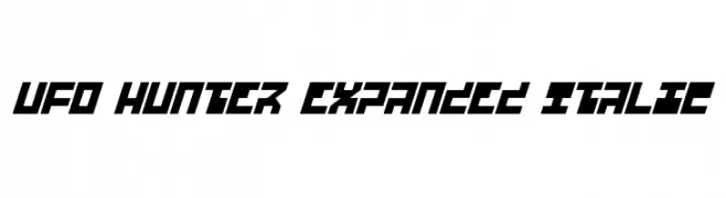
( Fonts by Daniel Zadorozny - www.iconian.com - Free for personal use )
A bold, expanded, and italicized futuristic font with geometric, angular characters.
![UFO Hunter Expanded Italic フリーフォントのダウンロード]() ダウンロード 145 ダウンロード数@WebFont
ダウンロード 145 ダウンロード数@WebFont -
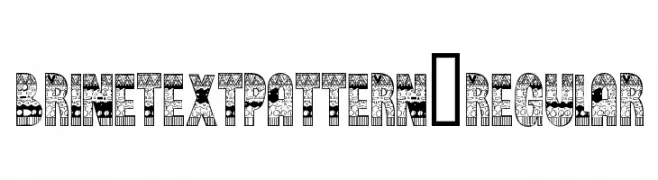
( thealexzone.com/ )
A decorative font with intricate patterns and bold uppercase letters.
![BrinetextPattern-Regular フリーフォントのダウンロード]() ダウンロード 145 ダウンロード数@WebFont
ダウンロード 145 ダウンロード数@WebFont -
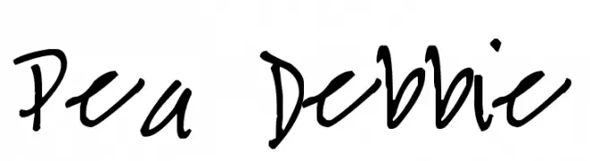
( Free for a personal use. For a commercial use please visit www.kevinandamanda.com )
A casual, handwritten font with a playful and informal style.
![Pea Debbie フリーフォントのダウンロード]() ダウンロード 145 ダウンロード数@WebFont
ダウンロード 145 ダウンロード数@WebFont -
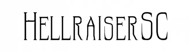
![HellraiserSC フリーフォントのダウンロード]() ダウンロード 145 ダウンロード数@WebFont
ダウンロード 145 ダウンロード数@WebFont -
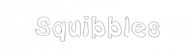
![Squibbles フリーフォントのダウンロード]() ダウンロード 145 ダウンロード数@WebFont
ダウンロード 145 ダウンロード数@WebFont

今のトップフォントは?
は、クリーンな造形と広い適用範囲で支持を集めています。 ブランディングからランディングページ、ポスターまで活躍します。
ロゴで人気のフォントは?
幾何学系の サンセリフ(例: Poppins、Gotham 系のファミリー)は、スケーラブルでクリーンな印象に最適。 親しみやすさを出すなら スクリプト や手書き系も定番です。 見出しは力強く、本文はニュートラルに──この組み合わせが認知とバランスを高めます。
人気リストはどのくらいの頻度で更新される?
ダウンロード数やエンゲージメントに基づき定期的に更新します。 こまめにチェックして、次に流行るフォントを先取りしましょう。
💡 ヒント: このページをブックマークしておくと便利です。トレンドは速く、今のトップが明日のリブランディングを導くこともあります。