人気フォント セクションへようこそ。ここでは「よくダウンロードされ、よく使われている」実績ある書体をまとめています。 ロゴ、Web、SNS のどれにも使いやすい、外さない選択肢が見つかります。
どの トップフォント も、バランス・可読性・汎用性で高評価です。 モダン・サンセリフ、エレガントなスクリプト、ヴィンテージなセリフ、ミニマルなディスプレイなどを厳選しています。
-
( Fresh Fonts - formerly at eccodomani.org/freshfonts/ )
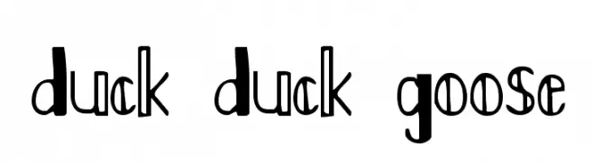
A playful and whimsical font with unique, exaggerated character shapes.
 ダウンロード 143 ダウンロード数@WebFont
 -
( Fonts by Sharkshock )
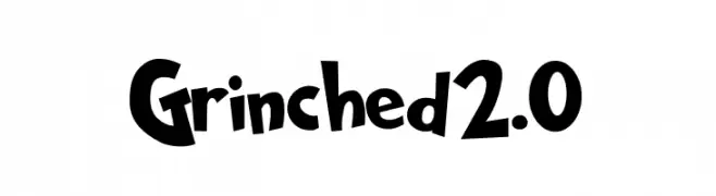
A playful, bold, and cartoonish font with irregular strokes and a whimsical style.
![Grinched2.0 フリーフォントのダウンロード]() ダウンロード 143 ダウンロード数@WebFont
ダウンロード 143 ダウンロード数@WebFont -
( Fonts by Daniel Zadorozny - www.iconian.com - Free for personal use )
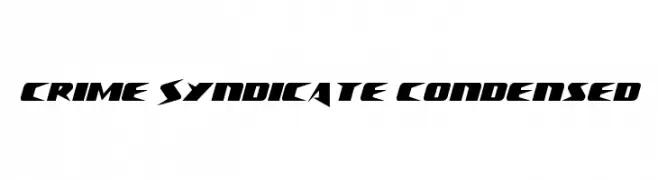
A bold, angular, and condensed font with a futuristic and edgy style.
![Crime Syndicate Condensed フリーフォントのダウンロード]() ダウンロード 143 ダウンロード数@WebFont
ダウンロード 143 ダウンロード数@WebFont -
( Fonts by Alit Design - Alit Suarnegara - Personal-use only. For commercial use please contact owner. )
A modern-vintage serif font with playful curves and artistic details.
![Roby Soho Regular フリーフォントのダウンロード]() ダウンロード 143 ダウンロード数@WebFont
ダウンロード 143 ダウンロード数@WebFont -
( Fonts by Din Studio - Donis Miftahudin - Personal-use only. For commercial use please contact owner. )
A sleek, modern font with clean lines and a minimalist aesthetic.
![Moderrat Extra Light フリーフォントのダウンロード]() ダウンロード 143 ダウンロード数@WebFont
ダウンロード 143 ダウンロード数@WebFont -
-
( Fonts by Steve Cloutier - www.cloutierfontes.ca )
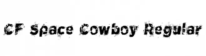
A bold, distressed font with a unique halftone pattern for a rugged, dynamic look.
![CF Space Cowboy Regular フリーフォントのダウンロード]() ダウンロード 143 ダウンロード数@WebFont
ダウンロード 143 ダウンロード数@WebFont -
( Fonts by Daniel Zadorozny - www.iconian.com - Personal-use only. For commercial use please contact owner. )
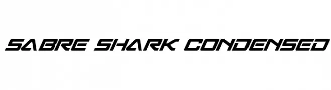
A futuristic, angular, and condensed font with a dynamic slant.
![Sabre Shark Condensed フリーフォントのダウンロード]() ダウンロード 143 ダウンロード数@WebFont
ダウンロード 143 ダウンロード数@WebFont -
( Fonts by Daniel Zadorozny - www.iconian.com - Free for personal use )
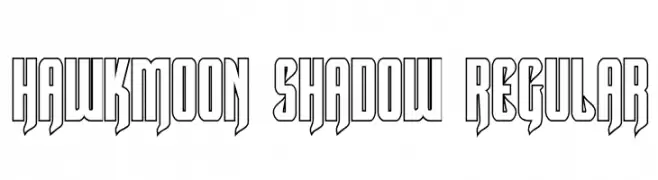
A bold, geometric font with a shadow effect for a modern, 3D look.
![Hawkmoon Shadow Regular フリーフォントのダウンロード]() ダウンロード 143 ダウンロード数@WebFont
ダウンロード 143 ダウンロード数@WebFont -
( Fonts by Daniel Zadorozny - www.iconian.com )
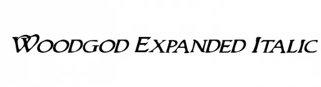
An expressive italic font with expanded letterforms and fluid strokes.
![Woodgod Expanded Italic フリーフォントのダウンロード]() ダウンロード 143 ダウンロード数@WebFont
ダウンロード 143 ダウンロード数@WebFont -
( Fonts by Castcraft Software - OPTI Fonts Archive - opti.netii.net - Personal-use only. For commercial use please contact owner. )
A bold, elegant script font with flowing, cursive design and ornate uppercase letters.
![QuoOpti-Bold フリーフォントのダウンロード]() ダウンロード 143 ダウンロード数@WebFont
ダウンロード 143 ダウンロード数@WebFont


今のトップフォントは?
は、クリーンな造形と広い適用範囲で支持を集めています。 ブランディングからランディングページ、ポスターまで活躍します。
ロゴで人気のフォントは?
幾何学系の サンセリフ(例: Poppins、Gotham 系のファミリー)は、スケーラブルでクリーンな印象に最適。 親しみやすさを出すなら スクリプト や手書き系も定番です。 見出しは力強く、本文はニュートラルに──この組み合わせが認知とバランスを高めます。
人気リストはどのくらいの頻度で更新される?
ダウンロード数やエンゲージメントに基づき定期的に更新します。 こまめにチェックして、次に流行るフォントを先取りしましょう。
💡 ヒント: このページをブックマークしておくと便利です。トレンドは速く、今のトップが明日のリブランディングを導くこともあります。