人気フォント セクションへようこそ。ここでは「よくダウンロードされ、よく使われている」実績ある書体をまとめています。 ロゴ、Web、SNS のどれにも使いやすい、外さない選択肢が見つかります。
どの トップフォント も、バランス・可読性・汎用性で高評価です。 モダン・サンセリフ、エレガントなスクリプト、ヴィンテージなセリフ、ミニマルなディスプレイなどを厳選しています。
-
 ダウンロード 2546 ダウンロード数
 -
( Copyright (c) 2010, NHN Corporation (http://www.nhncorp.com) )
A classic serif font with elegant strokes and balanced proportions.
![NanumMyeongjoBold フリーフォントのダウンロード]() ダウンロード 2546 ダウンロード数@WebFont
ダウンロード 2546 ダウンロード数@WebFont -
( Copyright (c) 2011, Thatcher Ulrich (http://tulrich.com), )
A bold, clean sans-serif font with geometric shapes and uniform strokes.
![Tuffy Bold フリーフォントのダウンロード]() ダウンロード 2546 ダウンロード数@WebFont
ダウンロード 2546 ダウンロード数@WebFont -
( Copyright 2018 Bai Jamjuree (https://github.com/cadsondemak/Bai-Jamjuree) )
A bold, modern sans-serif font with excellent readability and versatility.
![Bai Jamjuree Bold フリーフォントのダウンロード]() ダウンロード 2545 ダウンロード数@WebFont
ダウンロード 2545 ダウンロード数@WebFont -
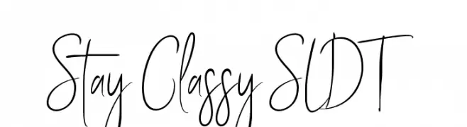
( Solidtype - bit.ly/2OxZn2V )
A stylish, handwritten font with elongated, flowing letterforms.
![Stay Classy SLDT フリーフォントのダウンロード]() ダウンロード 2545 ダウンロード数@WebFont
ダウンロード 2545 ダウンロード数@WebFont -
-
![MORVA フリーフォントのダウンロード]() ダウンロード 2545 ダウンロード数@WebFont
ダウンロード 2545 ダウンロード数@WebFont -
( Fonts by Mans Greback - www.mawns.com )
Graffiti-inspired font with bold, dripping letters and an urban aesthetic.
![Ruthless Drippin ONE フリーフォントのダウンロード]() ダウンロード 2545 ダウンロード数@WebFont
ダウンロード 2545 ダウンロード数@WebFont -
![Supposedly フリーフォントのダウンロード]() ダウンロード 2545 ダウンロード数@WebFont
ダウンロード 2545 ダウンロード数@WebFont -
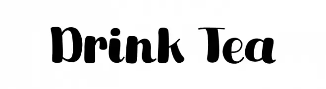
( Fonts by Khurasan )
A bold, playful font with rounded characters and a whimsical style.
![Drink Tea フリーフォントのダウンロード]() ダウンロード 2544 ダウンロード数@WebFont
ダウンロード 2544 ダウンロード数@WebFont -
( Free on condition that you make a donation of 5€ favor of an organization dealing with global warming. http://www.sergiolelli.it )
A bold, modern sans-serif font with a condensed and uniform style.
![Stravinskij フリーフォントのダウンロード]() ダウンロード 2544 ダウンロード数@WebFont
ダウンロード 2544 ダウンロード数@WebFont


今のトップフォントは?
は、クリーンな造形と広い適用範囲で支持を集めています。 ブランディングからランディングページ、ポスターまで活躍します。
ロゴで人気のフォントは?
幾何学系の サンセリフ(例: Poppins、Gotham 系のファミリー)は、スケーラブルでクリーンな印象に最適。 親しみやすさを出すなら スクリプト や手書き系も定番です。 見出しは力強く、本文はニュートラルに──この組み合わせが認知とバランスを高めます。
人気リストはどのくらいの頻度で更新される?
ダウンロード数やエンゲージメントに基づき定期的に更新します。 こまめにチェックして、次に流行るフォントを先取りしましょう。
💡 ヒント: このページをブックマークしておくと便利です。トレンドは速く、今のトップが明日のリブランディングを導くこともあります。