人気フォント セクションへようこそ。ここでは「よくダウンロードされ、よく使われている」実績ある書体をまとめています。 ロゴ、Web、SNS のどれにも使いやすい、外さない選択肢が見つかります。
どの トップフォント も、バランス・可読性・汎用性で高評価です。 モダン・サンセリフ、エレガントなスクリプト、ヴィンテージなセリフ、ミニマルなディスプレイなどを厳選しています。
-
( Fonts by Ben Nathan )
A bold, distressed font with jagged edges and a chaotic style.
 ダウンロード 654 ダウンロード数@WebFont
 -
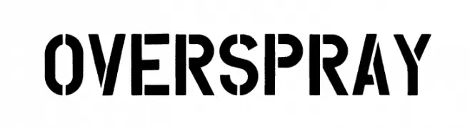
( Tension Type - Michael Tension - www.TensionType.com )
A bold, stencil-style font with an industrial, urban aesthetic.
![Overspray フリーフォントのダウンロード]() ダウンロード 654 ダウンロード数@WebFont
ダウンロード 654 ダウンロード数@WebFont -
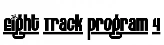
( Fonts by www.fontalicious.com )
A bold, modern font with blocky letters and decorative star motifs.
![Eight Track program 4 フリーフォントのダウンロード]() ダウンロード 654 ダウンロード数@WebFont
ダウンロード 654 ダウンロード数@WebFont -
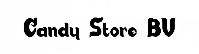
( Fonts by Blue Vinyl - Jess Latham - www.bvfonts.com )
A bold, playful font with rounded characters and a vintage flair.
![Candy Store BV フリーフォントのダウンロード]() ダウンロード 654 ダウンロード数@WebFont
ダウンロード 654 ダウンロード数@WebFont -
( Roland Huse Design - Roland Huse - rolandhuse.com )
A playful and whimsical font with bold strokes and decorative elements.
![Personalitype Demo Regular Regular フリーフォントのダウンロード]() ダウンロード 654 ダウンロード数@WebFont
ダウンロード 654 ダウンロード数@WebFont -
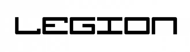
( Fonts by Daniel Zadorozny - www.iconian.com - Free for personal use )
A futuristic, geometric font with angular shapes and consistent stroke width.
![Legion フリーフォントのダウンロード]() ダウンロード 654 ダウンロード数@WebFont
ダウンロード 654 ダウンロード数@WebFont -
![AlphaBizzyBee フリーフォントのダウンロード]() ダウンロード 654 ダウンロード数@WebFont
ダウンロード 654 ダウンロード数@WebFont -
( Fonts by Daniel Zadorozny - www.iconian.com - Free for personal use )
A bold, playful font with rounded edges and a cohesive, friendly style.
![Action Man Extended Bold フリーフォントのダウンロード]() ダウンロード 654 ダウンロード数@WebFont
ダウンロード 654 ダウンロード数@WebFont -
( MaxiGamer )
A bold, rounded font with a playful and friendly style.
![Crewniverse フリーフォントのダウンロード]() ダウンロード 654 ダウンロード数@WebFont
ダウンロード 654 ダウンロード数@WebFont -
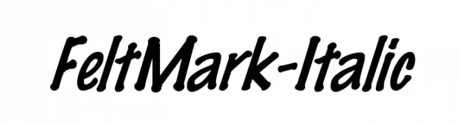
![FeltMark-Italic フリーフォントのダウンロード]() ダウンロード 654 ダウンロード数
ダウンロード 654 ダウンロード数 -
( Fonts by CannotIntoSpaceFonts - KineticPlasma Fonts - Personal-use only. For commercial use please contact owner. )
A bold, oblique font with strong, dynamic strokes and a cohesive design.
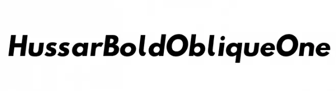
![Hussar Bold Oblique One フリーフォントのダウンロード]() ダウンロード 654 ダウンロード数@WebFont
ダウンロード 654 ダウンロード数@WebFont -
![Nickelodeon Playoffs フリーフォントのダウンロード]() ダウンロード 654 ダウンロード数@WebFont
ダウンロード 654 ダウンロード数@WebFont -
( Free Football Font - freefootballfont.blogspot.com )
A bold, outlined font with a modern and impactful style.
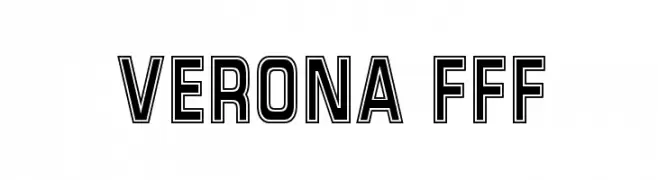
![Verona FFF フリーフォントのダウンロード]() ダウンロード 654 ダウンロード数@WebFont
ダウンロード 654 ダウンロード数@WebFont -
( Fonts by Daniel Zadorozny - www.iconian.com )
Bold, italicized stencil-style font with a modern, impactful design.
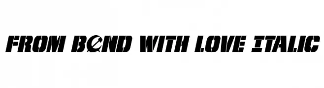
![From BOND With Love Italic フリーフォントのダウンロード]() ダウンロード 654 ダウンロード数@WebFont
ダウンロード 654 ダウンロード数@WebFont -
( Fonts by David Rakowski )
A decorative ribbon-style font with a three-dimensional effect.
![DavysRibbons フリーフォントのダウンロード]() ダウンロード 654 ダウンロード数@WebFont
ダウンロード 654 ダウンロード数@WebFont -
( Fonts by a Neale Davidson - www.pixelsagas.com. Personal-use only. For commercial use please contact owner. )
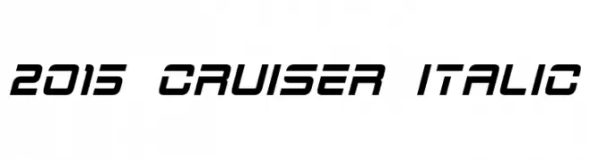
A modern, italicized font with a sleek, geometric design.
![2015 Cruiser Italic フリーフォントのダウンロード]() ダウンロード 654 ダウンロード数@WebFont
ダウンロード 654 ダウンロード数@WebFont -
( Copyright (c) 2005-2017 FONTRIX. All Rights Reserved. )
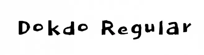
A playful, handwritten-style font with irregular strokes and a casual appearance.
![Dokdo Regular フリーフォントのダウンロード]() ダウンロード 654 ダウンロード数@WebFont
ダウンロード 654 ダウンロード数@WebFont -
( Fonts by yujikung - yujikung passawee - Personal-use only. For commercial use please contact owner. )
A playful, bold font with rounded, bubbly characters.
![Cookie フリーフォントのダウンロード]() ダウンロード 654 ダウンロード数@WebFont
ダウンロード 654 ダウンロード数@WebFont -
( Fonts by Tobias Benjamin Kohler - www.uncia.de )
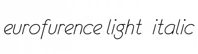
A sleek, modern, light italic font with elegant curves and minimal contrast.
![eurofurence light italic フリーフォントのダウンロード]() ダウンロード 654 ダウンロード数@WebFont
ダウンロード 654 ダウンロード数@WebFont -
( Fonts by Antipixel )
A bold, distressed sans-serif font with a vintage, stamped look.
![AustralSansStamp-Regular フリーフォントのダウンロード]() ダウンロード 654 ダウンロード数@WebFont
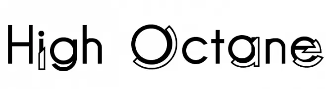
ダウンロード 654 ダウンロード数@WebFont -
![High Octane フリーフォントのダウンロード]() ダウンロード 654 ダウンロード数@WebFont
ダウンロード 654 ダウンロード数@WebFont -
( Fonts by www.woodcutter.es - woodcutter Manero - Personal-use only. For commercial use please contact owner. )
A festive icon set font with birthday and celebration motifs.
![Happy Birthday フリーフォントのダウンロード]() ダウンロード 654 ダウンロード数@WebFont
ダウンロード 654 ダウンロード数@WebFont -
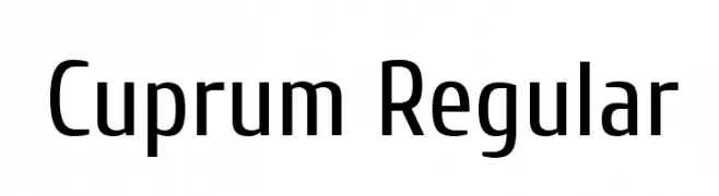
( Copyright 2010 The Cuprum Project Authors (lemonad@jovanny.ru), with Reserved Font Name "Cuprum". )
A modern, clean sans-serif font with a slightly condensed style.
![Cuprum Regular フリーフォントのダウンロード]() ダウンロード 654 ダウンロード数@WebFont
ダウンロード 654 ダウンロード数@WebFont -
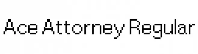
( Fonts by a David Fens. Personal-use only. For commercial use please contact owner. )
A pixelated, monospaced font with a retro digital style.
![Ace Attorney Regular フリーフォントのダウンロード]() ダウンロード 654 ダウンロード数@WebFont
ダウンロード 654 ダウンロード数@WebFont -
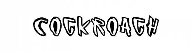
( Fonts by www.junkohanhero.com )
A bold, graffiti-inspired font with a playful and edgy style.
![Cockroach フリーフォントのダウンロード]() ダウンロード 654 ダウンロード数@WebFont
ダウンロード 654 ダウンロード数@WebFont -
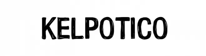
( Carrot Rope - typewhatyouloveandletitkillyou.tumblr.com/ )
A bold, hand-drawn font with a playful and informal style.
![Kelpotico フリーフォントのダウンロード]() ダウンロード 654 ダウンロード数@WebFont
ダウンロード 654 ダウンロード数@WebFont -
( Fonts by Zetafonts - Personal-use only. For commercial use please contact owner. )
A modern, rounded font with a clean and smooth appearance.
![Arista Pro Alternate Light フリーフォントのダウンロード]() ダウンロード 654 ダウンロード数@WebFont
ダウンロード 654 ダウンロード数@WebFont -
![Undercut フリーフォントのダウンロード]() ダウンロード 654 ダウンロード数@WebFont
ダウンロード 654 ダウンロード数@WebFont -
( Fonts by Omnibus Type )
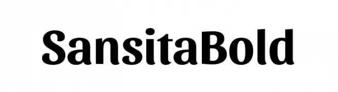
A bold, modern font with elegant curves and strong character presence.
![Sansita Bold フリーフォントのダウンロード]() ダウンロード 654 ダウンロード数@WebFont
ダウンロード 654 ダウンロード数@WebFont -
![MobitaleCnd フリーフォントのダウンロード]() ダウンロード 654 ダウンロード数@WebFont
ダウンロード 654 ダウンロード数@WebFont -
( Fonts by Daniel Zadorozny - www.iconian.com - Free for personal use )
Decorative silhouette figure font featuring women in multiple poses.
![QT's フリーフォントのダウンロード]() ダウンロード 654 ダウンロード数@WebFont
ダウンロード 654 ダウンロード数@WebFont -
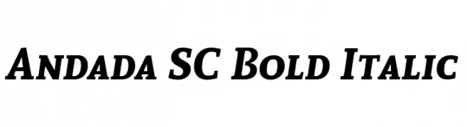
( Copyright (c) 2012 by Carolina Giovagnoli (huertatipografica.com.ar). All rights reserved. )
Bold, italic serif font with medium contrast and classic elegance.
![Andada SC Bold Italic フリーフォントのダウンロード]() ダウンロード 654 ダウンロード数@WebFont
ダウンロード 654 ダウンロード数@WebFont -
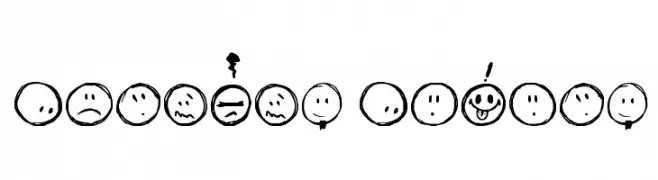
( Fonts by David Kerkhoff - www.hanodedphotography.com )
A playful set of hand-drawn smiley faces with various expressive emotions.
![Sketchy Smiley フリーフォントのダウンロード]() ダウンロード 653 ダウンロード数@WebFont
ダウンロード 653 ダウンロード数@WebFont -
フォント by JamboFonts. For commercial use please contact the owner.
![UrbanElegance-Bold フリーフォントのダウンロード]() ダウンロード 653 ダウンロード数@WebFont
ダウンロード 653 ダウンロード数@WebFont -
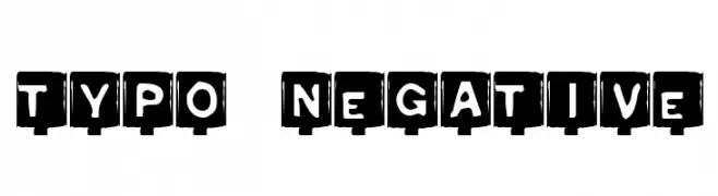
![Typo Negative フリーフォントのダウンロード]() ダウンロード 653 ダウンロード数@WebFont
ダウンロード 653 ダウンロード数@WebFont


今のトップフォントは?
は、クリーンな造形と広い適用範囲で支持を集めています。 ブランディングからランディングページ、ポスターまで活躍します。
ロゴで人気のフォントは?
幾何学系の サンセリフ(例: Poppins、Gotham 系のファミリー)は、スケーラブルでクリーンな印象に最適。 親しみやすさを出すなら スクリプト や手書き系も定番です。 見出しは力強く、本文はニュートラルに──この組み合わせが認知とバランスを高めます。
人気リストはどのくらいの頻度で更新される?
ダウンロード数やエンゲージメントに基づき定期的に更新します。 こまめにチェックして、次に流行るフォントを先取りしましょう。
💡 ヒント: このページをブックマークしておくと便利です。トレンドは速く、今のトップが明日のリブランディングを導くこともあります。