人気フォント セクションへようこそ。ここでは「よくダウンロードされ、よく使われている」実績ある書体をまとめています。 ロゴ、Web、SNS のどれにも使いやすい、外さない選択肢が見つかります。
どの トップフォント も、バランス・可読性・汎用性で高評価です。 モダン・サンセリフ、エレガントなスクリプト、ヴィンテージなセリフ、ミニマルなディスプレイなどを厳選しています。
-
( Southype - Rodrigo Gonzalez - www.southype.com )
A modern, geometric sans-serif font with consistent line weights and a minimalist design.
 ダウンロード 134 ダウンロード数@WebFont
 -
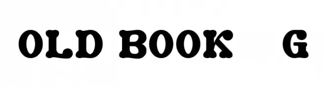
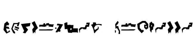
( Fonts by Goma Shin - www.geocities.jp/gomarice_font/ - Personal-use only. For commercial use please contact owner. )
A bold, decorative font with vintage flair and pronounced serifs.
![Old Book__G フリーフォントのダウンロード]() ダウンロード 134 ダウンロード数@WebFont
ダウンロード 134 ダウンロード数@WebFont -
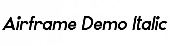
( Fonts by Edric Studio - Personal-use only. For commercial use please contact owner. )
A modern, italicized font with sleek curves and a dynamic style.
![Airframe Demo Italic フリーフォントのダウンロード]() ダウンロード 134 ダウンロード数@WebFont
ダウンロード 134 ダウンロード数@WebFont -
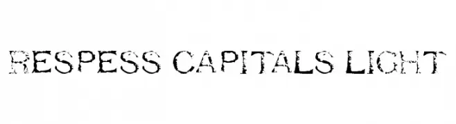
( Fonts by www.abecedarienne.com )
A distressed, textured font with a vintage, rugged appearance.
![Respess Capitals Light フリーフォントのダウンロード]() ダウンロード 134 ダウンロード数@WebFont
ダウンロード 134 ダウンロード数@WebFont -
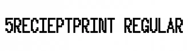
( Fonts by Winter Design Studio - winty5.wixsite.com/noahtheawesome/ - Personal-use only. For commercial use please contact owner. )
A pixelated, blocky font with a retro digital display style.
![5Recieptprint Regular フリーフォントのダウンロード]() ダウンロード 134 ダウンロード数@WebFont
ダウンロード 134 ダウンロード数@WebFont -
-
( Fonts by PressGang Studios )
A playful, handwritten font with bold, rounded strokes and a whimsical style.
![ShoujoPop! フリーフォントのダウンロード]() ダウンロード 134 ダウンロード数@WebFont
ダウンロード 134 ダウンロード数@WebFont -
( Fonts by a Neale Davidson - www.pixelsagas.com. Personal-use only. For commercial use please contact owner. )
A bold, edgy graffiti-style font with sharp angles and dynamic forms.
![Destronic Grafitti フリーフォントのダウンロード]() ダウンロード 134 ダウンロード数@WebFont
ダウンロード 134 ダウンロード数@WebFont -
( Fonts by Manfred Klein. Free for private and charity use. Free for commercial with donation to organizations )
Farm-themed dingbat font with cartoon-style illustrations.
![FarmersLife フリーフォントのダウンロード]() ダウンロード 134 ダウンロード数@WebFont
ダウンロード 134 ダウンロード数@WebFont -
( Fonts by Apostrophic Lab )
A wide, geometric font with a modern, digital aesthetic.
![So Wide フリーフォントのダウンロード]() ダウンロード 134 ダウンロード数@WebFont
ダウンロード 134 ダウンロード数@WebFont -
( Fonts by www.kimberlygeswein.com - Kimberly Geswein )
A futuristic, narrow font with angular lines and a sci-fi theme.
![KG Attack of the Robots フリーフォントのダウンロード]() ダウンロード 134 ダウンロード数@WebFont
ダウンロード 134 ダウンロード数@WebFont


今のトップフォントは?
は、クリーンな造形と広い適用範囲で支持を集めています。 ブランディングからランディングページ、ポスターまで活躍します。
ロゴで人気のフォントは?
幾何学系の サンセリフ(例: Poppins、Gotham 系のファミリー)は、スケーラブルでクリーンな印象に最適。 親しみやすさを出すなら スクリプト や手書き系も定番です。 見出しは力強く、本文はニュートラルに──この組み合わせが認知とバランスを高めます。
人気リストはどのくらいの頻度で更新される?
ダウンロード数やエンゲージメントに基づき定期的に更新します。 こまめにチェックして、次に流行るフォントを先取りしましょう。
💡 ヒント: このページをブックマークしておくと便利です。トレンドは速く、今のトップが明日のリブランディングを導くこともあります。