人気フォント セクションへようこそ。ここでは「よくダウンロードされ、よく使われている」実績ある書体をまとめています。 ロゴ、Web、SNS のどれにも使いやすい、外さない選択肢が見つかります。
どの トップフォント も、バランス・可読性・汎用性で高評価です。 モダン・サンセリフ、エレガントなスクリプト、ヴィンテージなセリフ、ミニマルなディスプレイなどを厳選しています。
-
( Copyright (c) 2011 by LatinoType Limitada (luciano@latinotype.com) )
A modern serif font with clean lines and a classic yet contemporary style.
 ダウンロード 2450 ダウンロード数@WebFont
 -
![Sgreek Medium フリーフォントのダウンロード]() ダウンロード 2450 ダウンロード数
ダウンロード 2450 ダウンロード数 -
![WoW-plexus フリーフォントのダウンロード]() ダウンロード 2450 ダウンロード数@WebFont
ダウンロード 2450 ダウンロード数@WebFont -
( Copyright (c) 2011, Eduardo Tunni (http://www.tipo.net.ar) )
A playful, bold font with rounded edges and a slightly italicized style.
![Lemon One Regular フリーフォントのダウンロード]() ダウンロード 2449 ダウンロード数@WebFont
ダウンロード 2449 ダウンロード数@WebFont -
( Fonts by Ingo Zimmermann - www.ingofonts.com )
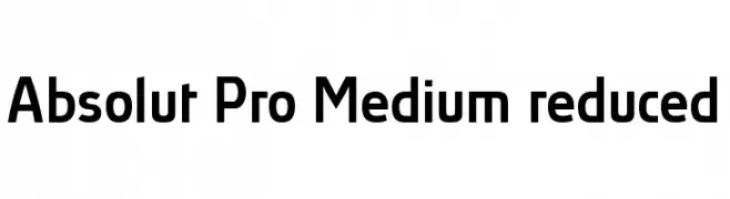
A modern, medium-weight sans-serif font with a clean and versatile design.
![Absolut Pro Medium reduced フリーフォントのダウンロード]() ダウンロード 2449 ダウンロード数@WebFont
ダウンロード 2449 ダウンロード数@WebFont -
-
![Hydra フリーフォントのダウンロード]() ダウンロード 2449 ダウンロード数@WebFont
ダウンロード 2449 ダウンロード数@WebFont -
( Fonts by Dieter Schumacher )
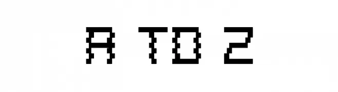
A pixelated, retro-style font with a digital, blocky appearance.
![A to Z フリーフォントのダウンロード]() ダウンロード 2449 ダウンロード数@WebFont
ダウンロード 2449 ダウンロード数@WebFont -
( Fonts by Sebastian Kosch - Personal-use only. For commercial use please contact owner. )
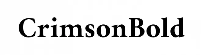
A bold, classic serif typeface with high contrast and elegant serifs.
![Crimson Bold フリーフォントのダウンロード]() ダウンロード 2448 ダウンロード数@WebFont
ダウンロード 2448 ダウンロード数@WebFont -
( Copyright (c) 2017, Ek Type. All rights reserved. )
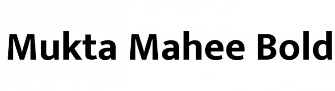
A bold, modern sans-serif font with excellent legibility and versatility.
![Mukta Mahee Bold フリーフォントのダウンロード]() ダウンロード 2448 ダウンロード数@WebFont
ダウンロード 2448 ダウンロード数@WebFont -
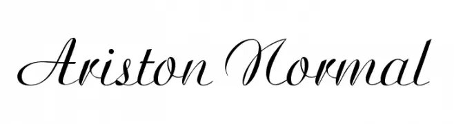
( Fonts by www.gliphmaker.com. Personal-use only. For commercial use please contact owner. )
An elegant script font with flowing, cursive letterforms and a classic appearance.
![Ariston Normal フリーフォントのダウンロード]() ダウンロード 2448 ダウンロード数@WebFont
ダウンロード 2448 ダウンロード数@WebFont

今のトップフォントは?
は、クリーンな造形と広い適用範囲で支持を集めています。 ブランディングからランディングページ、ポスターまで活躍します。
ロゴで人気のフォントは?
幾何学系の サンセリフ(例: Poppins、Gotham 系のファミリー)は、スケーラブルでクリーンな印象に最適。 親しみやすさを出すなら スクリプト や手書き系も定番です。 見出しは力強く、本文はニュートラルに──この組み合わせが認知とバランスを高めます。
人気リストはどのくらいの頻度で更新される?
ダウンロード数やエンゲージメントに基づき定期的に更新します。 こまめにチェックして、次に流行るフォントを先取りしましょう。
💡 ヒント: このページをブックマークしておくと便利です。トレンドは速く、今のトップが明日のリブランディングを導くこともあります。