人気フォント セクションへようこそ。ここでは「よくダウンロードされ、よく使われている」実績ある書体をまとめています。 ロゴ、Web、SNS のどれにも使いやすい、外さない選択肢が見つかります。
どの トップフォント も、バランス・可読性・汎用性で高評価です。 モダン・サンセリフ、エレガントなスクリプト、ヴィンテージなセリフ、ミニマルなディスプレイなどを厳選しています。
-
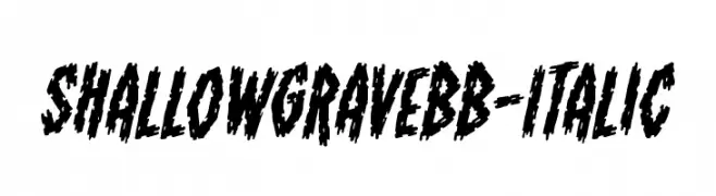
( Fonts by www.blambot.com )
A bold, jagged, and distressed italic font with a rugged, edgy style.
 ダウンロード 134 ダウンロード数@WebFont
 -
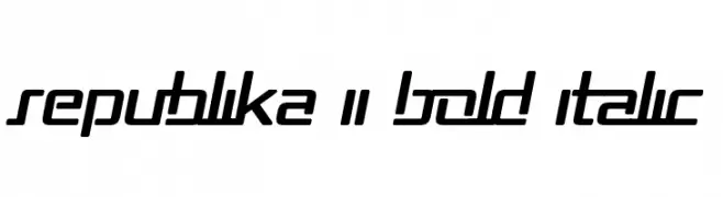
( Fonts by Apostrophic Lab )
A bold, italicized font with a modern, futuristic style and sharp geometric lines.
![Republika II Bold Italic フリーフォントのダウンロード]() ダウンロード 134 ダウンロード数@WebFont
ダウンロード 134 ダウンロード数@WebFont -
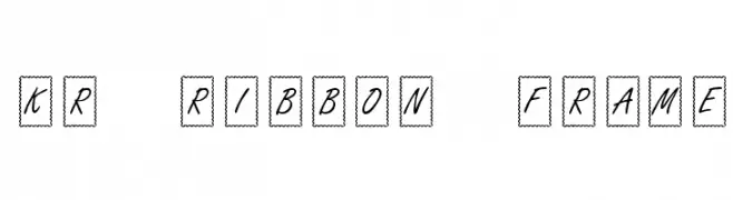
![KR Ribbon Frame フリーフォントのダウンロード]() ダウンロード 134 ダウンロード数@WebFont
ダウンロード 134 ダウンロード数@WebFont -
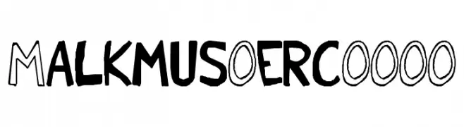
( Font by Eric Wirjanata. All of my font are donation based. You can support by buying something from here. http://society6.com/EricWirjanata )
A playful, hand-drawn font with a casual and informal style.
![Malkmus_erc_001 フリーフォントのダウンロード]() ダウンロード 134 ダウンロード数@WebFont
ダウンロード 134 ダウンロード数@WebFont -
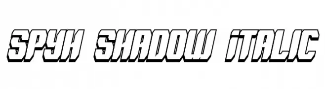
( Fonts by Paul Reid - tracertong.co.uk )
Bold, italicized font with a shadow effect and a futuristic, angular design.
![Spyh Shadow Italic フリーフォントのダウンロード]() ダウンロード 134 ダウンロード数@WebFont
ダウンロード 134 ダウンロード数@WebFont -
-
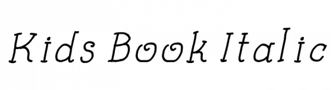
( Fonts by a Galdino Otten - galdinootten.com . Personal-use only. For commercial use please contact owner. )
A playful, italicized handwritten font with smooth strokes and moderate contrast.
![Kids Book Italic フリーフォントのダウンロード]() ダウンロード 134 ダウンロード数@WebFont
ダウンロード 134 ダウンロード数@WebFont -
![KBLaceNightgown フリーフォントのダウンロード]() ダウンロード 134 ダウンロード数@WebFont
ダウンロード 134 ダウンロード数@WebFont -
![FunZone Three Regular フリーフォントのダウンロード]() ダウンロード 134 ダウンロード数@WebFont
ダウンロード 134 ダウンロード数@WebFont -
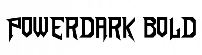
( LJ Design Studios - www.ljdesignstudios.com )
A bold, angular font with sharp, geometric edges and a futuristic style.
![PowerDark Bold フリーフォントのダウンロード]() ダウンロード 134 ダウンロード数@WebFont
ダウンロード 134 ダウンロード数@WebFont -
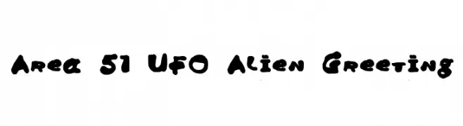
![Area 51 UFO Alien Greeting フリーフォントのダウンロード]() ダウンロード 134 ダウンロード数@WebFont
ダウンロード 134 ダウンロード数@WebFont
今のトップフォントは?
は、クリーンな造形と広い適用範囲で支持を集めています。 ブランディングからランディングページ、ポスターまで活躍します。
ロゴで人気のフォントは?
幾何学系の サンセリフ(例: Poppins、Gotham 系のファミリー)は、スケーラブルでクリーンな印象に最適。 親しみやすさを出すなら スクリプト や手書き系も定番です。 見出しは力強く、本文はニュートラルに──この組み合わせが認知とバランスを高めます。
人気リストはどのくらいの頻度で更新される?
ダウンロード数やエンゲージメントに基づき定期的に更新します。 こまめにチェックして、次に流行るフォントを先取りしましょう。
💡 ヒント: このページをブックマークしておくと便利です。トレンドは速く、今のトップが明日のリブランディングを導くこともあります。