人気フォント セクションへようこそ。ここでは「よくダウンロードされ、よく使われている」実績ある書体をまとめています。 ロゴ、Web、SNS のどれにも使いやすい、外さない選択肢が見つかります。
どの トップフォント も、バランス・可読性・汎用性で高評価です。 モダン・サンセリフ、エレガントなスクリプト、ヴィンテージなセリフ、ミニマルなディスプレイなどを厳選しています。
-
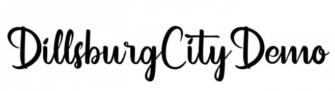
( Fonts by Noah Type - noahtype.com - Personal-use only. For commercial use please contact owner. )
A playful and dynamic script font with bold strokes and elegant curves.
 ダウンロード 132 ダウンロード数@WebFont
 -
( Noto is a trademark of Google Inc. Noto fonts are open source. All Noto fonts are published under the SIL Open Font License, Version 1.1 )
Error: No valid font characters shown.
![Noto Sans Batak Regular フリーフォントのダウンロード]() ダウンロード 132 ダウンロード数@WebFont
ダウンロード 132 ダウンロード数@WebFont -
![UP Tiny lcd four 8 decoV Light フリーフォントのダウンロード]() ダウンロード 132 ダウンロード数@WebFont
ダウンロード 132 ダウンロード数@WebFont -
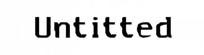
( Fonts by TarmSaft Font Factory - http://www.aska.nu/tarmsaft/ )
A bold, industrial-style font with sharp, angular edges and a distressed look.
![Untitted フリーフォントのダウンロード]() ダウンロード 132 ダウンロード数@WebFont
ダウンロード 132 ダウンロード数@WebFont -
![UP Tiny lcd four 8 decoC フリーフォントのダウンロード]() ダウンロード 132 ダウンロード数@WebFont
ダウンロード 132 ダウンロード数@WebFont -
-
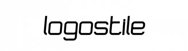
( John Merrigan )
A modern, sleek font with a futuristic and streamlined design.
![Logostile フリーフォントのダウンロード]() ダウンロード 132 ダウンロード数@WebFont
ダウンロード 132 ダウンロード数@WebFont -
( Fonts by Vladimir Nikolic )
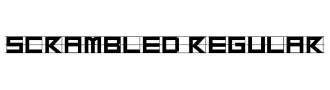
A bold, geometric font with a modern, futuristic design.
![Scrambled Regular フリーフォントのダウンロード]() ダウンロード 132 ダウンロード数@WebFont
ダウンロード 132 ダウンロード数@WebFont -
( Fonts by Nomi - Personal-use only. For commercial use please contact owner. )
A whimsical, hand-drawn font with playful, uneven strokes.
![Sorcerous_Mouse フリーフォントのダウンロード]() ダウンロード 132 ダウンロード数@WebFont
ダウンロード 132 ダウンロード数@WebFont -
![UP Tiny lcd four 8 decoH フリーフォントのダウンロード]() ダウンロード 132 ダウンロード数@WebFont
ダウンロード 132 ダウンロード数@WebFont -
( Fonts by Khrys Bosland )
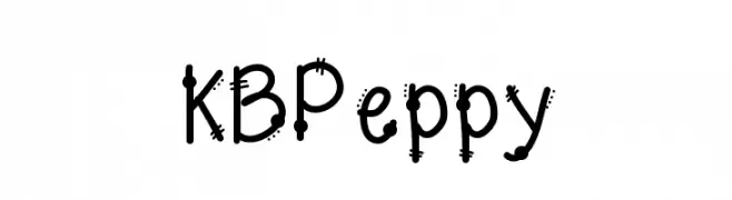
A playful, hand-drawn font with quirky details and a lively appearance.
![KBPeppy フリーフォントのダウンロード]() ダウンロード 132 ダウンロード数@WebFont
ダウンロード 132 ダウンロード数@WebFont


今のトップフォントは?
は、クリーンな造形と広い適用範囲で支持を集めています。 ブランディングからランディングページ、ポスターまで活躍します。
ロゴで人気のフォントは?
幾何学系の サンセリフ(例: Poppins、Gotham 系のファミリー)は、スケーラブルでクリーンな印象に最適。 親しみやすさを出すなら スクリプト や手書き系も定番です。 見出しは力強く、本文はニュートラルに──この組み合わせが認知とバランスを高めます。
人気リストはどのくらいの頻度で更新される?
ダウンロード数やエンゲージメントに基づき定期的に更新します。 こまめにチェックして、次に流行るフォントを先取りしましょう。
💡 ヒント: このページをブックマークしておくと便利です。トレンドは速く、今のトップが明日のリブランディングを導くこともあります。