人気フォント セクションへようこそ。ここでは「よくダウンロードされ、よく使われている」実績ある書体をまとめています。 ロゴ、Web、SNS のどれにも使いやすい、外さない選択肢が見つかります。
どの トップフォント も、バランス・可読性・汎用性で高評価です。 モダン・サンセリフ、エレガントなスクリプト、ヴィンテージなセリフ、ミニマルなディスプレイなどを厳選しています。
-
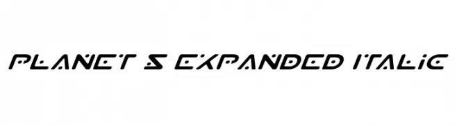
( Fonts by Daniel Zadorozny - www.iconian.com - Free for personal use )
A futuristic, expanded italic font with geometric shapes and smooth curves.
 ダウンロード 131 ダウンロード数@WebFont
 -
( Fonts by Steve Cloutier - www.cloutierfontes.ca )
A bold, decorative font with intricate, hand-drawn patterns and a playful style.
![Emilie Regular フリーフォントのダウンロード]() ダウンロード 131 ダウンロード数@WebFont
ダウンロード 131 ダウンロード数@WebFont -
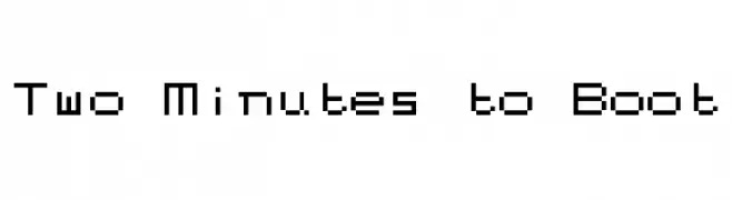
( Fonts by Kreative Korporation - www.kreativekorp.com )
A pixelated, retro-style font with a digital, blocky design.
![Two Minutes to Boot フリーフォントのダウンロード]() ダウンロード 131 ダウンロード数@WebFont
ダウンロード 131 ダウンロード数@WebFont -
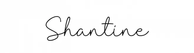
( Fonts by Sibelumpagi - Fajar Abdul Fatah - Personal-use only. For commercial use please contact owner. )
A graceful and elegant script font with flowing, continuous strokes.
![Shantine フリーフォントのダウンロード]() ダウンロード 131 ダウンロード数@WebFont
ダウンロード 131 ダウンロード数@WebFont -
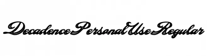
( Fonts by Billy Argel Fonts - www.billyargel.com - Personal-use only. For commercial use please contact owner. )
An elegant, bold script font with high contrast and flowing, interconnected letters.
![Decadence Personal Use Regular フリーフォントのダウンロード]() ダウンロード 131 ダウンロード数@WebFont
ダウンロード 131 ダウンロード数@WebFont -
-
( Fonts by Tokokoo Studio )
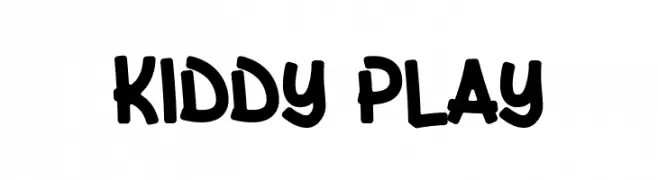
A playful, bold font with a hand-drawn, childlike style.
![Kiddy Play フリーフォントのダウンロード]() ダウンロード 131 ダウンロード数@WebFont
ダウンロード 131 ダウンロード数@WebFont -
( Fonts by www.studiotypo.com - Personal-use only. For commercial use please contact owner. )
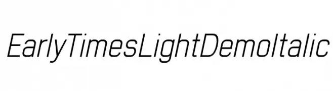
A sleek, modern italic font with light weight and medium contrast.
![Early Times Light Demo Italic フリーフォントのダウンロード]() ダウンロード 131 ダウンロード数@WebFont
ダウンロード 131 ダウンロード数@WebFont -
( Fonts by Geronimo Fonts - Personal-use only. For commercial use please contact owner. )
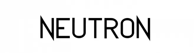
A modern, geometric sans-serif font with a clean and balanced appearance.
![NEUTRON フリーフォントのダウンロード]() ダウンロード 131 ダウンロード数@WebFont
ダウンロード 131 ダウンロード数@WebFont -
( Fonts by Manfred Klein - manfred-klein.ina-mar.com )
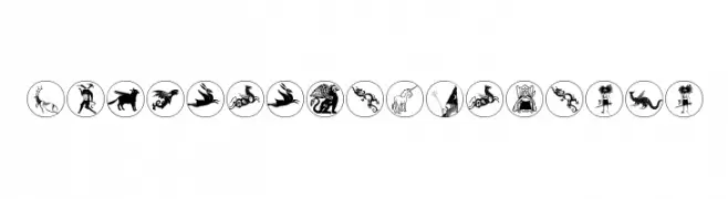
Ornate, mythological symbol-based decorative font.
![MythologicalDisks フリーフォントのダウンロード]() ダウンロード 131 ダウンロード数@WebFont
ダウンロード 131 ダウンロード数@WebFont -
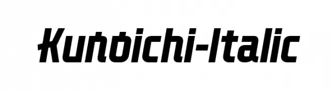
( Lloyd Garmadon Studios - ninjago-chronicles.blogspot.ro )
A bold, italicized font with a modern, dynamic style and medium contrast.
![Kunoichi-Italic フリーフォントのダウンロード]() ダウンロード 131 ダウンロード数@WebFont
ダウンロード 131 ダウンロード数@WebFont

今のトップフォントは?
は、クリーンな造形と広い適用範囲で支持を集めています。 ブランディングからランディングページ、ポスターまで活躍します。
ロゴで人気のフォントは?
幾何学系の サンセリフ(例: Poppins、Gotham 系のファミリー)は、スケーラブルでクリーンな印象に最適。 親しみやすさを出すなら スクリプト や手書き系も定番です。 見出しは力強く、本文はニュートラルに──この組み合わせが認知とバランスを高めます。
人気リストはどのくらいの頻度で更新される?
ダウンロード数やエンゲージメントに基づき定期的に更新します。 こまめにチェックして、次に流行るフォントを先取りしましょう。
💡 ヒント: このページをブックマークしておくと便利です。トレンドは速く、今のトップが明日のリブランディングを導くこともあります。