人気フォント セクションへようこそ。ここでは「よくダウンロードされ、よく使われている」実績ある書体をまとめています。 ロゴ、Web、SNS のどれにも使いやすい、外さない選択肢が見つかります。
どの トップフォント も、バランス・可読性・汎用性で高評価です。 モダン・サンセリフ、エレガントなスクリプト、ヴィンテージなセリフ、ミニマルなディスプレイなどを厳選しています。
-
 ダウンロード 6027 ダウンロード数@WebFont
 -
( Copyright (c) 2010, Santiago Orozco (hi@typemade.mx) )
A modern, minimalist font with clean lines and geometric shapes.
![JosefinSansStd-Light フリーフォントのダウンロード]() ダウンロード 6027 ダウンロード数@WebFont
ダウンロード 6027 ダウンロード数@WebFont -
![Roboto Slab Light フリーフォントのダウンロード]() ダウンロード 6026 ダウンロード数@WebFont
ダウンロード 6026 ダウンロード数@WebFont -
( Fonts by Jens R. Ziehn - www.filmhimmel.com )
A bold, playful font with rounded, geometric characters and unique cut-out details.
![Findet-Nemo フリーフォントのダウンロード]() ダウンロード 6026 ダウンロード数@WebFont
ダウンロード 6026 ダウンロード数@WebFont -
( Copyright (c) 2010, Sebastian Kosch (sebastian@aldusleaf.org) )
A classic serif font with bold, elegant characters and balanced proportions.
![Crimson Text Bold フリーフォントのダウンロード]() ダウンロード 6025 ダウンロード数@WebFont
ダウンロード 6025 ダウンロード数@WebFont -
-
( Fonts by Castcraft Software - opti.netii.net - check the website before use )
A bold, impactful font with tall, narrow uppercase letters and clear, distinct characters.
![OPTICeasar-Light フリーフォントのダウンロード]() ダウンロード 6024 ダウンロード数@WebFont
ダウンロード 6024 ダウンロード数@WebFont -
( Copyright (c) 2011, Agustina Mingote (agustinamingote@gmail.com) )
A bold, modern sans-serif font with clean lines and uniform strokes.
![Gudea Bold フリーフォントのダウンロード]() ダウンロード 6023 ダウンロード数@WebFont
ダウンロード 6023 ダウンロード数@WebFont -
( Fonts by Rajesh Rajput - gumroad.com/rajputrajesh_448 - Personal-use only. For commercial use please contact owner. )
A bold, italic font with a dynamic and modern style.
![Morganite Black Italic フリーフォントのダウンロード]() ダウンロード 6021 ダウンロード数@WebFont
ダウンロード 6021 ダウンロード数@WebFont -
( Fonts by ShyFonts )
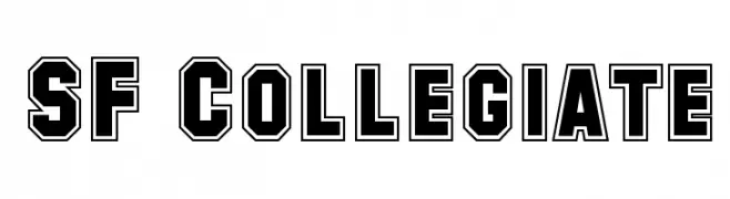
Bold, outlined collegiate font with a strong, traditional style.
![SF Collegiate フリーフォントのダウンロード]() ダウンロード 6020 ダウンロード数@WebFont
ダウンロード 6020 ダウンロード数@WebFont -
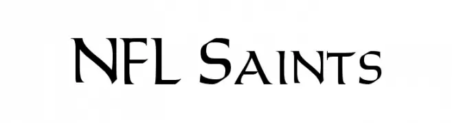
![NFL Saints フリーフォントのダウンロード]() ダウンロード 6019 ダウンロード数@WebFont
ダウンロード 6019 ダウンロード数@WebFont -
( Copyright (c) 2015, Impallari Type (www.impallari.com) )
A bold, modern font with strong, thick strokes and high contrast.
![LibreFranklin-Black フリーフォントのダウンロード]() ダウンロード 6016 ダウンロード数@WebFont
ダウンロード 6016 ダウンロード数@WebFont -
( Copyright 2016 The Archivo Project Authors (omnibus.type@gmail.com) )
A modern, clean typeface with excellent readability and balanced proportions.
![Archivo Medium フリーフォントのダウンロード]() ダウンロード 6015 ダウンロード数@WebFont
ダウンロード 6015 ダウンロード数@WebFont -
( Alejo Bergmann - www.designals.net/ )
A bold, geometric font with rounded edges, perfect for impactful headlines.
![Cunia フリーフォントのダウンロード]() ダウンロード 6008 ダウンロード数@WebFont
ダウンロード 6008 ダウンロード数@WebFont -
( Fonts by Cristiano Sobral - Personal-use only. For commercial use please contact owner. )
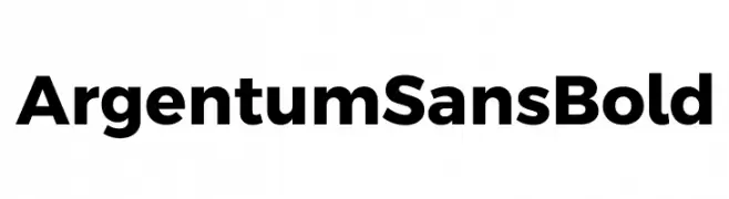
A bold, modern sans-serif font with strong, uniform strokes and excellent legibility.
![Argentum Sans Bold フリーフォントのダウンロード]() ダウンロード 6005 ダウンロード数@WebFont
ダウンロード 6005 ダウンロード数@WebFont -
( Copyright (c) 2012-2015, The Mozilla Foundation and Telefonica S.A. )
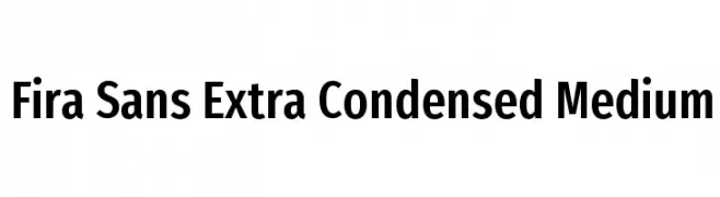
A modern, extra-condensed sans-serif typeface with medium weight and tight spacing.
![Fira Sans Extra Condensed Medium フリーフォントのダウンロード]() ダウンロード 6005 ダウンロード数@WebFont
ダウンロード 6005 ダウンロード数@WebFont -
![HI Manokalanipo Bold フリーフォントのダウンロード]() ダウンロード 6005 ダウンロード数@WebFont
ダウンロード 6005 ダウンロード数@WebFont -
( Fonts by www.26plus-zeichen.de )
A modern, clean sans-serif font with uniform stroke width and balanced spacing.
![Melbourne フリーフォントのダウンロード]() ダウンロード 6003 ダウンロード数@WebFont
ダウンロード 6003 ダウンロード数@WebFont -
![Vitesse SemiBold フリーフォントのダウンロード]() ダウンロード 6002 ダウンロード数@WebFont
ダウンロード 6002 ダウンロード数@WebFont -
![SKYfontThick フリーフォントのダウンロード]() ダウンロード 6001 ダウンロード数@WebFont
ダウンロード 6001 ダウンロード数@WebFont -
![Bosox フリーフォントのダウンロード]() ダウンロード 6000 ダウンロード数@WebFont
ダウンロード 6000 ダウンロード数@WebFont -
![Syfy Logo フリーフォントのダウンロード]() ダウンロード 5997 ダウンロード数@WebFont
ダウンロード 5997 ダウンロード数@WebFont -
![iCiel Pony フリーフォントのダウンロード]() ダウンロード 5996 ダウンロード数@WebFont
ダウンロード 5996 ダウンロード数@WebFont -
( Fonts by www.alphabetype.it )
A futuristic, angular font with bold, geometric letterforms.
![StarTrek フリーフォントのダウンロード]() ダウンロード 5993 ダウンロード数@WebFont
ダウンロード 5993 ダウンロード数@WebFont -
![EA Font v1.5 by Ghettoshark フリーフォントのダウンロード]() ダウンロード 5991 ダウンロード数@WebFont
ダウンロード 5991 ダウンロード数@WebFont -
( Fonts by Altsys Metamorphosis )
A bold, decorative font with vintage flair and ornate serifs.
![Vivala フリーフォントのダウンロード]() ダウンロード 5989 ダウンロード数@WebFont
ダウンロード 5989 ダウンロード数@WebFont -
( Fonts by Astigmatic One Eye Typographic Institute - Brian J. Bonislawsky - astigmatic.com )
A charming and elegant script font with fluid, graceful strokes.
![Montez フリーフォントのダウンロード]() ダウンロード 5988 ダウンロード数@WebFont
ダウンロード 5988 ダウンロード数@WebFont -
( Fonts by Bree Gorton )
A bold, modern sans-serif font with clean lines and excellent readability.
![Tempest フリーフォントのダウンロード]() ダウンロード 5987 ダウンロード数@WebFont
ダウンロード 5987 ダウンロード数@WebFont -
( Fonts by Balpirick Studio - https://www.creativefabrica.com/designer/balpirick/ref/308299/ - Personal-use only. For commercial use please contact owner. )
A dynamic, brush-style cursive font with a hand-drawn appearance.
![Baguette フリーフォントのダウンロード]() ダウンロード 5985 ダウンロード数@WebFont
ダウンロード 5985 ダウンロード数@WebFont -
( Copyright 2019 The Red Hat Project Authors (https://github.com/RedHatOfficial/RedHatFont) )
A bold, modern sans-serif font with clean lines and geometric shapes.
![Red Hat Display Black フリーフォントのダウンロード]() ダウンロード 5985 ダウンロード数@WebFont
ダウンロード 5985 ダウンロード数@WebFont -
![EXCELSIOR SANS フリーフォントのダウンロード]() ダウンロード 5985 ダウンロード数@WebFont
ダウンロード 5985 ダウンロード数@WebFont -
![NFL Jets フリーフォントのダウンロード]() ダウンロード 5979 ダウンロード数@WebFont
ダウンロード 5979 ダウンロード数@WebFont -
![Final Frontier Old Style フリーフォントのダウンロード]() ダウンロード 5978 ダウンロード数@WebFont
ダウンロード 5978 ダウンロード数@WebFont -
( Fonts by Graham Meade - GemFonts )
A tall, narrow, and modern font with thin, consistent strokes.
![Tall Films フリーフォントのダウンロード]() ダウンロード 5977 ダウンロード数@WebFont
ダウンロード 5977 ダウンロード数@WebFont -
![NBA Bobcats フリーフォントのダウンロード]() ダウンロード 5975 ダウンロード数@WebFont
ダウンロード 5975 ダウンロード数@WebFont -
![Fake Receipt フリーフォントのダウンロード]() ダウンロード 5975 ダウンロード数@WebFont
ダウンロード 5975 ダウンロード数@WebFont


今のトップフォントは?
は、クリーンな造形と広い適用範囲で支持を集めています。 ブランディングからランディングページ、ポスターまで活躍します。
ロゴで人気のフォントは?
幾何学系の サンセリフ(例: Poppins、Gotham 系のファミリー)は、スケーラブルでクリーンな印象に最適。 親しみやすさを出すなら スクリプト や手書き系も定番です。 見出しは力強く、本文はニュートラルに──この組み合わせが認知とバランスを高めます。
人気リストはどのくらいの頻度で更新される?
ダウンロード数やエンゲージメントに基づき定期的に更新します。 こまめにチェックして、次に流行るフォントを先取りしましょう。
💡 ヒント: このページをブックマークしておくと便利です。トレンドは速く、今のトップが明日のリブランディングを導くこともあります。