人気フォント セクションへようこそ。ここでは「よくダウンロードされ、よく使われている」実績ある書体をまとめています。 ロゴ、Web、SNS のどれにも使いやすい、外さない選択肢が見つかります。
どの トップフォント も、バランス・可読性・汎用性で高評価です。 モダン・サンセリフ、エレガントなスクリプト、ヴィンテージなセリフ、ミニマルなディスプレイなどを厳選しています。
-
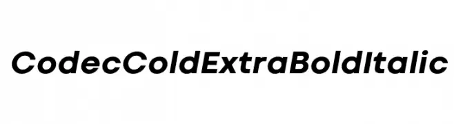
( Zetafonts - www.zetafonts.com )
A bold, italic font with a modern and sleek design.
 ダウンロード 118 ダウンロード数@WebFont
 -
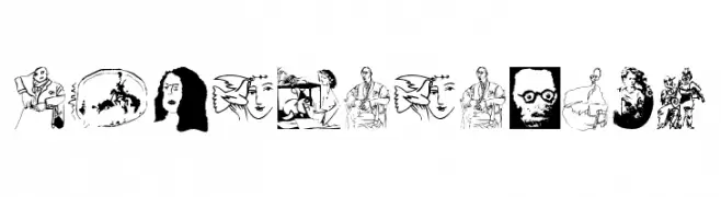
( Fonts by Manfred Klein. Free for private and charity use. Free for commercial with donation to organizations )
Abstract, illustrated font with expressive, art-driven glyphs.
![Vectortrials フリーフォントのダウンロード]() ダウンロード 118 ダウンロード数@WebFont
ダウンロード 118 ダウンロード数@WebFont -
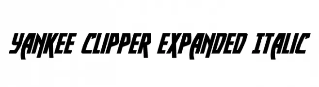
( Fonts by Daniel Zadorozny - www.iconian.com - Free for personal use )
A bold, expanded italic font with sharp angles and a modern, dynamic style.
![Yankee Clipper Expanded Italic フリーフォントのダウンロード]() ダウンロード 118 ダウンロード数@WebFont
ダウンロード 118 ダウンロード数@WebFont -
( Fonts by www.selawetype.com - Personal-use only. FOR DONATION https://www.paypal.me/selawe . For commercial use please contact owner. )
A cursive, calligraphy-inspired font with elegant loops and swashes.
![BlueKing フリーフォントのダウンロード]() ダウンロード 118 ダウンロード数@WebFont
ダウンロード 118 ダウンロード数@WebFont -
( Fonts by Darrell Flood )
A playful, bold font with thick, rounded outlines and a whimsical style.
![Fat Wobble Outlines フリーフォントのダウンロード]() ダウンロード 118 ダウンロード数@WebFont
ダウンロード 118 ダウンロード数@WebFont -
-
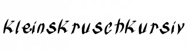
( Fonts by Manfred Klein. Free for private and charity use. Free for commercial with donation to organizations )
A bold and expressive script font with fluid, connected strokes.
![KleinsKruschKursiv フリーフォントのダウンロード]() ダウンロード 118 ダウンロード数@WebFont
ダウンロード 118 ダウンロード数@WebFont -
( Jonathan S. Harris - www.tattoowoo.com )
A bold, dynamic script font with fluid, cursive letterforms.
![Queens Perfume フリーフォントのダウンロード]() ダウンロード 118 ダウンロード数@WebFont
ダウンロード 118 ダウンロード数@WebFont -
( Fonts by Manfred Klein. Free for private and charity use. Free for commercial with donation to organizations )
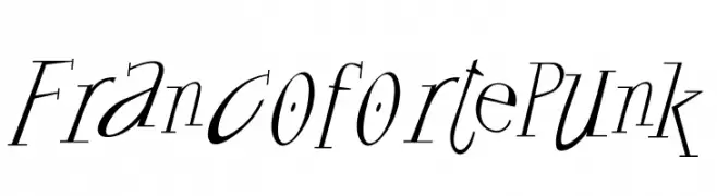
A dynamic, edgy font with sharp, angular strokes and a punk aesthetic.
![FrancofortePunk フリーフォントのダウンロード]() ダウンロード 118 ダウンロード数@WebFont
ダウンロード 118 ダウンロード数@WebFont -
( Fonts by Daniel Zadorozny - www.iconian.com - Free for personal use )
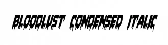
A dramatic, horror-themed font with sharp, jagged edges and a condensed italic style.
![Bloodlust Condensed Italic フリーフォントのダウンロード]() ダウンロード 118 ダウンロード数@WebFont
ダウンロード 118 ダウンロード数@WebFont -
( Ferdiansyah - creativemarket.com/ijemrockart )
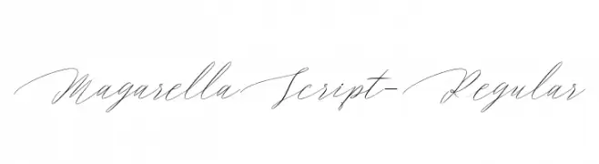
A graceful and elegant script font with flowing, interconnected characters.
![MagarellaScript-Regular フリーフォントのダウンロード]() ダウンロード 118 ダウンロード数@WebFont
ダウンロード 118 ダウンロード数@WebFont


今のトップフォントは?
は、クリーンな造形と広い適用範囲で支持を集めています。 ブランディングからランディングページ、ポスターまで活躍します。
ロゴで人気のフォントは?
幾何学系の サンセリフ(例: Poppins、Gotham 系のファミリー)は、スケーラブルでクリーンな印象に最適。 親しみやすさを出すなら スクリプト や手書き系も定番です。 見出しは力強く、本文はニュートラルに──この組み合わせが認知とバランスを高めます。
人気リストはどのくらいの頻度で更新される?
ダウンロード数やエンゲージメントに基づき定期的に更新します。 こまめにチェックして、次に流行るフォントを先取りしましょう。
💡 ヒント: このページをブックマークしておくと便利です。トレンドは速く、今のトップが明日のリブランディングを導くこともあります。