人気フォント セクションへようこそ。ここでは「よくダウンロードされ、よく使われている」実績ある書体をまとめています。 ロゴ、Web、SNS のどれにも使いやすい、外さない選択肢が見つかります。
どの トップフォント も、バランス・可読性・汎用性で高評価です。 モダン・サンセリフ、エレガントなスクリプト、ヴィンテージなセリフ、ミニマルなディスプレイなどを厳選しています。
-
( Fonts by www.junkohanhero.com - Personal-use only. For commercial use please contact owner. )
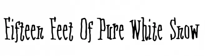
A whimsical, hand-drawn font with irregular, playful strokes.
 ダウンロード 117 ダウンロード数@WebFont
 -
( Fonts by Daniel Zadorozny - www.iconian.com - Free for personal use )
A bold, condensed, and italicized font with a rugged, distressed texture.
![Leatherface Condensed Italic フリーフォントのダウンロード]() ダウンロード 117 ダウンロード数@WebFont
ダウンロード 117 ダウンロード数@WebFont -
( Fonts by Ef Studio - Luthfi Ef - Personal-use only. For commercial use please contact owner. )
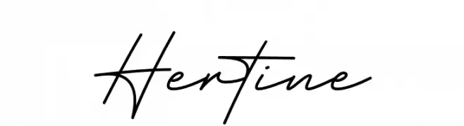
A cursive, handwritten-style font with elegant, flowing characters.
![Hertine フリーフォントのダウンロード]() ダウンロード 117 ダウンロード数@WebFont
ダウンロード 117 ダウンロード数@WebFont -
( Fonts by GGBot - www.ggbot.net - Personal-use only. For commercial use please contact owner. )
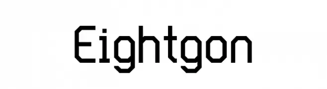
A geometric, angular font with octagonal shapes and a futuristic style.
![Eightgon フリーフォントのダウンロード]() ダウンロード 117 ダウンロード数@WebFont
ダウンロード 117 ダウンロード数@WebFont -
![NBP Informa FiveThree フリーフォントのダウンロード]() ダウンロード 117 ダウンロード数@WebFont
ダウンロード 117 ダウンロード数@WebFont -
-
( Fonts by Press Gang Studios - Andeh Pinkard - www.pressgang-studios.com )
A bold, italic, hand-drawn font with dynamic strokes and a playful style.
![Stubborn Heartz TBS Bold Italic フリーフォントのダウンロード]() ダウンロード 117 ダウンロード数@WebFont
ダウンロード 117 ダウンロード数@WebFont -
( Fonts by vladimirnikolic - Personal-use only. For commercial use please contact owner. )
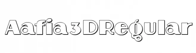
A bold, 3D outlined font with a modern and impactful style.
![Aafia 3D Regular フリーフォントのダウンロード]() ダウンロード 117 ダウンロード数@WebFont
ダウンロード 117 ダウンロード数@WebFont -
( Fonts by zone108.main.jp - Personal-use only. For commercial use please contact owner. )
A bold, geometric font with a digital glitch effect, perfect for modern and edgy designs.
![Saikei Black フリーフォントのダウンロード]() ダウンロード 117 ダウンロード数@WebFont
ダウンロード 117 ダウンロード数@WebFont -
( Fonts by Asad Rahman - Personal-use only. For commercial use please contact owner. )
A modern, geometric font with clean lines and a futuristic aesthetic.
![Adonay フリーフォントのダウンロード]() ダウンロード 117 ダウンロード数@WebFont
ダウンロード 117 ダウンロード数@WebFont -
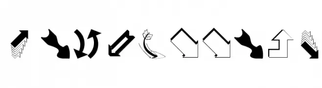
( Fonts by Manfred Klein. Free for private and charity use. Free for commercial with donation to organizations )
A decorative dingbat font featuring a wide variety of creative arrow symbols.
![SomeArrows フリーフォントのダウンロード]() ダウンロード 117 ダウンロード数@WebFont
ダウンロード 117 ダウンロード数@WebFont


今のトップフォントは?
は、クリーンな造形と広い適用範囲で支持を集めています。 ブランディングからランディングページ、ポスターまで活躍します。
ロゴで人気のフォントは?
幾何学系の サンセリフ(例: Poppins、Gotham 系のファミリー)は、スケーラブルでクリーンな印象に最適。 親しみやすさを出すなら スクリプト や手書き系も定番です。 見出しは力強く、本文はニュートラルに──この組み合わせが認知とバランスを高めます。
人気リストはどのくらいの頻度で更新される?
ダウンロード数やエンゲージメントに基づき定期的に更新します。 こまめにチェックして、次に流行るフォントを先取りしましょう。
💡 ヒント: このページをブックマークしておくと便利です。トレンドは速く、今のトップが明日のリブランディングを導くこともあります。