人気フォント セクションへようこそ。ここでは「よくダウンロードされ、よく使われている」実績ある書体をまとめています。 ロゴ、Web、SNS のどれにも使いやすい、外さない選択肢が見つかります。
どの トップフォント も、バランス・可読性・汎用性で高評価です。 モダン・サンセリフ、エレガントなスクリプト、ヴィンテージなセリフ、ミニマルなディスプレイなどを厳選しています。
-
( Fonts by www.fenotype.com )
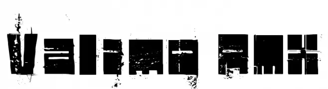
A bold, distressed font with a grunge aesthetic and geometric shapes.
 ダウンロード 117 ダウンロード数@WebFont
 -
( Fonts by Wino S Kadir - weknow - www.revolge.com/shop/weknow/ - Personal-use only. For commercial use please contact owner. )
A bold, playful script font with a handwritten feel.
![BACK TO NATURE フリーフォントのダウンロード]() ダウンロード 117 ダウンロード数@WebFont
ダウンロード 117 ダウンロード数@WebFont -
( Fonts by Iconian Fonts - Daniel Zadorozny - Personal-use only. For commercial use please contact owner. )
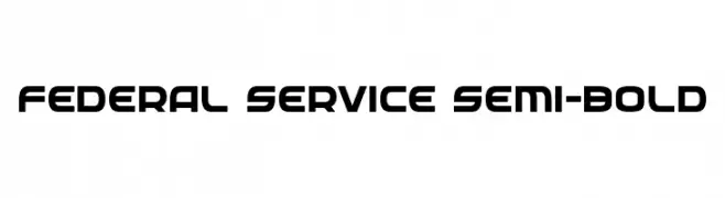
A modern, geometric typeface with bold, uniform characters and a slight curvature.
![Federal Service Semi-Bold フリーフォントのダウンロード]() ダウンロード 117 ダウンロード数@WebFont
ダウンロード 117 ダウンロード数@WebFont -
( Fonts by imagex )
A bold, urban-style font with a dripping cityscape effect.
![Megapoliscape フリーフォントのダウンロード]() ダウンロード 117 ダウンロード数@WebFont
ダウンロード 117 ダウンロード数@WebFont -
( Fonts by Manfred Klein. Free for private and charity use. Free for commercial with donation to organizations )
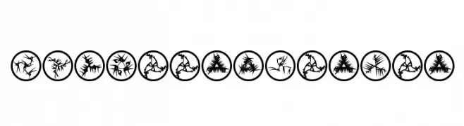
Intricate, abstract symbols with a futuristic and dynamic design.
![RosettaMutanta フリーフォントのダウンロード]() ダウンロード 117 ダウンロード数@WebFont
ダウンロード 117 ダウンロード数@WebFont -
-
( Fonts by Chris Vile - fontmonger.com - Personal-use only. For commercial use please contact owner. )
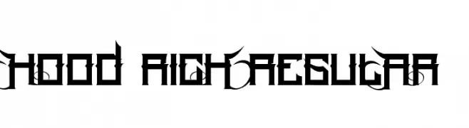
A bold, angular font with sharp edges and a geometric style.
![Hood Rich Regular フリーフォントのダウンロード]() ダウンロード 117 ダウンロード数@WebFont
ダウンロード 117 ダウンロード数@WebFont -
( Fonts by www.typodermicfonts.com - Ray Larabie )
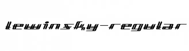
A futuristic, angular font with a dynamic slant and bold lines.
![Lewinsky-Regular フリーフォントのダウンロード]() ダウンロード 117 ダウンロード数@WebFont
ダウンロード 117 ダウンロード数@WebFont -
( Fonts by www.houseoflime.com )
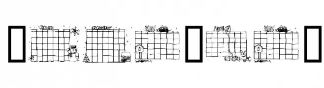
A whimsical, grid-patterned decorative font with a playful style.
![Calender フリーフォントのダウンロード]() ダウンロード 117 ダウンロード数@WebFont
ダウンロード 117 ダウンロード数@WebFont -
( Fonts by Cornertype Studio - Anang Fibriyanto - Personal-use only. For commercial use please contact owner. )
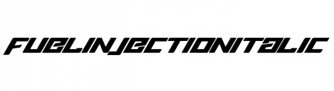
A bold, italicized font with sharp, angular lines and a futuristic style.
![Fuel Injection Italic フリーフォントのダウンロード]() ダウンロード 117 ダウンロード数@WebFont
ダウンロード 117 ダウンロード数@WebFont -
( Fonts by Billy Argel Fonts - www.billyargel.com - Personal-use only. For commercial use please contact owner. )
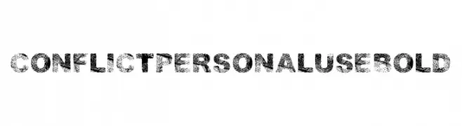
A bold, distressed font with a textured, grunge appearance.
![CONFLICT PERSONAL USE Bold フリーフォントのダウンロード]() ダウンロード 117 ダウンロード数@WebFont
ダウンロード 117 ダウンロード数@WebFont


今のトップフォントは?
は、クリーンな造形と広い適用範囲で支持を集めています。 ブランディングからランディングページ、ポスターまで活躍します。
ロゴで人気のフォントは?
幾何学系の サンセリフ(例: Poppins、Gotham 系のファミリー)は、スケーラブルでクリーンな印象に最適。 親しみやすさを出すなら スクリプト や手書き系も定番です。 見出しは力強く、本文はニュートラルに──この組み合わせが認知とバランスを高めます。
人気リストはどのくらいの頻度で更新される?
ダウンロード数やエンゲージメントに基づき定期的に更新します。 こまめにチェックして、次に流行るフォントを先取りしましょう。
💡 ヒント: このページをブックマークしておくと便利です。トレンドは速く、今のトップが明日のリブランディングを導くこともあります。