人気フォント セクションへようこそ。ここでは「よくダウンロードされ、よく使われている」実績ある書体をまとめています。 ロゴ、Web、SNS のどれにも使いやすい、外さない選択肢が見つかります。
どの トップフォント も、バランス・可読性・汎用性で高評価です。 モダン・サンセリフ、エレガントなスクリプト、ヴィンテージなセリフ、ミニマルなディスプレイなどを厳選しています。
-
( Fonts by Xerographer Fonts )
A jagged, edgy font with sharp, irregular strokes and a hand-drawn feel.
 ダウンロード 109 ダウンロード数@WebFont
 -
( Fonts by Daniel Zadorozny - www.iconian.com - Free for personal use )
A bold, futuristic font with geometric shapes and sharp angles.
![PsYonic VII Bold フリーフォントのダウンロード]() ダウンロード 109 ダウンロード数@WebFont
ダウンロード 109 ダウンロード数@WebFont -
フォント by danny91194. For commercial use please contact the owner.
( luxury got neat )
The image does not depict a valid font.
![BUCCANEERS OF TAMPA BAY フリーフォントのダウンロード]() ダウンロード 109 ダウンロード数@WebFont
ダウンロード 109 ダウンロード数@WebFont -
( Fonts by Manfred Klein. Free for private and charity use. Free for commercial with donation to organizations )
Abstract, grid-based display font with experimental, chaotic forms.
![DadaGridB フリーフォントのダウンロード]() ダウンロード 109 ダウンロード数@WebFont
ダウンロード 109 ダウンロード数@WebFont -
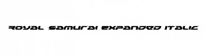
( Iconian Fonts - Daniel Zadorozny - www.iconian.com )
A bold, expanded, and italicized font with a futuristic, angular design.
![Royal Samurai Expanded Italic フリーフォントのダウンロード]() ダウンロード 109 ダウンロード数@WebFont
ダウンロード 109 ダウンロード数@WebFont -
-
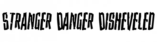
( Fonts by Daniel Zadorozny - www.iconian.com )
A bold, distressed font with jagged edges and a hand-drawn appearance.
![Stranger Danger Disheveled フリーフォントのダウンロード]() ダウンロード 109 ダウンロード数@WebFont
ダウンロード 109 ダウンロード数@WebFont -
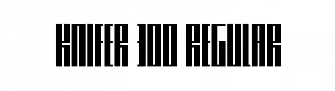
( Fonts by Marivo )
A bold, geometric font with uniform thickness and a modern, industrial style.
![Knifer 300 Regular フリーフォントのダウンロード]() ダウンロード 109 ダウンロード数@WebFont
ダウンロード 109 ダウンロード数@WebFont -
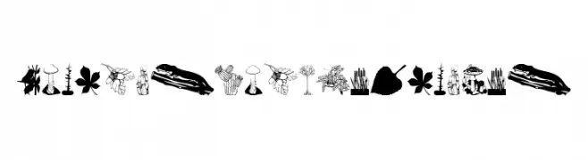
( Fonts by Manfred Klein. Free for private and charity use. Free for commercial with donation to organizations )
Botanical illustration font with plant and nature motifs for each character.
![BotanishAndRelatives フリーフォントのダウンロード]() ダウンロード 109 ダウンロード数@WebFont
ダウンロード 109 ダウンロード数@WebFont -
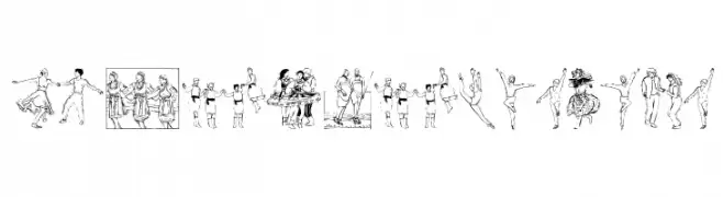
( Fonts by Manfred Klein. Free for private and charity use. Free for commercial with donation to organizations )
A playful, illustrative font featuring dancing people as each character.
![DancingPeople フリーフォントのダウンロード]() ダウンロード 109 ダウンロード数@WebFont
ダウンロード 109 ダウンロード数@WebFont -
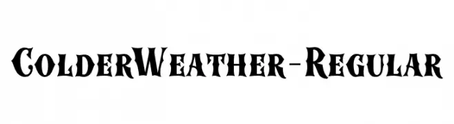
( Fonts by Roland Huse Design - Roland Huse - Personal-use only. For commercial use please contact owner. )
A bold, gothic-inspired font with sharp serifs and dramatic flair.
![ColderWeather-Regular フリーフォントのダウンロード]() ダウンロード 109 ダウンロード数@WebFont
ダウンロード 109 ダウンロード数@WebFont


今のトップフォントは?
は、クリーンな造形と広い適用範囲で支持を集めています。 ブランディングからランディングページ、ポスターまで活躍します。
ロゴで人気のフォントは?
幾何学系の サンセリフ(例: Poppins、Gotham 系のファミリー)は、スケーラブルでクリーンな印象に最適。 親しみやすさを出すなら スクリプト や手書き系も定番です。 見出しは力強く、本文はニュートラルに──この組み合わせが認知とバランスを高めます。
人気リストはどのくらいの頻度で更新される?
ダウンロード数やエンゲージメントに基づき定期的に更新します。 こまめにチェックして、次に流行るフォントを先取りしましょう。
💡 ヒント: このページをブックマークしておくと便利です。トレンドは速く、今のトップが明日のリブランディングを導くこともあります。