人気フォント セクションへようこそ。ここでは「よくダウンロードされ、よく使われている」実績ある書体をまとめています。 ロゴ、Web、SNS のどれにも使いやすい、外さない選択肢が見つかります。
どの トップフォント も、バランス・可読性・汎用性で高評価です。 モダン・サンセリフ、エレガントなスクリプト、ヴィンテージなセリフ、ミニマルなディスプレイなどを厳選しています。
-
( Fonts by zamjump - Ahmad Zamzami - Personal-use only. For commercial use please contact owner. )
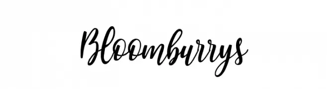
A flowing, cursive font with elegant, connected strokes and a handwritten appearance.
 ダウンロード 108 ダウンロード数@WebFont
 -
( Fonts by Manfred Klein. Free for private and charity use. Free for commercial with donation to organizations )
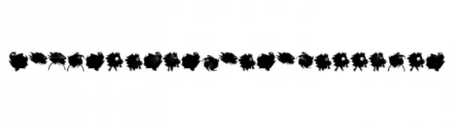
A whimsical, creature-inspired decorative font with bold, artistic characters.
![DemocraticPeaceWarriors フリーフォントのダウンロード]() ダウンロード 108 ダウンロード数@WebFont
ダウンロード 108 ダウンロード数@WebFont -
( These fonts are free to use in any private, recreational manner.For commercial go to www.flopdesign.com/fordesign/font.html )
A bold, pixelated font with a retro digital aesthetic.
![REGO フリーフォントのダウンロード]() ダウンロード 108 ダウンロード数@WebFont
ダウンロード 108 ダウンロード数@WebFont -
( Fonts by INKsTYPIA )
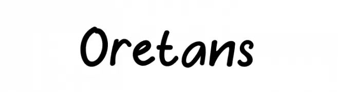
A playful, handwritten font with smooth curves and a casual style.
![Oretans フリーフォントのダウンロード]() ダウンロード 108 ダウンロード数@WebFont
ダウンロード 108 ダウンロード数@WebFont -
( Fonts by Rodrigo German - RASDESIGN )
Hand-drawn, skate-themed decorative font with playful illustrations.
![skatelove フリーフォントのダウンロード]() ダウンロード 108 ダウンロード数@WebFont
ダウンロード 108 ダウンロード数@WebFont -
-
( Fonts by Graphix Line Studio )
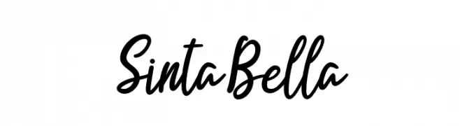
Handwritten script font with a playful style.
![Sinta Bella フリーフォントのダウンロード]() ダウンロード 108 ダウンロード数@WebFont
ダウンロード 108 ダウンロード数@WebFont -
( Fonts by Charlie Samways - www.csamways.com - Personal-use only. For commercial use please contact owner. )
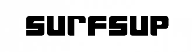
A bold, geometric font with a modern and impactful design.
![SurfsUp フリーフォントのダウンロード]() ダウンロード 108 ダウンロード数@WebFont
ダウンロード 108 ダウンロード数@WebFont -
( Vladimir Nikolic - www.coroflot.com/vladimirnikolic )
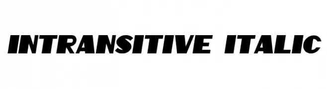
A bold, italic font with strong, angular lines and a dynamic slant.
![Intransitive Italic フリーフォントのダウンロード]() ダウンロード 108 ダウンロード数@WebFont
ダウンロード 108 ダウンロード数@WebFont -
( Fonts by Manfred Klein. Free for private and charity use. Free for commercial with donation to organizations )
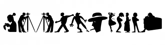
A display font made from diverse human silhouette illustrations.
![SilhouFaces フリーフォントのダウンロード]() ダウンロード 108 ダウンロード数@WebFont
ダウンロード 108 ダウンロード数@WebFont -
( Fonts by Manfred Klein. Free for private and charity use. Free for commercial with donation to organizations )
A decorative and artistic font with intricate patterns and unique designs.
![SaltoTwo Regular フリーフォントのダウンロード]() ダウンロード 108 ダウンロード数@WebFont
ダウンロード 108 ダウンロード数@WebFont


今のトップフォントは?
は、クリーンな造形と広い適用範囲で支持を集めています。 ブランディングからランディングページ、ポスターまで活躍します。
ロゴで人気のフォントは?
幾何学系の サンセリフ(例: Poppins、Gotham 系のファミリー)は、スケーラブルでクリーンな印象に最適。 親しみやすさを出すなら スクリプト や手書き系も定番です。 見出しは力強く、本文はニュートラルに──この組み合わせが認知とバランスを高めます。
人気リストはどのくらいの頻度で更新される?
ダウンロード数やエンゲージメントに基づき定期的に更新します。 こまめにチェックして、次に流行るフォントを先取りしましょう。
💡 ヒント: このページをブックマークしておくと便利です。トレンドは速く、今のトップが明日のリブランディングを導くこともあります。