人気フォント セクションへようこそ。ここでは「よくダウンロードされ、よく使われている」実績ある書体をまとめています。 ロゴ、Web、SNS のどれにも使いやすい、外さない選択肢が見つかります。
どの トップフォント も、バランス・可読性・汎用性で高評価です。 モダン・サンセリフ、エレガントなスクリプト、ヴィンテージなセリフ、ミニマルなディスプレイなどを厳選しています。
-
( Fonts by Craft Supply Co - Personal-use only. For commercial use please contact owner. )
A classic serif font with elegant, sharp serifs and moderate contrast, ideal for sophisticated designs.
 ダウンロード 107 ダウンロード数@WebFont
 -
( https://www.facebook.com/typesgal )
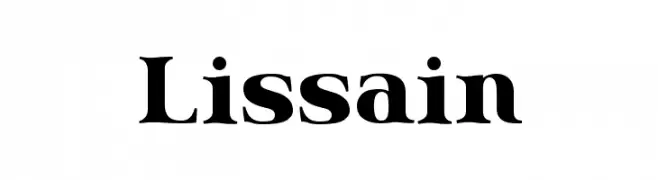
A bold, high-contrast serif font with pronounced serifs and a classic style.
![Lissain フリーフォントのダウンロード]() ダウンロード 107 ダウンロード数@WebFont
ダウンロード 107 ダウンロード数@WebFont -
( Fonts by Helotype )
A whimsical set of botanical and floral illustrations with a hand-drawn style.
![Growing Garden Dingbats フリーフォントのダウンロード]() ダウンロード 107 ダウンロード数@WebFont
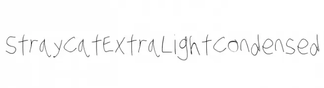
ダウンロード 107 ダウンロード数@WebFont -
![Stray Cat ExtraLight Condensed フリーフォントのダウンロード]() ダウンロード 107 ダウンロード数@WebFont
ダウンロード 107 ダウンロード数@WebFont -
( Fonts by StringLabs - stringlabscreative.com - Personal-use only. For commercial use please contact owner. )
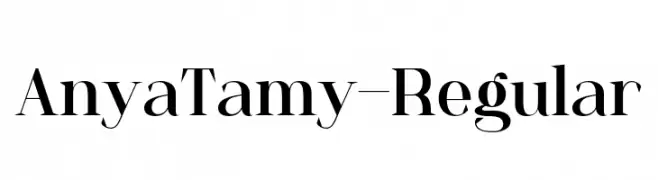
A classic serif font with high contrast and elegant strokes.
![AnyaTamy-Regular フリーフォントのダウンロード]() ダウンロード 107 ダウンロード数@WebFont
ダウンロード 107 ダウンロード数@WebFont -
-
( Fonts by Darrell Flood )
A bold, handwritten font with a dynamic, marker-like style.
![Speedy Marker フリーフォントのダウンロード]() ダウンロード 107 ダウンロード数@WebFont
ダウンロード 107 ダウンロード数@WebFont -
![irisisweird フリーフォントのダウンロード]() ダウンロード 107 ダウンロード数@WebFont
ダウンロード 107 ダウンロード数@WebFont -
( Fonts by Kevin May - Personal-use only. For commercial use please contact owner. )
A modern, rounded font with clean lines and balanced spacing.
![Apollo フリーフォントのダウンロード]() ダウンロード 107 ダウンロード数@WebFont
ダウンロード 107 ダウンロード数@WebFont -
( Fonts by Manfred Klein. Free for private and charity use. Free for commercial with donation to organizations )
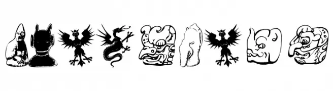
An artistic and decorative font with mythical and abstract character designs.
![IdolsFour フリーフォントのダウンロード]() ダウンロード 107 ダウンロード数@WebFont
ダウンロード 107 ダウンロード数@WebFont -
![SpizikeHand フリーフォントのダウンロード]() ダウンロード 107 ダウンロード数@WebFont
ダウンロード 107 ダウンロード数@WebFont


今のトップフォントは?
は、クリーンな造形と広い適用範囲で支持を集めています。 ブランディングからランディングページ、ポスターまで活躍します。
ロゴで人気のフォントは?
幾何学系の サンセリフ(例: Poppins、Gotham 系のファミリー)は、スケーラブルでクリーンな印象に最適。 親しみやすさを出すなら スクリプト や手書き系も定番です。 見出しは力強く、本文はニュートラルに──この組み合わせが認知とバランスを高めます。
人気リストはどのくらいの頻度で更新される?
ダウンロード数やエンゲージメントに基づき定期的に更新します。 こまめにチェックして、次に流行るフォントを先取りしましょう。
💡 ヒント: このページをブックマークしておくと便利です。トレンドは速く、今のトップが明日のリブランディングを導くこともあります。