人気フォント セクションへようこそ。ここでは「よくダウンロードされ、よく使われている」実績ある書体をまとめています。 ロゴ、Web、SNS のどれにも使いやすい、外さない選択肢が見つかります。
どの トップフォント も、バランス・可読性・汎用性で高評価です。 モダン・サンセリフ、エレガントなスクリプト、ヴィンテージなセリフ、ミニマルなディスプレイなどを厳選しています。
-
 ダウンロード 2159 ダウンロード数@WebFont
 -
![Evanescence- フリーフォントのダウンロード]() ダウンロード 2159 ダウンロード数@WebFont
ダウンロード 2159 ダウンロード数@WebFont -
( Personal-use only. For commercial use please contact owner. )
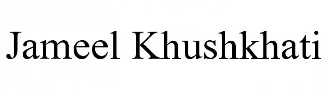
A classic serif font with elegant, sharp serifs and balanced stroke contrast.
![Jameel Khushkhati フリーフォントのダウンロード]() ダウンロード 2158 ダウンロード数@WebFont
ダウンロード 2158 ダウンロード数@WebFont -
( Fonts by Style-7 - www.styleseven.com - Personal-use only. For commercial use please contact owner. )
A digital-style, italic font mimicking seven-segment displays with a modern, tech-inspired look.
![Digital-7 Italic フリーフォントのダウンロード]() ダウンロード 2158 ダウンロード数@WebFont
ダウンロード 2158 ダウンロード数@WebFont -
( Kautsar Rahadi - dribbble.com/kautsarrahadi )
A bold, geometric font with strong lines and uniform height.
![Hansief フリーフォントのダウンロード]() ダウンロード 2157 ダウンロード数@WebFont
ダウンロード 2157 ダウンロード数@WebFont -
-
フォント by spideraysfonts. For commercial use please contact the owner.
![Wizards' Magic フリーフォントのダウンロード]() ダウンロード 2157 ダウンロード数@WebFont
ダウンロード 2157 ダウンロード数@WebFont -
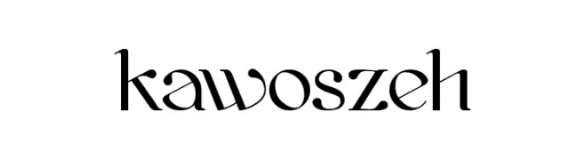
( Fonts by Grzegorz l - www.glukfonts.pl )
A modern serif font with elegant curves and flared strokes.
![kawoszeh フリーフォントのダウンロード]() ダウンロード 2157 ダウンロード数@WebFont
ダウンロード 2157 ダウンロード数@WebFont -
( Fonts by www.houseoflime.com )
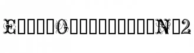
An ornate and decorative font with intricate swirls and embellishments.
![ExtraOrnamentalNo2 フリーフォントのダウンロード]() ダウンロード 2157 ダウンロード数@WebFont
ダウンロード 2157 ダウンロード数@WebFont -
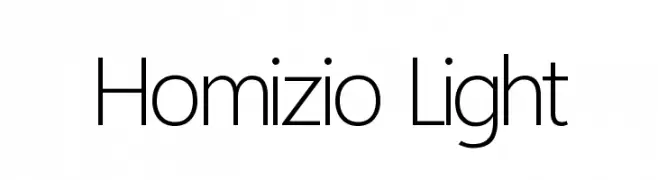
( Fonts by Alvaro Thomaz - alvarothomaz.com )
A modern, light sans-serif font with clean lines and excellent legibility.
![Homizio Light フリーフォントのダウンロード]() ダウンロード 2156 ダウンロード数@WebFont
ダウンロード 2156 ダウンロード数@WebFont -
( Copyright (c) 2010, Igino Marini (mail@iginomarini.com) )
A classic, italic font with a hand-drawn, vintage English style.
![IM FELL English Italic フリーフォントのダウンロード]() ダウンロード 2156 ダウンロード数@WebFont
ダウンロード 2156 ダウンロード数@WebFont


今のトップフォントは?
は、クリーンな造形と広い適用範囲で支持を集めています。 ブランディングからランディングページ、ポスターまで活躍します。
ロゴで人気のフォントは?
幾何学系の サンセリフ(例: Poppins、Gotham 系のファミリー)は、スケーラブルでクリーンな印象に最適。 親しみやすさを出すなら スクリプト や手書き系も定番です。 見出しは力強く、本文はニュートラルに──この組み合わせが認知とバランスを高めます。
人気リストはどのくらいの頻度で更新される?
ダウンロード数やエンゲージメントに基づき定期的に更新します。 こまめにチェックして、次に流行るフォントを先取りしましょう。
💡 ヒント: このページをブックマークしておくと便利です。トレンドは速く、今のトップが明日のリブランディングを導くこともあります。