人気フォント セクションへようこそ。ここでは「よくダウンロードされ、よく使われている」実績ある書体をまとめています。 ロゴ、Web、SNS のどれにも使いやすい、外さない選択肢が見つかります。
どの トップフォント も、バランス・可読性・汎用性で高評価です。 モダン・サンセリフ、エレガントなスクリプト、ヴィンテージなセリフ、ミニマルなディスプレイなどを厳選しています。
-
( Fonts by Fontles.com )
A bold, outlined font with a playful and energetic style.
 ダウンロード 106 ダウンロード数@WebFont
 -
( Fonts by xZamboxArtz SwompGraphics )
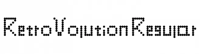
A dot matrix style font with a retro digital aesthetic.
![RetroVolution Regular フリーフォントのダウンロード]() ダウンロード 106 ダウンロード数@WebFont
ダウンロード 106 ダウンロード数@WebFont -
( Fonts by Almarkhatype - Abdul Malik Wisnu - Personal-use only. For commercial use please contact owner. )
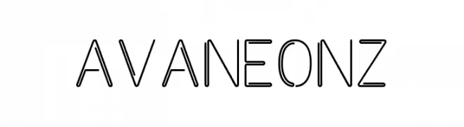
A modern, geometric font with clean lines and a minimalist aesthetic.
![Avaneonz フリーフォントのダウンロード]() ダウンロード 106 ダウンロード数@WebFont
ダウンロード 106 ダウンロード数@WebFont -
( Fonts by Billy Argel - Personal-use only. For commercial use please contact owner. )
An elegant script font with flowing, cursive strokes and decorative flourishes.
![Valentine Day Personal Use Regular フリーフォントのダウンロード]() ダウンロード 106 ダウンロード数@WebFont
ダウンロード 106 ダウンロード数@WebFont -
( Fonts by Luu Thy Nguyen )
A modern, artistic handwritten font with playful loops and sharp angles.
![Hong Kim Regular フリーフォントのダウンロード]() ダウンロード 106 ダウンロード数@WebFont
ダウンロード 106 ダウンロード数@WebFont -
-
( Iconian Fonts - Daniel Zadorozny - www.iconian.com )
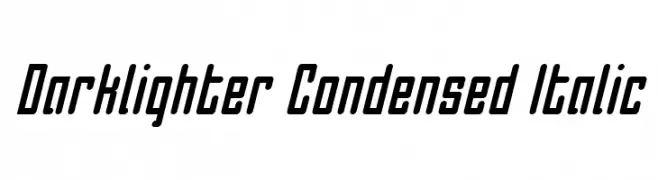
A modern, condensed, and italicized font with consistent stroke thickness.
![Darklighter Condensed Italic フリーフォントのダウンロード]() ダウンロード 106 ダウンロード数@WebFont
ダウンロード 106 ダウンロード数@WebFont -
( Fonts by Alfredo Marco Pradil - Personal-use only. For commercial use please contact owner. )
A modern, medium-weight, italic sans-serif font with a clean and dynamic style.
![Open Sauce One Medium Italic フリーフォントのダウンロード]() ダウンロード 106 ダウンロード数@WebFont
ダウンロード 106 ダウンロード数@WebFont -
( Fonts by a Situjuh Nazara - c7n1.wordpress.com. Personal-use only. For commercial use please contact owner. )
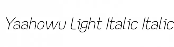
A modern, light, and italicized font with smooth, rounded edges.
![Yaahowu Light Italic Italic フリーフォントのダウンロード]() ダウンロード 106 ダウンロード数@WebFont
ダウンロード 106 ダウンロード数@WebFont -
( Fonts by Fontfabric - Svetoslav Simov - Personal-use only. For commercial use please contact owner. )
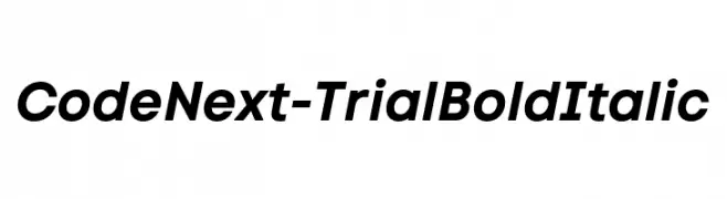
A bold, italicized font with a modern and dynamic style.
![Code Next-Trial Bold Italic フリーフォントのダウンロード]() ダウンロード 106 ダウンロード数@WebFont
ダウンロード 106 ダウンロード数@WebFont -
( Fonts by Iconian Fonts - Daniel Zadorozny - Personal-use only. For commercial use please contact owner. )
A bold, geometric font with strong, thick strokes for impactful design.
![Phenomicon フリーフォントのダウンロード]() ダウンロード 106 ダウンロード数@WebFont
ダウンロード 106 ダウンロード数@WebFont


今のトップフォントは?
は、クリーンな造形と広い適用範囲で支持を集めています。 ブランディングからランディングページ、ポスターまで活躍します。
ロゴで人気のフォントは?
幾何学系の サンセリフ(例: Poppins、Gotham 系のファミリー)は、スケーラブルでクリーンな印象に最適。 親しみやすさを出すなら スクリプト や手書き系も定番です。 見出しは力強く、本文はニュートラルに──この組み合わせが認知とバランスを高めます。
人気リストはどのくらいの頻度で更新される?
ダウンロード数やエンゲージメントに基づき定期的に更新します。 こまめにチェックして、次に流行るフォントを先取りしましょう。
💡 ヒント: このページをブックマークしておくと便利です。トレンドは速く、今のトップが明日のリブランディングを導くこともあります。