人気フォント セクションへようこそ。ここでは「よくダウンロードされ、よく使われている」実績ある書体をまとめています。 ロゴ、Web、SNS のどれにも使いやすい、外さない選択肢が見つかります。
どの トップフォント も、バランス・可読性・汎用性で高評価です。 モダン・サンセリフ、エレガントなスクリプト、ヴィンテージなセリフ、ミニマルなディスプレイなどを厳選しています。
-
( Fonts by Jonathan S. Harris - www.tattoowoo.com. Personal-use only. For commercial use please contact owner. )
A playful, hand-drawn font with a whimsical and informal style.
![[First Grader] フリーフォントのダウンロード](https://d144mzi0q5mijx.cloudfront.net/img/0/F/First-Grader1.webp) ダウンロード 105 ダウンロード数@WebFont
ダウンロード 105 ダウンロード数@WebFont -
( Fonts by Manfred Klein. Free for private and charity use. Free for commercial with donation to organizations )
Decorative geometric icon font with abstract faces in bold circles.
![GeoFacesBold フリーフォントのダウンロード]() ダウンロード 105 ダウンロード数@WebFont
ダウンロード 105 ダウンロード数@WebFont -
( Fonts by Des Gomez )
A playful, handwritten font with a casual and friendly style.
![LibertySails フリーフォントのダウンロード]() ダウンロード 105 ダウンロード数@WebFont
ダウンロード 105 ダウンロード数@WebFont -
![JetLag-BoldEaten フリーフォントのダウンロード]() ダウンロード 105 ダウンロード数@WebFont
ダウンロード 105 ダウンロード数@WebFont -
![Sharpie Hand フリーフォントのダウンロード]() ダウンロード 105 ダウンロード数@WebFont
ダウンロード 105 ダウンロード数@WebFont -
-
( Fonts by Apostrophic Lab )
A bold, italic font with a shattered, geometric design for modern, dynamic projects.
![Republikaps Exp - Shatter Italic フリーフォントのダウンロード]() ダウンロード 105 ダウンロード数@WebFont
ダウンロード 105 ダウンロード数@WebFont -
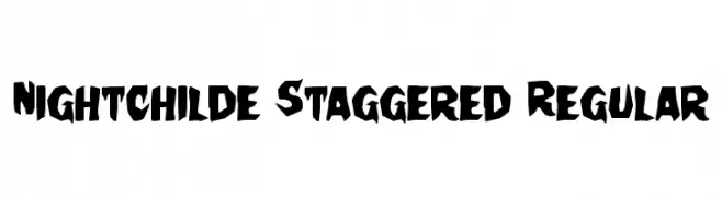
( Fonts by Daniel Zadorozny - www.iconian.com )
A bold, jagged, and highly decorative font with an edgy, dynamic style.
![Nightchilde Staggered Regular フリーフォントのダウンロード]() ダウンロード 105 ダウンロード数@WebFont
ダウンロード 105 ダウンロード数@WebFont -
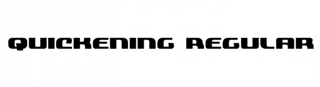
( Fonts by Daniel Zadorozny - www.iconian.com )
A bold, geometric font with a futuristic and dynamic style.
![Quickening Regular フリーフォントのダウンロード]() ダウンロード 105 ダウンロード数@WebFont
ダウンロード 105 ダウンロード数@WebFont -
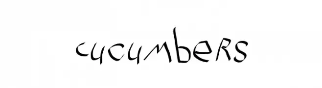
( Fonts by Manfred Klein. Free for private and charity use. Free for commercial with donation to organizations )
A whimsical, hand-drawn font with irregular, dynamic strokes.
![Cucumbers フリーフォントのダウンロード]() ダウンロード 105 ダウンロード数@WebFont
ダウンロード 105 ダウンロード数@WebFont -
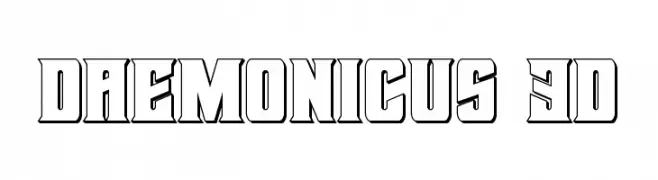
![Daemonicus 3D フリーフォントのダウンロード]() ダウンロード 105 ダウンロード数@WebFont
ダウンロード 105 ダウンロード数@WebFont


今のトップフォントは?
は、クリーンな造形と広い適用範囲で支持を集めています。 ブランディングからランディングページ、ポスターまで活躍します。
ロゴで人気のフォントは?
幾何学系の サンセリフ(例: Poppins、Gotham 系のファミリー)は、スケーラブルでクリーンな印象に最適。 親しみやすさを出すなら スクリプト や手書き系も定番です。 見出しは力強く、本文はニュートラルに──この組み合わせが認知とバランスを高めます。
人気リストはどのくらいの頻度で更新される?
ダウンロード数やエンゲージメントに基づき定期的に更新します。 こまめにチェックして、次に流行るフォントを先取りしましょう。
💡 ヒント: このページをブックマークしておくと便利です。トレンドは速く、今のトップが明日のリブランディングを導くこともあります。