人気フォント セクションへようこそ。ここでは「よくダウンロードされ、よく使われている」実績ある書体をまとめています。 ロゴ、Web、SNS のどれにも使いやすい、外さない選択肢が見つかります。
どの トップフォント も、バランス・可読性・汎用性で高評価です。 モダン・サンセリフ、エレガントなスクリプト、ヴィンテージなセリフ、ミニマルなディスプレイなどを厳選しています。
-
( Fonts by VSV Belgium )
A playful, whimsical font with uneven, distorted letterforms and a brush-like texture.
 ダウンロード 103 ダウンロード数@WebFont
 -
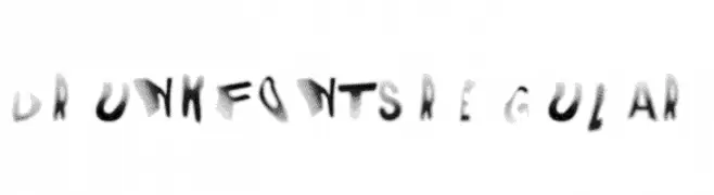
( Fonts by Jonathan S. Harris - www.tattoowoo.com. Personal-use only. For commercial use please contact owner. )
An elegant and intricate script font with flowing, interconnected letters and elaborate swashes.
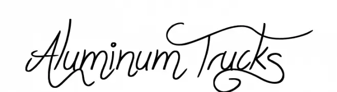
![Aluminum Trucks フリーフォントのダウンロード]() ダウンロード 103 ダウンロード数@WebFont
ダウンロード 103 ダウンロード数@WebFont -
( Fonts by Kreative Korporation - www.kreativekorp.com )
A pixelated, retro-style font with a nostalgic digital display aesthetic.
![Mischke フリーフォントのダウンロード]() ダウンロード 103 ダウンロード数@WebFont
ダウンロード 103 ダウンロード数@WebFont -
( Fonts by Press Gang Studios )
A playful, comic-style font with bold, irregular characters.
![comicdouche フリーフォントのダウンロード]() ダウンロード 103 ダウンロード数@WebFont
ダウンロード 103 ダウンロード数@WebFont -
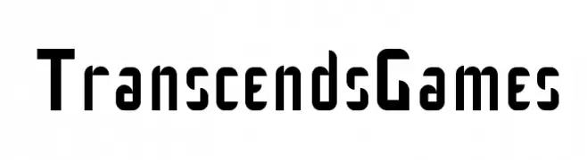
( Fonts by james kilfiger - Personal-use only. For commercial use please contact owner. )
A bold, modern font with geometric and futuristic elements.
![Transcends Games フリーフォントのダウンロード]() ダウンロード 103 ダウンロード数@WebFont
ダウンロード 103 ダウンロード数@WebFont -
-
( Fonts by InspiraType )
A playful, rounded handwritten font with a bold presence.
![DierjaFREE フリーフォントのダウンロード]() ダウンロード 103 ダウンロード数@WebFont
ダウンロード 103 ダウンロード数@WebFont -
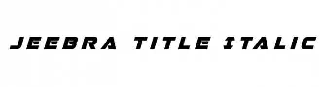
( Iconian Fonts - Daniel Zadorozny - www.iconian.com )
A bold, italic, and futuristic font with sharp angles and a dynamic style.
![Jeebra Title Italic フリーフォントのダウンロード]() ダウンロード 103 ダウンロード数@WebFont
ダウンロード 103 ダウンロード数@WebFont -
( Fonts by Manfred Klein. Free for private and charity use. Free for commercial with donation to organizations )
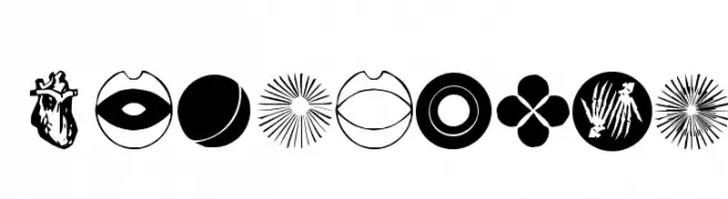
A modern, decorative icon font with bold and outlined life-inspired symbols.
![LifeIcons フリーフォントのダウンロード]() ダウンロード 103 ダウンロード数@WebFont
ダウンロード 103 ダウンロード数@WebFont -
( Noto is a trademark of Google Inc. Noto fonts are open source. All Noto fonts are published under the SIL Open Font License, Version 1.1 )
A bold, condensed font with a modern and professional style.
![Noto Sans Khmer Condensed Bold フリーフォントのダウンロード]() ダウンロード 103 ダウンロード数@WebFont
ダウンロード 103 ダウンロード数@WebFont -
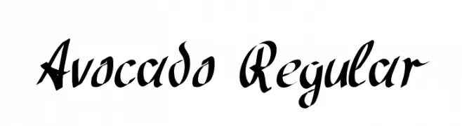
( Fonts by Peter Wiegel - www.peter-wiegel.de - Personal-use only. For commercial use please contact owner. )
A bold, calligraphic script font with high contrast and dynamic strokes.
![Avocado Regular フリーフォントのダウンロード]() ダウンロード 103 ダウンロード数@WebFont
ダウンロード 103 ダウンロード数@WebFont


今のトップフォントは?
は、クリーンな造形と広い適用範囲で支持を集めています。 ブランディングからランディングページ、ポスターまで活躍します。
ロゴで人気のフォントは?
幾何学系の サンセリフ(例: Poppins、Gotham 系のファミリー)は、スケーラブルでクリーンな印象に最適。 親しみやすさを出すなら スクリプト や手書き系も定番です。 見出しは力強く、本文はニュートラルに──この組み合わせが認知とバランスを高めます。
人気リストはどのくらいの頻度で更新される?
ダウンロード数やエンゲージメントに基づき定期的に更新します。 こまめにチェックして、次に流行るフォントを先取りしましょう。
💡 ヒント: このページをブックマークしておくと便利です。トレンドは速く、今のトップが明日のリブランディングを導くこともあります。