人気フォント セクションへようこそ。ここでは「よくダウンロードされ、よく使われている」実績ある書体をまとめています。 ロゴ、Web、SNS のどれにも使いやすい、外さない選択肢が見つかります。
どの トップフォント も、バランス・可読性・汎用性で高評価です。 モダン・サンセリフ、エレガントなスクリプト、ヴィンテージなセリフ、ミニマルなディスプレイなどを厳選しています。
-
( Sengkeo Vangxiengvue - www.facebook.com/vangxiengvue )
A modern, geometric font with rounded edges and a sleek design.
 ダウンロード 103 ダウンロード数@WebFont
 -
( Fonts by backpacker - Personal-use only. For commercial use please contact owner. )
A playful, bold handwritten font with a childlike charm.
![BPchildFatty フリーフォントのダウンロード]() ダウンロード 103 ダウンロード数@WebFont
ダウンロード 103 ダウンロード数@WebFont -
( Fonts by Marivo )
A bold, geometric font with a blocky, modern design.
![Knifer 600 Regular フリーフォントのダウンロード]() ダウンロード 103 ダウンロード数@WebFont
ダウンロード 103 ダウンロード数@WebFont -
( Fonts by Hatf Type )
A lively, expressive handwritten font with dynamic strokes and a playful style.
![Gossipers フリーフォントのダウンロード]() ダウンロード 103 ダウンロード数@WebFont
ダウンロード 103 ダウンロード数@WebFont -
( Fonts by Maulana Creative - Gilang Maulana - Personal-use only. For commercial use please contact owner. )
A bold, brush-style font with dynamic and expressive strokes.
![Black Range Free Regular フリーフォントのダウンロード]() ダウンロード 103 ダウンロード数@WebFont
ダウンロード 103 ダウンロード数@WebFont -
-
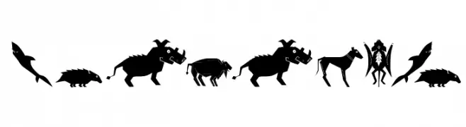
( Fonts by Manfred Klein. Free for private and charity use. Free for commercial with donation to organizations )
A collection of stylized animal and mythical creature silhouettes with tribal and indigenous art influences.
![Shamanish フリーフォントのダウンロード]() ダウンロード 103 ダウンロード数@WebFont
ダウンロード 103 ダウンロード数@WebFont -
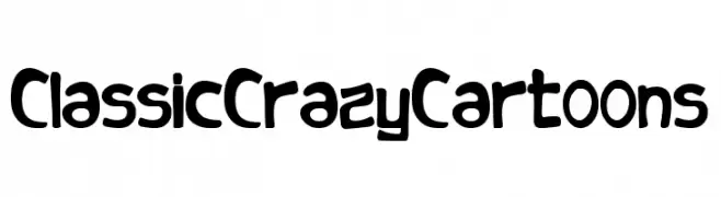
( Fonts by Woodcutter )
A bold, playful font with a cartoonish, hand-drawn style.
![Classic Crazy Cartoons フリーフォントのダウンロード]() ダウンロード 103 ダウンロード数@WebFont
ダウンロード 103 ダウンロード数@WebFont -
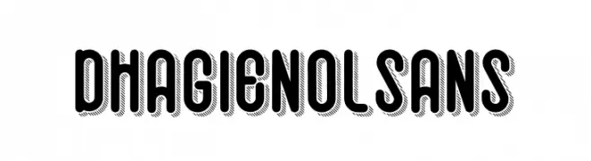
( Fonts by Kotak Kuning Studio - kotakkuning.com - Personal-use only. For commercial use please contact owner. )
A bold, shadowed font with a three-dimensional effect, perfect for striking designs.
![Dhagienol Sans フリーフォントのダウンロード]() ダウンロード 103 ダウンロード数@WebFont
ダウンロード 103 ダウンロード数@WebFont -
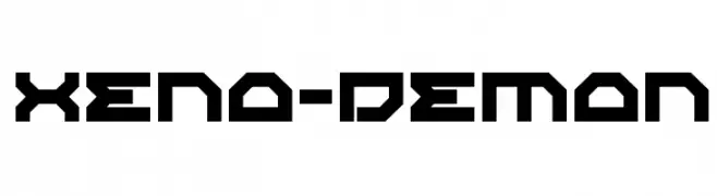
( Fonts by Iconian Fonts )
A bold, futuristic font with angular, geometric shapes and a tech-inspired aesthetic.
![Xeno-Demon フリーフォントのダウンロード]() ダウンロード 103 ダウンロード数@WebFont
ダウンロード 103 ダウンロード数@WebFont -
フォント by letterhanna. For commercial use please contact the owner.
( Free for personal use only. With only $15 You can purchase the basic desktop license: https://letterhanna.com/ )
A modern, elegant font with clean lines and balanced structure.
![Luminous Gardenia Free Regular フリーフォントのダウンロード]() ダウンロード 103 ダウンロード数@WebFont
ダウンロード 103 ダウンロード数@WebFont


今のトップフォントは?
は、クリーンな造形と広い適用範囲で支持を集めています。 ブランディングからランディングページ、ポスターまで活躍します。
ロゴで人気のフォントは?
幾何学系の サンセリフ(例: Poppins、Gotham 系のファミリー)は、スケーラブルでクリーンな印象に最適。 親しみやすさを出すなら スクリプト や手書き系も定番です。 見出しは力強く、本文はニュートラルに──この組み合わせが認知とバランスを高めます。
人気リストはどのくらいの頻度で更新される?
ダウンロード数やエンゲージメントに基づき定期的に更新します。 こまめにチェックして、次に流行るフォントを先取りしましょう。
💡 ヒント: このページをブックマークしておくと便利です。トレンドは速く、今のトップが明日のリブランディングを導くこともあります。