人気フォント セクションへようこそ。ここでは「よくダウンロードされ、よく使われている」実績ある書体をまとめています。 ロゴ、Web、SNS のどれにも使いやすい、外さない選択肢が見つかります。
どの トップフォント も、バランス・可読性・汎用性で高評価です。 モダン・サンセリフ、エレガントなスクリプト、ヴィンテージなセリフ、ミニマルなディスプレイなどを厳選しています。
-
( Fonts by Typodermic Fonts )
A classic serif font with elegant strokes and a timeless appeal.
 ダウンロード 101 ダウンロード数@WebFont
 -
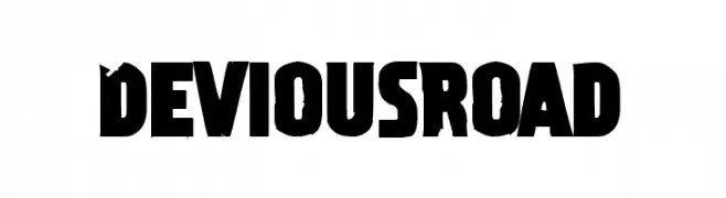
( Fonts by Chequered Ink )
A bold, distressed font with a rugged, gritty appearance.
![Devious Road フリーフォントのダウンロード]() ダウンロード 101 ダウンロード数@WebFont
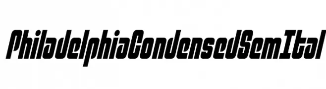
ダウンロード 101 ダウンロード数@WebFont -
![Philadelphia Condensed SemItal フリーフォントのダウンロード]() ダウンロード 101 ダウンロード数@WebFont
ダウンロード 101 ダウンロード数@WebFont -
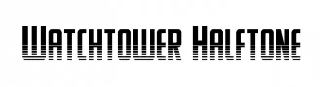
( Iconian Fonts - Daniel Zadorozny - www.iconian.com )
A bold, modern font with a halftone effect and geometric structure.
![Watchtower Halftone フリーフォントのダウンロード]() ダウンロード 101 ダウンロード数@WebFont
ダウンロード 101 ダウンロード数@WebFont -
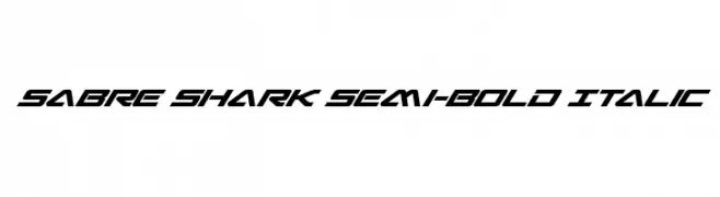
( Fonts by Daniel Zadorozny - www.iconian.com - Personal-use only. For commercial use please contact owner. )
A dynamic, futuristic semi-bold italic font with sharp angles and high contrast.
![Sabre Shark Semi-Bold Italic フリーフォントのダウンロード]() ダウンロード 101 ダウンロード数@WebFont
ダウンロード 101 ダウンロード数@WebFont -
-
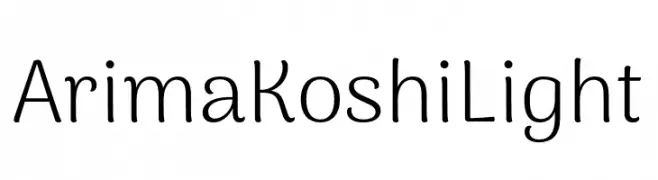
( Fonts by NDISCOVER )
A clean, modern font with rounded edges and consistent stroke width, offering excellent readability.
![Arima Koshi Light フリーフォントのダウンロード]() ダウンロード 101 ダウンロード数@WebFont
ダウンロード 101 ダウンロード数@WebFont -
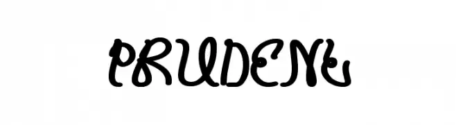
![PRUDENT フリーフォントのダウンロード]() ダウンロード 101 ダウンロード数@WebFont
ダウンロード 101 ダウンロード数@WebFont -
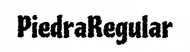
![Piedra Regular フリーフォントのダウンロード]() ダウンロード 101 ダウンロード数@WebFont
ダウンロード 101 ダウンロード数@WebFont -
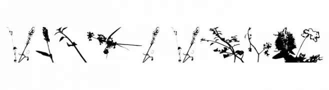
( bellafontsblog.blogspot.com/p/bellafonts-license.html )
A botanical silhouette display font with each glyph formed from plant shapes.
![Floral Flush フリーフォントのダウンロード]() ダウンロード 101 ダウンロード数@WebFont
ダウンロード 101 ダウンロード数@WebFont -
( Levi Szekeres - www.loremipsum.ro )
A bold, woodcut-style font with horizontal lines and a vintage-modern appeal.
![Fat Flamingo5 Woodcut フリーフォントのダウンロード]() ダウンロード 101 ダウンロード数@WebFont
ダウンロード 101 ダウンロード数@WebFont

今のトップフォントは?
は、クリーンな造形と広い適用範囲で支持を集めています。 ブランディングからランディングページ、ポスターまで活躍します。
ロゴで人気のフォントは?
幾何学系の サンセリフ(例: Poppins、Gotham 系のファミリー)は、スケーラブルでクリーンな印象に最適。 親しみやすさを出すなら スクリプト や手書き系も定番です。 見出しは力強く、本文はニュートラルに──この組み合わせが認知とバランスを高めます。
人気リストはどのくらいの頻度で更新される?
ダウンロード数やエンゲージメントに基づき定期的に更新します。 こまめにチェックして、次に流行るフォントを先取りしましょう。
💡 ヒント: このページをブックマークしておくと便利です。トレンドは速く、今のトップが明日のリブランディングを導くこともあります。