人気フォント セクションへようこそ。ここでは「よくダウンロードされ、よく使われている」実績ある書体をまとめています。 ロゴ、Web、SNS のどれにも使いやすい、外さない選択肢が見つかります。
どの トップフォント も、バランス・可読性・汎用性で高評価です。 モダン・サンセリフ、エレガントなスクリプト、ヴィンテージなセリフ、ミニマルなディスプレイなどを厳選しています。
-
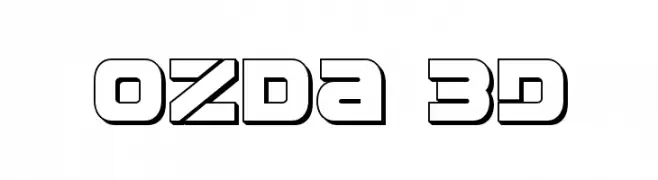
( Iconian Fonts - Daniel Zadorozny - www.iconian.com )
A bold, 3D geometric font with outlined characters.
 ダウンロード 87 ダウンロード数@WebFont
 -
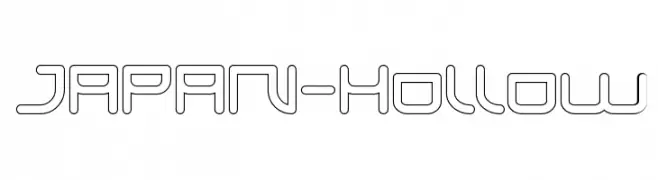
( weknow - Wino S Kadir - www.creativefabrica.com/designer/weknow/ )
A hollow, geometric font with a futuristic and minimalist design.
![JAPAN-Hollow フリーフォントのダウンロード]() ダウンロード 87 ダウンロード数@WebFont
ダウンロード 87 ダウンロード数@WebFont -
( Fonts by Situjuh Nazara - 7ntypes.com - Personal-use only. For commercial use please contact owner. )
A tall, narrow font with elegant curves and playful character.
![Aynha フリーフォントのダウンロード]() ダウンロード 87 ダウンロード数@WebFont
ダウンロード 87 ダウンロード数@WebFont -
( Fonts by Shetya Atriyani - Personal-use only. For commercial use please contact owner. )
A playful, rounded font with a hand-drawn, friendly appearance.
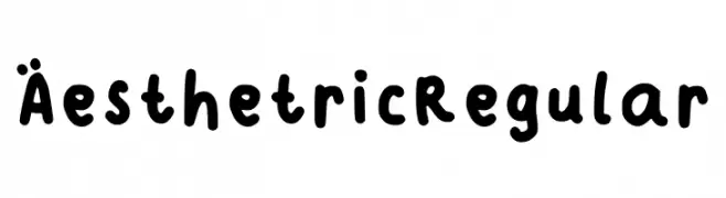
![Aesthetric Regular フリーフォントのダウンロード]() ダウンロード 87 ダウンロード数@WebFont
ダウンロード 87 ダウンロード数@WebFont -
( Fonts by Maelle.K - Thomas Boucherie )
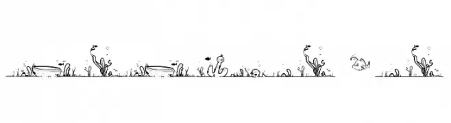
The image features decorative underwater illustrations, not a font.
![LaLinea Sea フリーフォントのダウンロード]() ダウンロード 87 ダウンロード数@WebFont
ダウンロード 87 ダウンロード数@WebFont -
-
( Corvus 113 )
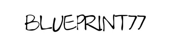
A casual, handwritten font with a lively and approachable style.
![Blueprint77 フリーフォントのダウンロード]() ダウンロード 87 ダウンロード数@WebFont
ダウンロード 87 ダウンロード数@WebFont -
( Fonts by Peter Wiegel - www.peter-wiegel.de - Personal-use only. For commercial use please contact owner. )
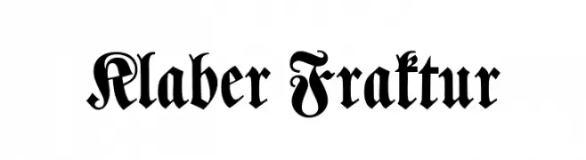
An ornate blackletter font with intricate, bold designs and historical flair.
![Klaber Fraktur フリーフォントのダウンロード]() ダウンロード 87 ダウンロード数@WebFont
ダウンロード 87 ダウンロード数@WebFont -
( Fonts by Wahyu Eka Prasetya - wepfont.com - Personal-use only. For commercial use please contact owner. )
A bold, hand-painted style font with a dynamic and playful appearance.
![GEMPUR フリーフォントのダウンロード]() ダウンロード 87 ダウンロード数@WebFont
ダウンロード 87 ダウンロード数@WebFont -
( Fonts by elo - Personal-use only. For commercial use please contact owner. )
A bold, slab serif font with a vintage Western style.
![Faroest フリーフォントのダウンロード]() ダウンロード 87 ダウンロード数@WebFont
ダウンロード 87 ダウンロード数@WebFont -
( Fonts by Edric Studio www.creativefabrica.com/designer/edricstudio/ - Personal-use only. For commercial use please contact owner. )
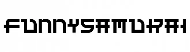
A bold, geometric font with a futuristic and industrial style.
![Funny Samurai フリーフォントのダウンロード]() ダウンロード 87 ダウンロード数@WebFont
ダウンロード 87 ダウンロード数@WebFont


今のトップフォントは?
は、クリーンな造形と広い適用範囲で支持を集めています。 ブランディングからランディングページ、ポスターまで活躍します。
ロゴで人気のフォントは?
幾何学系の サンセリフ(例: Poppins、Gotham 系のファミリー)は、スケーラブルでクリーンな印象に最適。 親しみやすさを出すなら スクリプト や手書き系も定番です。 見出しは力強く、本文はニュートラルに──この組み合わせが認知とバランスを高めます。
人気リストはどのくらいの頻度で更新される?
ダウンロード数やエンゲージメントに基づき定期的に更新します。 こまめにチェックして、次に流行るフォントを先取りしましょう。
💡 ヒント: このページをブックマークしておくと便利です。トレンドは速く、今のトップが明日のリブランディングを導くこともあります。