人気フォント セクションへようこそ。ここでは「よくダウンロードされ、よく使われている」実績ある書体をまとめています。 ロゴ、Web、SNS のどれにも使いやすい、外さない選択肢が見つかります。
どの トップフォント も、バランス・可読性・汎用性で高評価です。 モダン・サンセリフ、エレガントなスクリプト、ヴィンテージなセリフ、ミニマルなディスプレイなどを厳選しています。
-
( Fonts by Michael Muranaka - muraknockout.com - Personal-use only. For commercial use please contact owner. )
A decorative font with a blend of modern and vintage styles, featuring bold and whimsical characters.
 ダウンロード 87 ダウンロード数@WebFont
 -
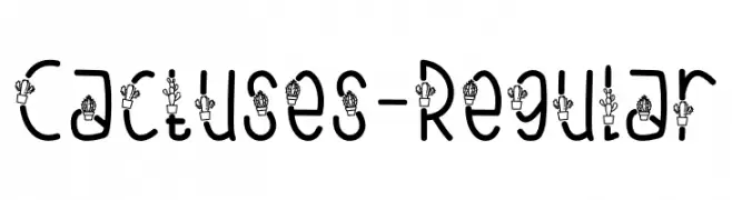
( Fonts by Nur Aisyah Amalia )
A playful font with cactus illustrations integrated into each character, offering a whimsical and decorative style.
![Cactuses-Regular フリーフォントのダウンロード]() ダウンロード 87 ダウンロード数@WebFont
ダウンロード 87 ダウンロード数@WebFont -
( Fonts by Mozyen Studio - Personal-use only. For commercial use please contact owner. )
A graceful, cursive script font with a handwritten style.
![Lestya フリーフォントのダウンロード]() ダウンロード 87 ダウンロード数@WebFont
ダウンロード 87 ダウンロード数@WebFont -
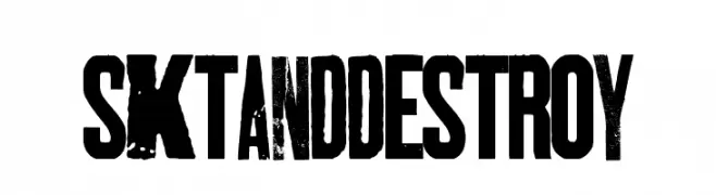
( Fonts by Billy Argel - www.billyargel.com - Personal-use only. For commercial use please contact owner. )
A bold, distressed font with a grunge aesthetic and tight spacing.
![SKTANDDESTROY フリーフォントのダウンロード]() ダウンロード 87 ダウンロード数@WebFont
ダウンロード 87 ダウンロード数@WebFont -
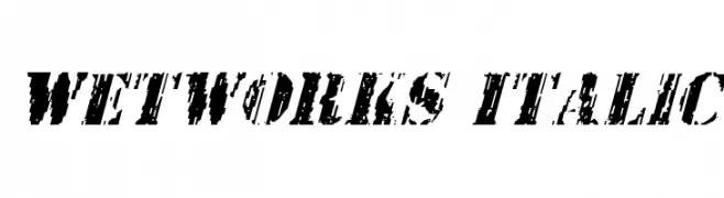
( Fonts by Daniel Zadorozny - www.iconian.com - Free for personal use )
A bold, distressed italic font with a grunge aesthetic.
![Wetworks Italic フリーフォントのダウンロード]() ダウンロード 87 ダウンロード数@WebFont
ダウンロード 87 ダウンロード数@WebFont -
-
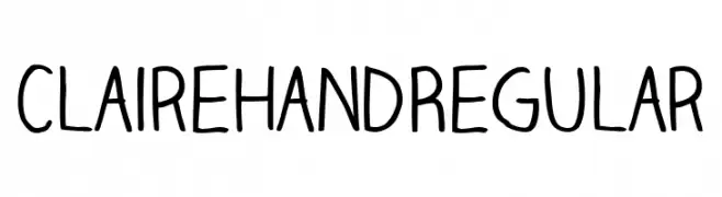
( Fonts by team scope - Katie Young - Personal-use only. For commercial use please contact owner. )
A playful, casual handwritten font with smooth, rounded strokes.
![Claire Hand Regular フリーフォントのダウンロード]() ダウンロード 87 ダウンロード数@WebFont
ダウンロード 87 ダウンロード数@WebFont -
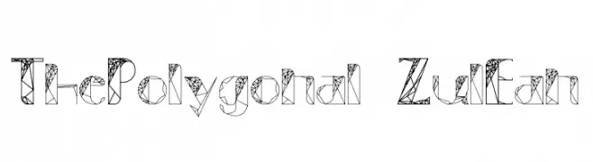
( Fonts by Low Polyonal )
A geometric font with polygonal shapes and interconnected lines.
![ThePolygonal-ZulEan フリーフォントのダウンロード]() ダウンロード 87 ダウンロード数@WebFont
ダウンロード 87 ダウンロード数@WebFont -
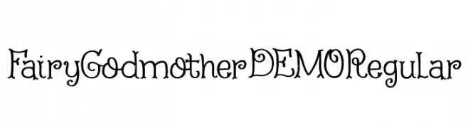
( Hanoded - David Kerkhoff - www.hanodedfonts.com )
A whimsical, fairy-tale inspired font with decorative, magical elements.
![Fairy Godmother DEMO Regular フリーフォントのダウンロード]() ダウンロード 87 ダウンロード数@WebFont
ダウンロード 87 ダウンロード数@WebFont -
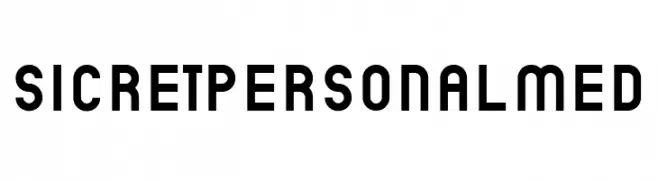
( Fonts by Mans Greback - Personal-use only. For commercial use please contact owner. )
A bold, geometric font with a modern, monospaced style.
![SicretPERSONALMed フリーフォントのダウンロード]() ダウンロード 87 ダウンロード数@WebFont
ダウンロード 87 ダウンロード数@WebFont -
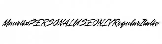
( Fonts by Mans Greback - Personal-use only. For commercial use please contact owner. )
A bold, italic script font with dynamic and expressive strokes.
![Mauritz PERSONAL USE ONLY Regular Italic フリーフォントのダウンロード]() ダウンロード 87 ダウンロード数@WebFont
ダウンロード 87 ダウンロード数@WebFont

今のトップフォントは?
は、クリーンな造形と広い適用範囲で支持を集めています。 ブランディングからランディングページ、ポスターまで活躍します。
ロゴで人気のフォントは?
幾何学系の サンセリフ(例: Poppins、Gotham 系のファミリー)は、スケーラブルでクリーンな印象に最適。 親しみやすさを出すなら スクリプト や手書き系も定番です。 見出しは力強く、本文はニュートラルに──この組み合わせが認知とバランスを高めます。
人気リストはどのくらいの頻度で更新される?
ダウンロード数やエンゲージメントに基づき定期的に更新します。 こまめにチェックして、次に流行るフォントを先取りしましょう。
💡 ヒント: このページをブックマークしておくと便利です。トレンドは速く、今のトップが明日のリブランディングを導くこともあります。