人気フォント セクションへようこそ。ここでは「よくダウンロードされ、よく使われている」実績ある書体をまとめています。 ロゴ、Web、SNS のどれにも使いやすい、外さない選択肢が見つかります。
どの トップフォント も、バランス・可読性・汎用性で高評価です。 モダン・サンセリフ、エレガントなスクリプト、ヴィンテージなセリフ、ミニマルなディスプレイなどを厳選しています。
-
( Splintered - www.splintered.co.uk )
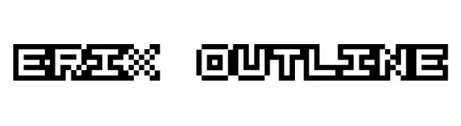
A bold, pixelated outline font with a retro digital aesthetic.
 ダウンロード 86 ダウンロード数@WebFont
 -
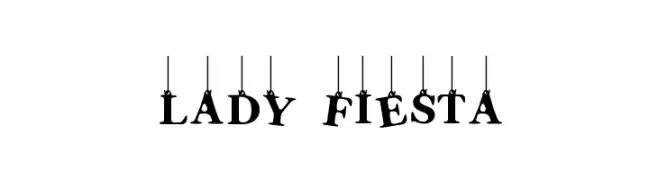
( Fonts by www.woodcutter.es - woodcutter Manero - Personal-use only. For commercial use please contact owner. )
A playful, decorative font with characters that appear to hang from strings.
![Lady Fiesta フリーフォントのダウンロード]() ダウンロード 86 ダウンロード数@WebFont
ダウンロード 86 ダウンロード数@WebFont -
( Lollibomb - www.lollibomb.com/ )
A display font using human head silhouettes as characters.
![Facetype Normal フリーフォントのダウンロード]() ダウンロード 86 ダウンロード数@WebFont
ダウンロード 86 ダウンロード数@WebFont -
( Fonts by Get Studio - Hermansyah , - Personal-use only. For commercial use please contact owner. )
A dynamic and expressive script font with bold, flowing strokes.
![Headey Script Regular フリーフォントのダウンロード]() ダウンロード 86 ダウンロード数@WebFont
ダウンロード 86 ダウンロード数@WebFont -
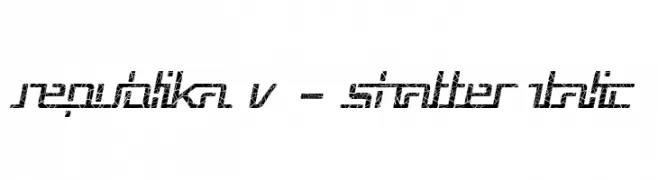
( Fonts by Apostrophic Lab )
A shattered, italicized font with a modern, geometric design.
![Republika V - Shatter Italic フリーフォントのダウンロード]() ダウンロード 86 ダウンロード数@WebFont
ダウンロード 86 ダウンロード数@WebFont -
-
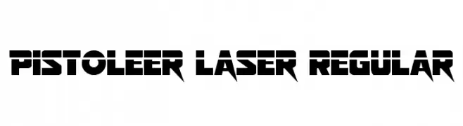
( Fonts by Daniel Zadorozny - www.iconian.com )
A bold, futuristic font with sharp, angular edges and a sci-fi aesthetic.
![Pistoleer Laser Regular フリーフォントのダウンロード]() ダウンロード 86 ダウンロード数@WebFont
ダウンロード 86 ダウンロード数@WebFont -
( Fonts by Woodcutter Manero - http://www.woodcutter.es - Personal-use only. For commercial use please contact owner. )
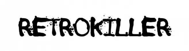
A bold, grungy font with a distressed, hand-drawn appearance.
![Retro Killer フリーフォントのダウンロード]() ダウンロード 86 ダウンロード数@WebFont
ダウンロード 86 ダウンロード数@WebFont -
( Fonts by AdanteCreative - Personal-use only. For commercial use please contact owner. )
An elegant, cursive font with flowing, intricate strokes.
![Handcaster フリーフォントのダウンロード]() ダウンロード 86 ダウンロード数@WebFont
ダウンロード 86 ダウンロード数@WebFont -
( Fonts by Raoul --- Compagnie - Personal-use only. For commercial use please contact owner. )
A bold, modern font with a condensed and authoritative style.
![Raoul AUTOROUTE Britannique フリーフォントのダウンロード]() ダウンロード 86 ダウンロード数@WebFont
ダウンロード 86 ダウンロード数@WebFont -
( Fonts by Manfred Klein. Free for private and charity use. Free for commercial with donation to organizations )
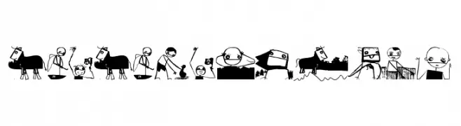
Whimsical, illustrative font made of cartoon and surrealist scenes.
![NewNeighbours フリーフォントのダウンロード]() ダウンロード 86 ダウンロード数@WebFont
ダウンロード 86 ダウンロード数@WebFont


今のトップフォントは?
は、クリーンな造形と広い適用範囲で支持を集めています。 ブランディングからランディングページ、ポスターまで活躍します。
ロゴで人気のフォントは?
幾何学系の サンセリフ(例: Poppins、Gotham 系のファミリー)は、スケーラブルでクリーンな印象に最適。 親しみやすさを出すなら スクリプト や手書き系も定番です。 見出しは力強く、本文はニュートラルに──この組み合わせが認知とバランスを高めます。
人気リストはどのくらいの頻度で更新される?
ダウンロード数やエンゲージメントに基づき定期的に更新します。 こまめにチェックして、次に流行るフォントを先取りしましょう。
💡 ヒント: このページをブックマークしておくと便利です。トレンドは速く、今のトップが明日のリブランディングを導くこともあります。