人気フォント セクションへようこそ。ここでは「よくダウンロードされ、よく使われている」実績ある書体をまとめています。 ロゴ、Web、SNS のどれにも使いやすい、外さない選択肢が見つかります。
どの トップフォント も、バランス・可読性・汎用性で高評価です。 モダン・サンセリフ、エレガントなスクリプト、ヴィンテージなセリフ、ミニマルなディスプレイなどを厳選しています。
-
( Fonts by Mans Greback - Personal-use only. For commercial use please contact owner. )
A bold, modern serif font with dynamic strokes and sharp serifs.
 ダウンロード 86 ダウンロード数@WebFont
 -
( Fonts by Eknoji Studio - Personal-use only. For commercial use please contact owner. )
An elegant script font with ornate floral embellishments and high contrast strokes.
![Ralgani フリーフォントのダウンロード]() ダウンロード 86 ダウンロード数@WebFont
ダウンロード 86 ダウンロード数@WebFont -
( Fonts by Vladimir Nikolic )
A novelty font composed of illustrated cow faces for each character.
![Prins Regular フリーフォントのダウンロード]() ダウンロード 86 ダウンロード数@WebFont
ダウンロード 86 ダウンロード数@WebFont -
( Fonts by Daniel Zadorozny - www.iconian.com - Personal-use only. For commercial use please contact owner. )
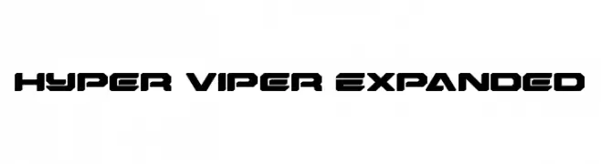
A bold, angular, and futuristic font with expanded width and tight spacing.
![Hyper Viper Expanded フリーフォントのダウンロード]() ダウンロード 86 ダウンロード数@WebFont
ダウンロード 86 ダウンロード数@WebFont -
( Fonts by inst.ink-type - Galih S Aji - Personal-use only. For commercial use please contact owner. )
A dynamic and elegant cursive script font with a modern yet classic appeal.
![steelysticoPERSONALUSEONLY-Rg フリーフォントのダウンロード]() ダウンロード 86 ダウンロード数@WebFont
ダウンロード 86 ダウンロード数@WebFont -
-
( Nils Merkel )
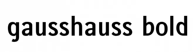
A bold, modern sans-serif font with clean lines and high legibility.
![gausshauss bold フリーフォントのダウンロード]() ダウンロード 86 ダウンロード数@WebFont
ダウンロード 86 ダウンロード数@WebFont -
( Fonts by Manfred Klein. Free for private and charity use. Free for commercial with donation to organizations )
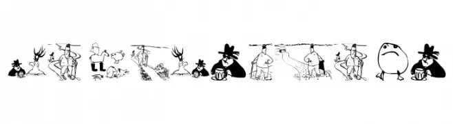
Cartoon illustration-based decorative font with unique character drawings.
![PardonAgain フリーフォントのダウンロード]() ダウンロード 86 ダウンロード数@WebFont
ダウンロード 86 ダウンロード数@WebFont -
( Fonts by Alpaprana - Personal-use only. For commercial use please contact owner. )
A spooky, dripping font with a hand-drawn, horror-inspired style.
![Ghoulies フリーフォントのダウンロード]() ダウンロード 86 ダウンロード数@WebFont
ダウンロード 86 ダウンロード数@WebFont -
( Fonts by Edric Studio - Personal-use only. For commercial use please contact owner. )
A playful, handwritten script font with smooth, rounded strokes.
![Happy Sweety Demo フリーフォントのダウンロード]() ダウンロード 86 ダウンロード数@WebFont
ダウンロード 86 ダウンロード数@WebFont -
( Fonts by Xerographer Fonts )
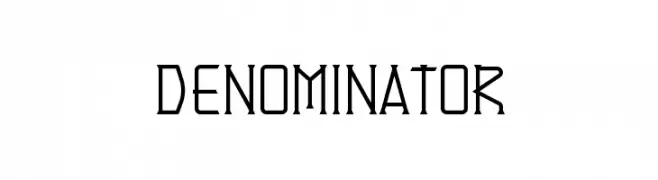
A geometric, angular font with a modern and technical style.
![Denominator フリーフォントのダウンロード]() ダウンロード 86 ダウンロード数@WebFont
ダウンロード 86 ダウンロード数@WebFont


今のトップフォントは?
は、クリーンな造形と広い適用範囲で支持を集めています。 ブランディングからランディングページ、ポスターまで活躍します。
ロゴで人気のフォントは?
幾何学系の サンセリフ(例: Poppins、Gotham 系のファミリー)は、スケーラブルでクリーンな印象に最適。 親しみやすさを出すなら スクリプト や手書き系も定番です。 見出しは力強く、本文はニュートラルに──この組み合わせが認知とバランスを高めます。
人気リストはどのくらいの頻度で更新される?
ダウンロード数やエンゲージメントに基づき定期的に更新します。 こまめにチェックして、次に流行るフォントを先取りしましょう。
💡 ヒント: このページをブックマークしておくと便利です。トレンドは速く、今のトップが明日のリブランディングを導くこともあります。