人気フォント セクションへようこそ。ここでは「よくダウンロードされ、よく使われている」実績ある書体をまとめています。 ロゴ、Web、SNS のどれにも使いやすい、外さない選択肢が見つかります。
どの トップフォント も、バランス・可読性・汎用性で高評価です。 モダン・サンセリフ、エレガントなスクリプト、ヴィンテージなセリフ、ミニマルなディスプレイなどを厳選しています。
-
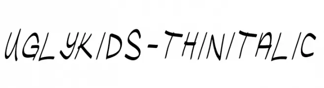
( Fonts by Chris Vile )
A playful, handwritten font with an italicized, dynamic style.
 ダウンロード 68 ダウンロード数@WebFont
 -
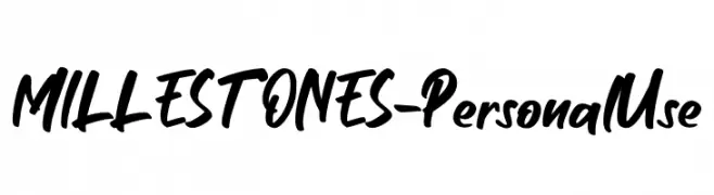
( Fonts by Haksen Studio - Sarwo Edhi Prayitno - Personal-use only. For commercial use please contact owner. )
A bold, handwritten-style font with a dynamic and expressive appearance.
![MILLESTONES - Personal Use フリーフォントのダウンロード]() ダウンロード 68 ダウンロード数@WebFont
ダウンロード 68 ダウンロード数@WebFont -
( Fonts by ARLILA FOUNDATION - Personal-use only. For commercial use please contact owner. )
A lively, expressive handwritten font with fluid, dynamic strokes.
![LovingYou フリーフォントのダウンロード]() ダウンロード 68 ダウンロード数@WebFont
ダウンロード 68 ダウンロード数@WebFont -
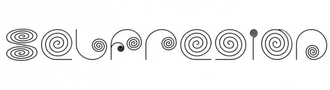
( Fonts by Wino S Kadir - weknow - www.revolge.com/shop/weknow/ - Personal-use only. For commercial use please contact owner. )
A whimsical font with intricate spiral designs and thin lines.
![selfregion フリーフォントのダウンロード]() ダウンロード 68 ダウンロード数@WebFont
ダウンロード 68 ダウンロード数@WebFont -
( Fonts by Letter Jos - Personal-use only. For commercial use please contact owner. )
A dynamic and flowing script font with a handwritten appearance.
![aluna Regular フリーフォントのダウンロード]() ダウンロード 68 ダウンロード数@WebFont
ダウンロード 68 ダウンロード数@WebFont -
-
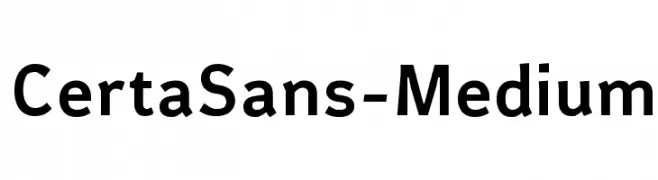
( Fonts by Glen Jan - Personal-use only. For commercial use please contact owner. )
A modern, clean sans-serif font with uniform strokes and geometric letterforms.
![CertaSans-Medium フリーフォントのダウンロード]() ダウンロード 68 ダウンロード数@WebFont
ダウンロード 68 ダウンロード数@WebFont -
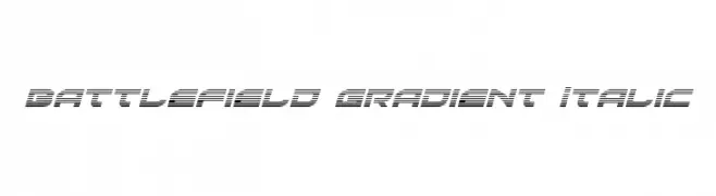
( Fonts by Daniel Zadorozny - www.iconian.com - Free for personal use )
A bold, italicized font with a gradient effect and modern, futuristic style.
![Battlefield Gradient Italic フリーフォントのダウンロード]() ダウンロード 68 ダウンロード数@WebFont
ダウンロード 68 ダウンロード数@WebFont -
( Fonts by Runsell Studio - Personal-use only. For commercial use please contact owner. )
An elegant and expressive handwritten font with fluid, dynamic strokes.
![Josephine フリーフォントのダウンロード]() ダウンロード 68 ダウンロード数@WebFont
ダウンロード 68 ダウンロード数@WebFont -
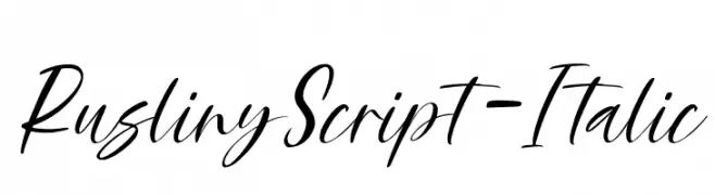
( Fonts by Rastype )
A fluid, elegant script font with a natural handwriting style.
![RuslinyScript-Italic フリーフォントのダウンロード]() ダウンロード 68 ダウンロード数@WebFont
ダウンロード 68 ダウンロード数@WebFont -
( Fonts by Kat`s Fun Fonts - Personal-use only. For commercial use please contact owner. )
A decorative script font with shooting star embellishments.
![KR Shooting Star [Left] フリーフォントのダウンロード]() ダウンロード 68 ダウンロード数@WebFont
ダウンロード 68 ダウンロード数@WebFont


![KR Shooting Star [Left] フリーフォントのダウンロード](https://d144mzi0q5mijx.cloudfront.net/img/K/R/KR-Shooting-Star-Left1.webp)
今のトップフォントは?
は、クリーンな造形と広い適用範囲で支持を集めています。 ブランディングからランディングページ、ポスターまで活躍します。
ロゴで人気のフォントは?
幾何学系の サンセリフ(例: Poppins、Gotham 系のファミリー)は、スケーラブルでクリーンな印象に最適。 親しみやすさを出すなら スクリプト や手書き系も定番です。 見出しは力強く、本文はニュートラルに──この組み合わせが認知とバランスを高めます。
人気リストはどのくらいの頻度で更新される?
ダウンロード数やエンゲージメントに基づき定期的に更新します。 こまめにチェックして、次に流行るフォントを先取りしましょう。
💡 ヒント: このページをブックマークしておくと便利です。トレンドは速く、今のトップが明日のリブランディングを導くこともあります。