人気フォント セクションへようこそ。ここでは「よくダウンロードされ、よく使われている」実績ある書体をまとめています。 ロゴ、Web、SNS のどれにも使いやすい、外さない選択肢が見つかります。
どの トップフォント も、バランス・可読性・汎用性で高評価です。 モダン・サンセリフ、エレガントなスクリプト、ヴィンテージなセリフ、ミニマルなディスプレイなどを厳選しています。
-
( Fonts by Font Environment - fontenvironment.com )
A bold, chaotic font with a scribbled, decorative outline.
 ダウンロード 68 ダウンロード数@WebFont
 -
( Fonts by Daniel Zadorozny - www.iconian.com - Free for personal use )
A futuristic, striped font with a bold, digital aesthetic.
![Galactic Storm Gradient フリーフォントのダウンロード]() ダウンロード 68 ダウンロード数@WebFont
ダウンロード 68 ダウンロード数@WebFont -
( Fonts by Wahyu Studio - Wahyu Setiyawan - Personal-use only. For commercial use please contact owner. )
A playful, handwritten font with a casual and friendly style.
![Mochi フリーフォントのダウンロード]() ダウンロード 68 ダウンロード数@WebFont
ダウンロード 68 ダウンロード数@WebFont -
( Fonts by Peter Wiegel - www.peter-wiegel.de - Personal-use only. For commercial use please contact owner. )
A bold, playful outline font with a dynamic, script-like style.
![LichteGraphicCAT フリーフォントのダウンロード]() ダウンロード 68 ダウンロード数@WebFont
ダウンロード 68 ダウンロード数@WebFont -
( Fonts by Woodcutter Manero - http://www.woodcutter.es - Personal-use only. For commercial use please contact owner. )
Bold, modern icons for business and startup themes.
![Startup Icons フリーフォントのダウンロード]() ダウンロード 68 ダウンロード数@WebFont
ダウンロード 68 ダウンロード数@WebFont -
-
( mlkwsn - Malik Wisnu )
A bold, brush-stroke font with a textured, artistic style.
![THEROCK フリーフォントのダウンロード]() ダウンロード 68 ダウンロード数@WebFont
ダウンロード 68 ダウンロード数@WebFont -
( Fonts by Iconian Fonts )
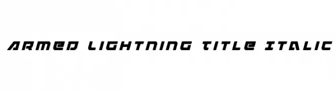
A bold, italicized font with a futuristic and angular design.
![Armed Lightning Title Italic フリーフォントのダウンロード]() ダウンロード 68 ダウンロード数@WebFont
ダウンロード 68 ダウンロード数@WebFont -
( Fonts by Typetemp Studio - Personal-use only. For commercial use please contact owner. )
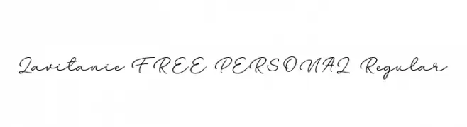
An elegant, flowing script font with a handwritten appearance.
![Lavitanie FREE PERSONAL Regular フリーフォントのダウンロード]() ダウンロード 68 ダウンロード数@WebFont
ダウンロード 68 ダウンロード数@WebFont -
( Fonts by Fontfabric - Svetoslav Simov - Personal-use only. For commercial use please contact owner. )
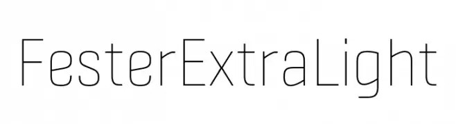
A sleek, minimalist font with thin, uniform strokes and geometric shapes.
![Fester ExtraLight フリーフォントのダウンロード]() ダウンロード 68 ダウンロード数@WebFont
ダウンロード 68 ダウンロード数@WebFont -
( Fonts by Kurnia Setyadi - Personal-use only. For commercial use please contact owner. )
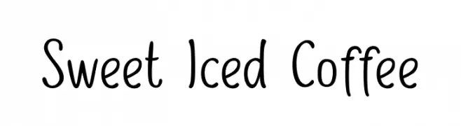
A playful handwritten font with smooth curves and a casual style.
![Sweet Iced Coffee フリーフォントのダウンロード]() ダウンロード 68 ダウンロード数@WebFont
ダウンロード 68 ダウンロード数@WebFont

今のトップフォントは?
は、クリーンな造形と広い適用範囲で支持を集めています。 ブランディングからランディングページ、ポスターまで活躍します。
ロゴで人気のフォントは?
幾何学系の サンセリフ(例: Poppins、Gotham 系のファミリー)は、スケーラブルでクリーンな印象に最適。 親しみやすさを出すなら スクリプト や手書き系も定番です。 見出しは力強く、本文はニュートラルに──この組み合わせが認知とバランスを高めます。
人気リストはどのくらいの頻度で更新される?
ダウンロード数やエンゲージメントに基づき定期的に更新します。 こまめにチェックして、次に流行るフォントを先取りしましょう。
💡 ヒント: このページをブックマークしておくと便利です。トレンドは速く、今のトップが明日のリブランディングを導くこともあります。