人気フォント セクションへようこそ。ここでは「よくダウンロードされ、よく使われている」実績ある書体をまとめています。 ロゴ、Web、SNS のどれにも使いやすい、外さない選択肢が見つかります。
どの トップフォント も、バランス・可読性・汎用性で高評価です。 モダン・サンセリフ、エレガントなスクリプト、ヴィンテージなセリフ、ミニマルなディスプレイなどを厳選しています。
-
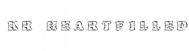
( Fonts by Kat`s Fun Fonts - Personal-use only. For commercial use please contact owner. )
A decorative font with heart-filled characters, perfect for romantic and playful designs.
 ダウンロード 66 ダウンロード数@WebFont
 -
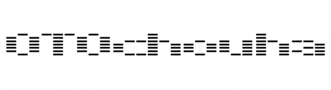
( Kinema Moon Graphics - www.kinemamoon.com/ )
A segmented, digital-style font with a modern, tech-inspired look.
![OTOchouha フリーフォントのダウンロード]() ダウンロード 66 ダウンロード数@WebFont
ダウンロード 66 ダウンロード数@WebFont -
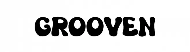
( Fonts by Salamahtype.com )
A bold, playful font with rounded, bubbly characters ideal for retro and whimsical designs.
![Grooven フリーフォントのダウンロード]() ダウンロード 66 ダウンロード数@WebFont
ダウンロード 66 ダウンロード数@WebFont -
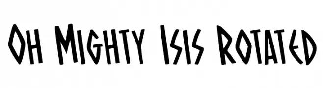
( Fonts by Daniel Zadorozny - www.iconian.com )
A bold, playful font with uneven strokes and a whimsical style.
![Oh Mighty Isis Rotated フリーフォントのダウンロード]() ダウンロード 66 ダウンロード数@WebFont
ダウンロード 66 ダウンロード数@WebFont -
( Fonts by Edric Studio - Personal-use only. For commercial use please contact owner. )
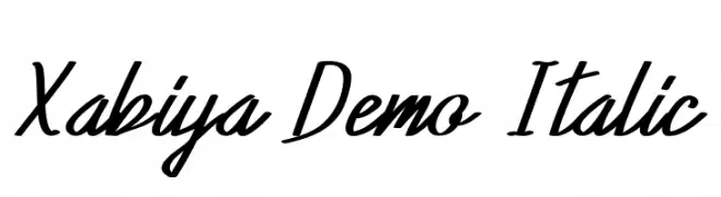
A dynamic and elegant script font with a fluid, italic style.
![Xabiya Demo Italic フリーフォントのダウンロード]() ダウンロード 66 ダウンロード数@WebFont
ダウンロード 66 ダウンロード数@WebFont -
-
( Fonts by Darwin Rodriguez - Personal-use only. For commercial use please contact owner. )
A playful, rounded font with smooth curves and a friendly appearance.
![DARR フリーフォントのダウンロード]() ダウンロード 66 ダウンロード数@WebFont
ダウンロード 66 ダウンロード数@WebFont -
( Fonts by Vunira Design - Personal-use only. For commercial use please contact owner. )
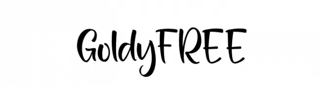
A playful, cursive script font with medium contrast and a whimsical style.
![GoldyFREE フリーフォントのダウンロード]() ダウンロード 66 ダウンロード数@WebFont
ダウンロード 66 ダウンロード数@WebFont -
( Kinema Moon Graphics - www.kinemamoon.com/ )
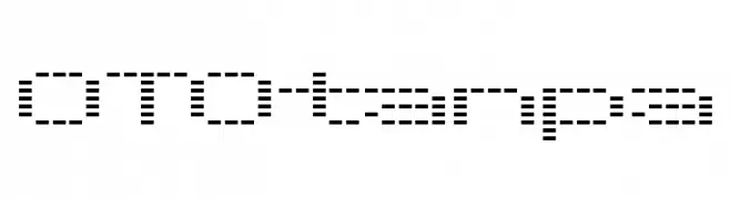
A dot-matrix style font with a retro digital appearance.
![OTOtanpa フリーフォントのダウンロード]() ダウンロード 66 ダウンロード数@WebFont
ダウンロード 66 ダウンロード数@WebFont -
( Noto is a trademark of Google Inc. Noto fonts are open source. All Noto fonts are published under the SIL Open Font License, Version 1.1 )
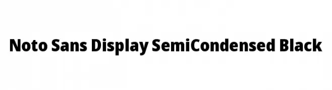
A bold, semi-condensed sans-serif font with a modern and robust design.
![Noto Sans Display SemiCondensed Black フリーフォントのダウンロード]() ダウンロード 66 ダウンロード数@WebFont
ダウンロード 66 ダウンロード数@WebFont -
( Fonts by Lemon Studio Type - Herpin Maulana - Personal-use only. For commercial use please contact owner. )
A clean, modern sans-serif font with uniform stroke width and excellent readability.
![borneo Regular フリーフォントのダウンロード]() ダウンロード 66 ダウンロード数@WebFont
ダウンロード 66 ダウンロード数@WebFont

今のトップフォントは?
は、クリーンな造形と広い適用範囲で支持を集めています。 ブランディングからランディングページ、ポスターまで活躍します。
ロゴで人気のフォントは?
幾何学系の サンセリフ(例: Poppins、Gotham 系のファミリー)は、スケーラブルでクリーンな印象に最適。 親しみやすさを出すなら スクリプト や手書き系も定番です。 見出しは力強く、本文はニュートラルに──この組み合わせが認知とバランスを高めます。
人気リストはどのくらいの頻度で更新される?
ダウンロード数やエンゲージメントに基づき定期的に更新します。 こまめにチェックして、次に流行るフォントを先取りしましょう。
💡 ヒント: このページをブックマークしておくと便利です。トレンドは速く、今のトップが明日のリブランディングを導くこともあります。