人気フォント セクションへようこそ。ここでは「よくダウンロードされ、よく使われている」実績ある書体をまとめています。 ロゴ、Web、SNS のどれにも使いやすい、外さない選択肢が見つかります。
どの トップフォント も、バランス・可読性・汎用性で高評価です。 モダン・サンセリフ、エレガントなスクリプト、ヴィンテージなセリフ、ミニマルなディスプレイなどを厳選しています。
-
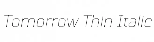
( Copyright 2019 The Tomorrow Project Authors (github.com/MonicaRizzolli/Tomorrow) )
A thin, italicized font with a geometric and modern design.
 ダウンロード 66 ダウンロード数@WebFont
 -
( Fonts by UnderNoControlTypofoundry (Alex Chavot) - Personal-use only. For commercial use please contact owner. )
A modern, slanted font with a clean and dynamic style.
![Interval-slanted フリーフォントのダウンロード]() ダウンロード 66 ダウンロード数@WebFont
ダウンロード 66 ダウンロード数@WebFont -
( Fonts by Edric Studio - Personal-use only. For commercial use please contact owner. )
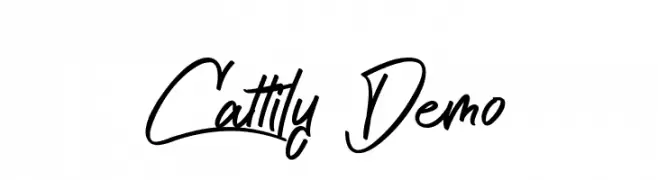
A dynamic and expressive handwritten script with fluid, cursive strokes.
![Cattily Demo フリーフォントのダウンロード]() ダウンロード 66 ダウンロード数@WebFont
ダウンロード 66 ダウンロード数@WebFont -
( Fonts by deFharo - Fernando Haro - Personal-use only. For commercial use please contact owner. )
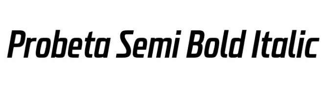
A modern, semi-bold italic font with a sleek and compact design.
![Probeta Semi Bold Italic フリーフォントのダウンロード]() ダウンロード 66 ダウンロード数@WebFont
ダウンロード 66 ダウンロード数@WebFont -
( Fonts by twinletter - Rozikan - Personal-use only. For commercial use please contact owner. )
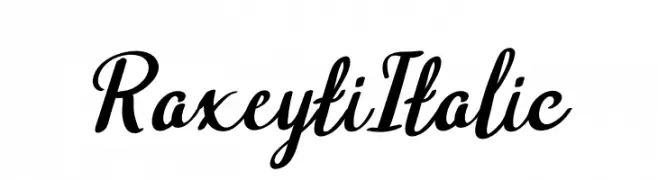
A flowing, cursive font with elegant, sweeping strokes and a dynamic appearance.
![Raxeyti Italic フリーフォントのダウンロード]() ダウンロード 66 ダウンロード数@WebFont
ダウンロード 66 ダウンロード数@WebFont -
-
( Iconian Fonts - Daniel Zadorozny - www.iconian.com )
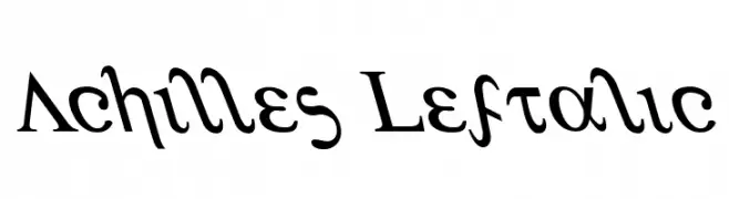
A dynamic serif font with italicized, elegant characters and sharp serifs.
![Achilles Leftalic フリーフォントのダウンロード]() ダウンロード 66 ダウンロード数@WebFont
ダウンロード 66 ダウンロード数@WebFont -
( London's Letters - www.londonsletters.com/ )
A bold serif font with playful rabbit illustrations integrated into each character.
![LMS My Favorite Rabbit フリーフォントのダウンロード]() ダウンロード 66 ダウンロード数@WebFont
ダウンロード 66 ダウンロード数@WebFont -
( Fonts by hati )
A bold, playful font with a hand-drawn, whimsical style.
![xotax フリーフォントのダウンロード]() ダウンロード 66 ダウンロード数@WebFont
ダウンロード 66 ダウンロード数@WebFont -
( Fonts by Daniel Zadorozny - www.iconian.com )
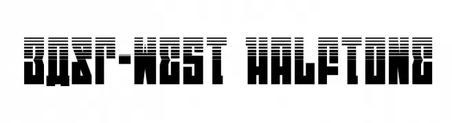
A bold, geometric font with a unique halftone pattern for modern, eye-catching designs.
![EAST-west Halftone フリーフォントのダウンロード]() ダウンロード 66 ダウンロード数@WebFont
ダウンロード 66 ダウンロード数@WebFont -
( Fonts by Michael Muranaka - muraknockout.com - Personal-use only. For commercial use please contact owner. )
A bold, artistic font with irregular, hand-crafted characters.
![Brand New Day [Midnight] フリーフォントのダウンロード]() ダウンロード 66 ダウンロード数@WebFont
ダウンロード 66 ダウンロード数@WebFont


![Brand New Day [Midnight] フリーフォントのダウンロード](https://d144mzi0q5mijx.cloudfront.net/img/B/R/Brand-New-Day-Midnight1.webp)
今のトップフォントは?
は、クリーンな造形と広い適用範囲で支持を集めています。 ブランディングからランディングページ、ポスターまで活躍します。
ロゴで人気のフォントは?
幾何学系の サンセリフ(例: Poppins、Gotham 系のファミリー)は、スケーラブルでクリーンな印象に最適。 親しみやすさを出すなら スクリプト や手書き系も定番です。 見出しは力強く、本文はニュートラルに──この組み合わせが認知とバランスを高めます。
人気リストはどのくらいの頻度で更新される?
ダウンロード数やエンゲージメントに基づき定期的に更新します。 こまめにチェックして、次に流行るフォントを先取りしましょう。
💡 ヒント: このページをブックマークしておくと便利です。トレンドは速く、今のトップが明日のリブランディングを導くこともあります。