人気フォント セクションへようこそ。ここでは「よくダウンロードされ、よく使われている」実績ある書体をまとめています。 ロゴ、Web、SNS のどれにも使いやすい、外さない選択肢が見つかります。
どの トップフォント も、バランス・可読性・汎用性で高評価です。 モダン・サンセリフ、エレガントなスクリプト、ヴィンテージなセリフ、ミニマルなディスプレイなどを厳選しています。
-
( Fonts by www.selawetype.com - Personal-use only. FOR DONATION https://www.paypal.me/selawe . For commercial use please contact owner. )
A geometric, modern font with a hexagonal, futuristic design.
 ダウンロード 65 ダウンロード数@WebFont
 -
( Fonts by dcoxy )
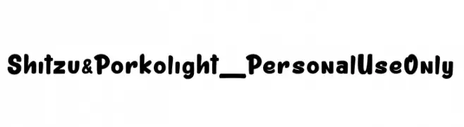
A playful, bold font with rounded edges and a friendly appearance.
![Shitzu&Porko light_PersonalUseOnly フリーフォントのダウンロード]() ダウンロード 65 ダウンロード数@WebFont
ダウンロード 65 ダウンロード数@WebFont -
( Fonts by Vigilante Typeface Corporation Larry Yerkes. Personal-use only. For commercial use please contact owner. )
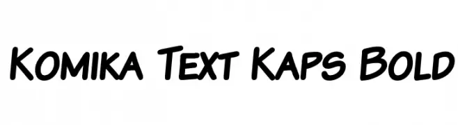
A bold, playful font with rounded, slanted characters.
![Komika Text Kaps Bold フリーフォントのダウンロード]() ダウンロード 65 ダウンロード数@WebFont
ダウンロード 65 ダウンロード数@WebFont -
( Graphicfresh - graphicfresh.com/ )
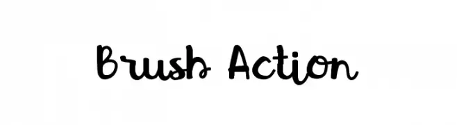
A bold, brush-style font with a playful, handwritten look.
![Brush Action フリーフォントのダウンロード]() ダウンロード 65 ダウンロード数@WebFont
ダウンロード 65 ダウンロード数@WebFont -
( Fonts by Abo Daniel Studio - Panggah Laksono - Personal-use only. For commercial use please contact owner. )
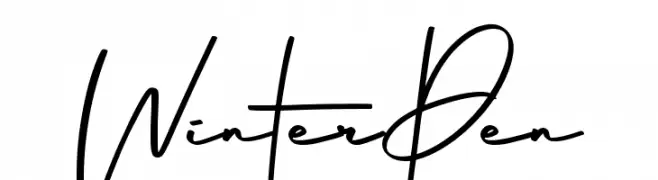
A modern, handwritten font with fluid, dynamic strokes.
![Winter Pen フリーフォントのダウンロード]() ダウンロード 65 ダウンロード数@WebFont
ダウンロード 65 ダウンロード数@WebFont -
-
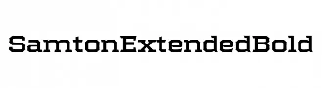
( Fonts by Ilham Herry - Personal-use only. For commercial use please contact owner. )
A bold, extended font with a geometric, industrial style.
![Samton Extended Bold フリーフォントのダウンロード]() ダウンロード 65 ダウンロード数@WebFont
ダウンロード 65 ダウンロード数@WebFont -
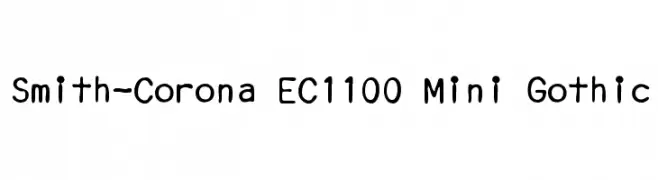
( Aleksandar Stevanov - www.behance.net/Stevanov )
A playful, hand-drawn style with rounded edges and consistent stroke width.
![Smith-Corona EC1100 Mini Gothic フリーフォントのダウンロード]() ダウンロード 65 ダウンロード数@WebFont
ダウンロード 65 ダウンロード数@WebFont -
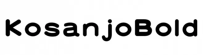
( Fonts by zone108.main.jp - Personal-use only. For commercial use please contact owner. )
A bold, rounded font with smooth curves and a modern, friendly appearance.
![Kosanjo Bold フリーフォントのダウンロード]() ダウンロード 65 ダウンロード数@WebFont
ダウンロード 65 ダウンロード数@WebFont -
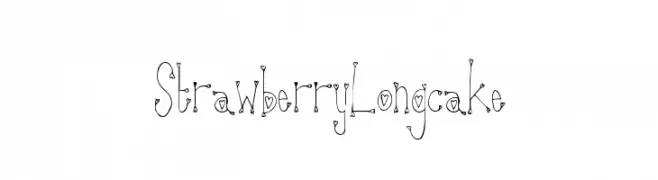
( Fonts by a Max Infeld - XEROGRAPHER FONTS - xerographer.blogspot.com . Personal-use only. For commercial use please contact owner. )
A whimsical, heart-embellished decorative font with a playful, hand-drawn style.
![StrawberryLongcake フリーフォントのダウンロード]() ダウンロード 65 ダウンロード数@WebFont
ダウンロード 65 ダウンロード数@WebFont -
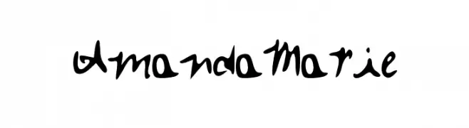
( Amanda Marie )
A playful and artistic font with fluid, organic letterforms and varying stroke thickness.
![Amanda_Marie フリーフォントのダウンロード]() ダウンロード 65 ダウンロード数@WebFont
ダウンロード 65 ダウンロード数@WebFont
今のトップフォントは?
は、クリーンな造形と広い適用範囲で支持を集めています。 ブランディングからランディングページ、ポスターまで活躍します。
ロゴで人気のフォントは?
幾何学系の サンセリフ(例: Poppins、Gotham 系のファミリー)は、スケーラブルでクリーンな印象に最適。 親しみやすさを出すなら スクリプト や手書き系も定番です。 見出しは力強く、本文はニュートラルに──この組み合わせが認知とバランスを高めます。
人気リストはどのくらいの頻度で更新される?
ダウンロード数やエンゲージメントに基づき定期的に更新します。 こまめにチェックして、次に流行るフォントを先取りしましょう。
💡 ヒント: このページをブックマークしておくと便利です。トレンドは速く、今のトップが明日のリブランディングを導くこともあります。