人気フォント セクションへようこそ。ここでは「よくダウンロードされ、よく使われている」実績ある書体をまとめています。 ロゴ、Web、SNS のどれにも使いやすい、外さない選択肢が見つかります。
どの トップフォント も、バランス・可読性・汎用性で高評価です。 モダン・サンセリフ、エレガントなスクリプト、ヴィンテージなセリフ、ミニマルなディスプレイなどを厳選しています。
-
( Fonts by www.fontpanda.com. Personal-use only. For commercial use please contact owner. )
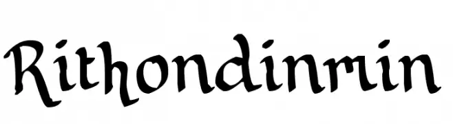
A decorative blackletter font with medieval manuscript influences.
 ダウンロード 65 ダウンロード数@WebFont
 -
( Fonts by Velvetyne Type Foundry - Personal-use only. For commercial use please contact owner. )
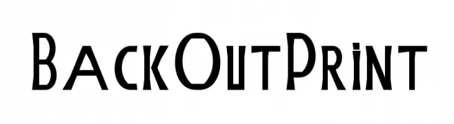
A bold, angular font with a modern and artistic style.
![BackOutPrint フリーフォントのダウンロード]() ダウンロード 65 ダウンロード数@WebFont
ダウンロード 65 ダウンロード数@WebFont -
( Fonts by Vladimir Nikolic )
A bold, decorative font with a patriotic theme featuring stars and stripes.
![Patriotic Regular フリーフォントのダウンロード]() ダウンロード 65 ダウンロード数@WebFont
ダウンロード 65 ダウンロード数@WebFont -
( Fonts by DikasStudio - Personal-use only. For commercial use please contact owner. )
A playful, hand-drawn font with bold, irregular strokes and a dynamic appearance.
![Oldventure フリーフォントのダウンロード]() ダウンロード 65 ダウンロード数@WebFont
ダウンロード 65 ダウンロード数@WebFont -
( Fonts by dot colon )
A sleek, thin, and italicized font with a modern and elegant design.
![Aileron Thin Italic フリーフォントのダウンロード]() ダウンロード 65 ダウンロード数@WebFont
ダウンロード 65 ダウンロード数@WebFont -
-
( weknow - Wino S Kadir - www.creativefabrica.com/designer/weknow/ )
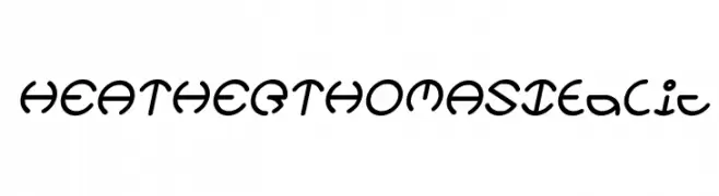
A playful, italic font with rounded, consistent strokes and a modern, decorative style.
![HEATHER THOMAS Italic フリーフォントのダウンロード]() ダウンロード 65 ダウンロード数@WebFont
ダウンロード 65 ダウンロード数@WebFont -
( Noto is a trademark of Google Inc. Noto fonts are open source. All Noto fonts are published under the SIL Open Font License, Version 1.1 )
A bold, modern sans-serif font with clear numerals and special characters.
![Noto Sans Gurmukhi UI Bold フリーフォントのダウンロード]() ダウンロード 65 ダウンロード数@WebFont
ダウンロード 65 ダウンロード数@WebFont -
( Fonts by Iconian Fonts - Daniel Zadorozny - Personal-use only. For commercial use please contact owner. )
A bold, blocky font perfect for impactful headlines.
![Punch Title フリーフォントのダウンロード]() ダウンロード 65 ダウンロード数@WebFont
ダウンロード 65 ダウンロード数@WebFont -
( London's Letters - www.londonsletters.com/ )
A whimsical decorative font with intricate illustrations in each character.
![LMS A Whole New World フリーフォントのダウンロード]() ダウンロード 65 ダウンロード数@WebFont
ダウンロード 65 ダウンロード数@WebFont -
( Fonts by Vladimir Nikolic - https://www.creativefabrica.com/product/educated-deers/ref/144265/ - Personal-use only. For commercial use please contact owner. )
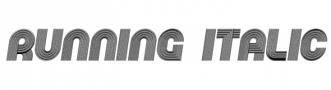
A bold, italicized font with parallel lines creating a dynamic, modern look.
![Running Italic フリーフォントのダウンロード]() ダウンロード 65 ダウンロード数@WebFont
ダウンロード 65 ダウンロード数@WebFont


今のトップフォントは?
は、クリーンな造形と広い適用範囲で支持を集めています。 ブランディングからランディングページ、ポスターまで活躍します。
ロゴで人気のフォントは?
幾何学系の サンセリフ(例: Poppins、Gotham 系のファミリー)は、スケーラブルでクリーンな印象に最適。 親しみやすさを出すなら スクリプト や手書き系も定番です。 見出しは力強く、本文はニュートラルに──この組み合わせが認知とバランスを高めます。
人気リストはどのくらいの頻度で更新される?
ダウンロード数やエンゲージメントに基づき定期的に更新します。 こまめにチェックして、次に流行るフォントを先取りしましょう。
💡 ヒント: このページをブックマークしておくと便利です。トレンドは速く、今のトップが明日のリブランディングを導くこともあります。