人気フォント セクションへようこそ。ここでは「よくダウンロードされ、よく使われている」実績ある書体をまとめています。 ロゴ、Web、SNS のどれにも使いやすい、外さない選択肢が見つかります。
どの トップフォント も、バランス・可読性・汎用性で高評価です。 モダン・サンセリフ、エレガントなスクリプト、ヴィンテージなセリフ、ミニマルなディスプレイなどを厳選しています。
-
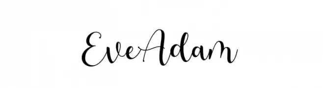
( Fonts by HIRO std - Personal-use only. For commercial use please contact owner. )
A modern, elegant script font with flowing curves and loops.
 ダウンロード 62 ダウンロード数@WebFont
 -
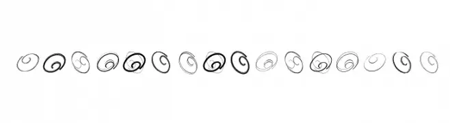
( Fonts by Manfred Klein. Free for private and charity use. Free for commercial with donation to organizations )
Abstract spiral designs, not a valid font.
![SpiralnauticsTwo フリーフォントのダウンロード]() ダウンロード 62 ダウンロード数@WebFont
ダウンロード 62 ダウンロード数@WebFont -
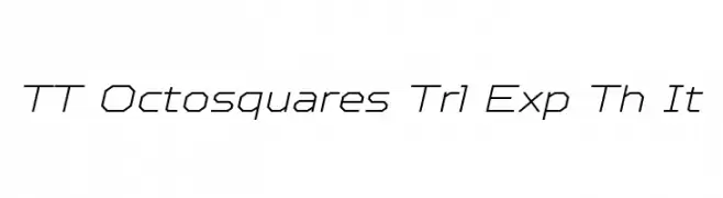
( Fonts by TypeType Foundry )
A geometric, angular font with a modern, slanted design.
![TT Octosquares Trl Exp Th It フリーフォントのダウンロード]() ダウンロード 62 ダウンロード数@WebFont
ダウンロード 62 ダウンロード数@WebFont -
フォント by Sabrcreative. For commercial use please contact the owner.
( Natalisa )
A sleek, modern italic font with consistent stroke thickness and a dynamic appearance.
![Natalisa Regular Italic Demo Regular Italic フリーフォントのダウンロード]() ダウンロード 62 ダウンロード数@WebFont
ダウンロード 62 ダウンロード数@WebFont -
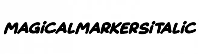
( Fonts by Darrell Flood )
A bold, italicized handwritten font with a playful and friendly style.
![Magical Markers Italic フリーフォントのダウンロード]() ダウンロード 62 ダウンロード数@WebFont
ダウンロード 62 ダウンロード数@WebFont -
-
( Fonts by Zanatlija - Personal-use only. For commercial use please contact owner. )
Ornate, illustrative skull icons with a bold, tattoo-style appearance.
![only skulls フリーフォントのダウンロード]() ダウンロード 62 ダウンロード数@WebFont
ダウンロード 62 ダウンロード数@WebFont -
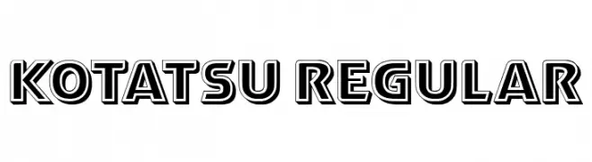
( Fonts by Vladimir Nikolic - www.creativefabrica.com/designer/vladimirnikolic/ - Personal-use only. For commercial use please contact owner. )
A bold, geometric font with a three-dimensional shadow effect.
![Kotatsu Regular フリーフォントのダウンロード]() ダウンロード 62 ダウンロード数@WebFont
ダウンロード 62 ダウンロード数@WebFont -
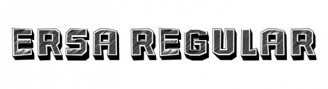
( Fonts by Vladimir Nikolic - www.creativefabrica.com/designer/vladimirnikolic/ - Personal-use only. For commercial use please contact owner. )
A bold, three-dimensional font with a shadow effect and textured interior.
![Ersa Regular フリーフォントのダウンロード]() ダウンロード 62 ダウンロード数@WebFont
ダウンロード 62 ダウンロード数@WebFont -
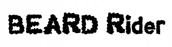
( Fonts by Wino S Kadir - weknow - www.revolge.com/shop/weknow/ - Personal-use only. For commercial use please contact owner. )
A bold, playful font with a textured, fluffy appearance.
![BEARD Rider フリーフォントのダウンロード]() ダウンロード 62 ダウンロード数@WebFont
ダウンロード 62 ダウンロード数@WebFont -
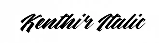
( Fonts by Kong Font - Personal-use only. For commercial use please contact owner. )
A bold, italic script font with dynamic, connected characters.
![Kenthir Italic フリーフォントのダウンロード]() ダウンロード 62 ダウンロード数@WebFont
ダウンロード 62 ダウンロード数@WebFont


今のトップフォントは?
は、クリーンな造形と広い適用範囲で支持を集めています。 ブランディングからランディングページ、ポスターまで活躍します。
ロゴで人気のフォントは?
幾何学系の サンセリフ(例: Poppins、Gotham 系のファミリー)は、スケーラブルでクリーンな印象に最適。 親しみやすさを出すなら スクリプト や手書き系も定番です。 見出しは力強く、本文はニュートラルに──この組み合わせが認知とバランスを高めます。
人気リストはどのくらいの頻度で更新される?
ダウンロード数やエンゲージメントに基づき定期的に更新します。 こまめにチェックして、次に流行るフォントを先取りしましょう。
💡 ヒント: このページをブックマークしておくと便利です。トレンドは速く、今のトップが明日のリブランディングを導くこともあります。