人気フォント セクションへようこそ。ここでは「よくダウンロードされ、よく使われている」実績ある書体をまとめています。 ロゴ、Web、SNS のどれにも使いやすい、外さない選択肢が見つかります。
どの トップフォント も、バランス・可読性・汎用性で高評価です。 モダン・サンセリフ、エレガントなスクリプト、ヴィンテージなセリフ、ミニマルなディスプレイなどを厳選しています。
-
( Fonts by Adult Ramblings - Anastacia E. Zittel - Personal-use only. For commercial use please contact owner. )
A playful, decorative font with pattern-filled, textured letterforms.
 ダウンロード 62 ダウンロード数@WebFont
 -
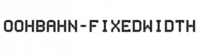
( Fonts by Benjamin Posch - Personal-use only. For commercial use please contact owner. )
A geometric, fixed-width font with a mosaic-like pattern, offering a modern and artistic style.
![OohBahn-FixedWidth フリーフォントのダウンロード]() ダウンロード 62 ダウンロード数@WebFont
ダウンロード 62 ダウンロード数@WebFont -
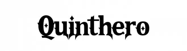
( Fonts by Fachranheit - Fachrul Rozi - Personal-use only. For commercial use please contact owner. )
A bold, angular serif font with a striking and edgy design.
![Quinthero フリーフォントのダウンロード]() ダウンロード 62 ダウンロード数@WebFont
ダウンロード 62 ダウンロード数@WebFont -
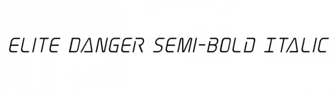
( Fonts by Iconian Fonts )
A sleek, modern semi-bold italic font with a futuristic and streamlined design.
![Elite Danger Semi-Bold Italic フリーフォントのダウンロード]() ダウンロード 62 ダウンロード数@WebFont
ダウンロード 62 ダウンロード数@WebFont -
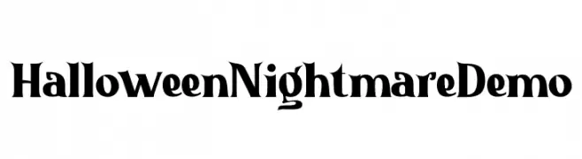
( Fonts by Nuryanto Dwi - Personal-use only. For commercial use please contact owner. )
A spooky, whimsical font ideal for Halloween themes.
![Halloween Nightmare Demo フリーフォントのダウンロード]() ダウンロード 62 ダウンロード数@WebFont
ダウンロード 62 ダウンロード数@WebFont -
-
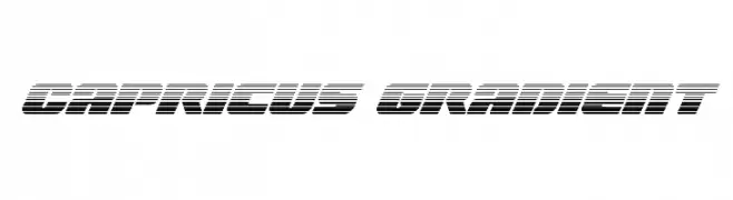
( Iconian Fonts - Daniel Zadorozny - www.iconian.com )
A bold, futuristic font with horizontal gradient lines and a slanted, dynamic style.
![Capricus Gradient フリーフォントのダウンロード]() ダウンロード 62 ダウンロード数@WebFont
ダウンロード 62 ダウンロード数@WebFont -
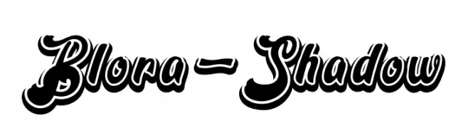
( Fonts by Emanes Dsign - Personal-use only. For commercial use please contact owner. )
A bold script font with a dynamic shadow effect, perfect for impactful designs.
![Blora-Shadow フリーフォントのダウンロード]() ダウンロード 62 ダウンロード数@WebFont
ダウンロード 62 ダウンロード数@WebFont -
( Iconian Fonts - Daniel Zadorozny - www.iconian.com )
A bold, geometric font with an engraved, three-dimensional effect.
![Drone Tracker Engraved フリーフォントのダウンロード]() ダウンロード 62 ダウンロード数@WebFont
ダウンロード 62 ダウンロード数@WebFont -
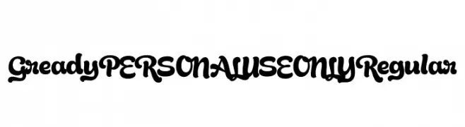
( Fonts by Mans Greback - Personal-use only. For commercial use please contact owner. )
A bold, playful script font with rounded, flowing characters.
![Gready PERSONAL USE ONLY Regular フリーフォントのダウンロード]() ダウンロード 62 ダウンロード数@WebFont
ダウンロード 62 ダウンロード数@WebFont -
( Ink creative - creativemarket.com/inkcreativeart/ )
A handwritten-style font with elongated, fluid characters.
![Emmasignature フリーフォントのダウンロード]() ダウンロード 62 ダウンロード数@WebFont
ダウンロード 62 ダウンロード数@WebFont

今のトップフォントは?
は、クリーンな造形と広い適用範囲で支持を集めています。 ブランディングからランディングページ、ポスターまで活躍します。
ロゴで人気のフォントは?
幾何学系の サンセリフ(例: Poppins、Gotham 系のファミリー)は、スケーラブルでクリーンな印象に最適。 親しみやすさを出すなら スクリプト や手書き系も定番です。 見出しは力強く、本文はニュートラルに──この組み合わせが認知とバランスを高めます。
人気リストはどのくらいの頻度で更新される?
ダウンロード数やエンゲージメントに基づき定期的に更新します。 こまめにチェックして、次に流行るフォントを先取りしましょう。
💡 ヒント: このページをブックマークしておくと便利です。トレンドは速く、今のトップが明日のリブランディングを導くこともあります。