人気フォント セクションへようこそ。ここでは「よくダウンロードされ、よく使われている」実績ある書体をまとめています。 ロゴ、Web、SNS のどれにも使いやすい、外さない選択肢が見つかります。
どの トップフォント も、バランス・可読性・汎用性で高評価です。 モダン・サンセリフ、エレガントなスクリプト、ヴィンテージなセリフ、ミニマルなディスプレイなどを厳選しています。
-
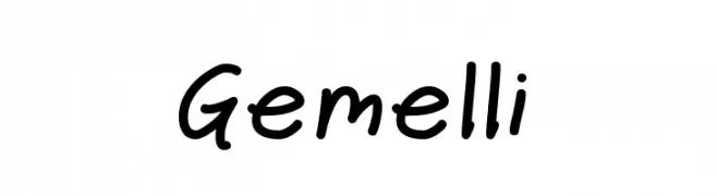
( Fonts by Jason Pagura - Personal-use only. For commercial use please contact owner. )
A playful, casual handwritten font with smooth, flowing curves.
 ダウンロード 57 ダウンロード数@WebFont
 -
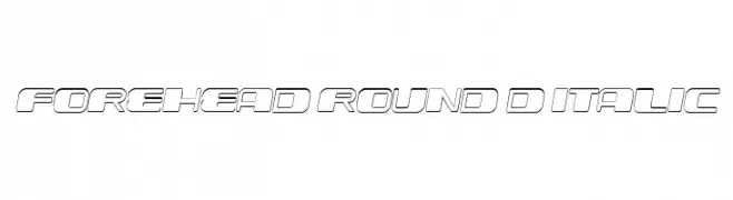
( Fonts by Vladimir Nikolic - www.creativefabrica.com/designer/vladimirnikolic/ - Personal-use only. For commercial use please contact owner. )
A bold, 3D italic font with rounded edges and a futuristic style.
![Forehead Round 3D Italic フリーフォントのダウンロード]() ダウンロード 57 ダウンロード数@WebFont
ダウンロード 57 ダウンロード数@WebFont -
( Fonts of Afrika - www.themaps.co.za/downloads.asp )
Primitive, hand-drawn glyphs reminiscent of ancient rock art.
![Afrika RockArt N Cberg2 フリーフォントのダウンロード]() ダウンロード 57 ダウンロード数@WebFont
ダウンロード 57 ダウンロード数@WebFont -
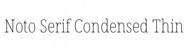
( Noto is a trademark of Google Inc. Noto fonts are open source. All Noto fonts are published under the SIL Open Font License, Version 1.1 )
A refined, thin serif font with a condensed style and elegant strokes.
![Noto Serif Condensed Thin フリーフォントのダウンロード]() ダウンロード 57 ダウンロード数@WebFont
ダウンロード 57 ダウンロード数@WebFont -
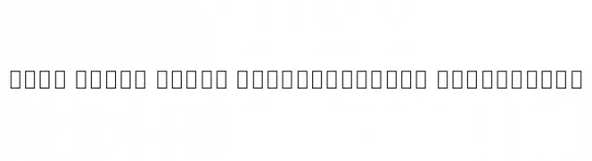
( Noto is a trademark of Google Inc. Noto fonts are open source. All Noto fonts are published under the SIL Open Font License, Version 1.1 )
Font glyphs are missing; only a few extra light serif punctuation and numbers are shown.
![Noto Serif Khmer SemiCondensed ExtraLight フリーフォントのダウンロード]() ダウンロード 57 ダウンロード数@WebFont
ダウンロード 57 ダウンロード数@WebFont -
-
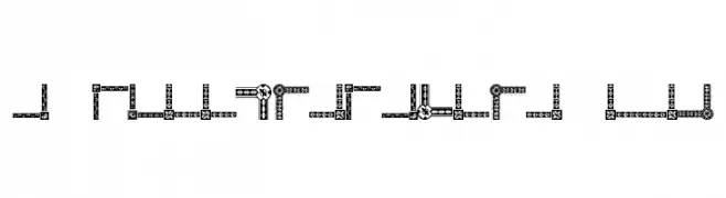
![Vintage Decorative Corners 18 フリーフォントのダウンロード]() ダウンロード 57 ダウンロード数@WebFont
ダウンロード 57 ダウンロード数@WebFont -
( Fonts by Balpirick - Personal-use only. For commercial use please contact owner. )
A modern, elegant handwritten script with fluid, graceful strokes.
![Acoustica フリーフォントのダウンロード]() ダウンロード 57 ダウンロード数@WebFont
ダウンロード 57 ダウンロード数@WebFont -
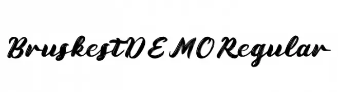
( Fonts by Prioritype Co - Prio Nurokhim Aji - Personal-use only. For commercial use please contact owner. )
A bold, expressive script font with dynamic brush strokes.
![Bruskest DEMO Regular フリーフォントのダウンロード]() ダウンロード 57 ダウンロード数@WebFont
ダウンロード 57 ダウンロード数@WebFont -
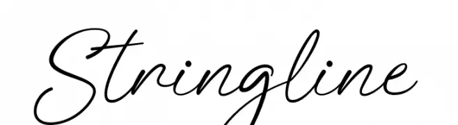
( Fonts by Mans Greback - www.mansgreback.com - Personal-use only. For commercial use please contact owner. )
An elegant, flowing script font with a natural handwriting style.
![Stringline フリーフォントのダウンロード]() ダウンロード 57 ダウンロード数@WebFont
ダウンロード 57 ダウンロード数@WebFont -
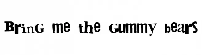
( Fonts by 28fonts )
A playful, hand-drawn font with bold, irregular letterforms and a whimsical style.
![Bring me the gummy bears フリーフォントのダウンロード]() ダウンロード 57 ダウンロード数@WebFont
ダウンロード 57 ダウンロード数@WebFont


今のトップフォントは?
は、クリーンな造形と広い適用範囲で支持を集めています。 ブランディングからランディングページ、ポスターまで活躍します。
ロゴで人気のフォントは?
幾何学系の サンセリフ(例: Poppins、Gotham 系のファミリー)は、スケーラブルでクリーンな印象に最適。 親しみやすさを出すなら スクリプト や手書き系も定番です。 見出しは力強く、本文はニュートラルに──この組み合わせが認知とバランスを高めます。
人気リストはどのくらいの頻度で更新される?
ダウンロード数やエンゲージメントに基づき定期的に更新します。 こまめにチェックして、次に流行るフォントを先取りしましょう。
💡 ヒント: このページをブックマークしておくと便利です。トレンドは速く、今のトップが明日のリブランディングを導くこともあります。