人気フォント セクションへようこそ。ここでは「よくダウンロードされ、よく使われている」実績ある書体をまとめています。 ロゴ、Web、SNS のどれにも使いやすい、外さない選択肢が見つかります。
どの トップフォント も、バランス・可読性・汎用性で高評価です。 モダン・サンセリフ、エレガントなスクリプト、ヴィンテージなセリフ、ミニマルなディスプレイなどを厳選しています。
-
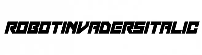
( Fonts by Darrell Flood - Personal-use only. For commercial use please contact owner. )
A bold, futuristic italic font with sharp angles and a sci-fi aesthetic.
 ダウンロード 57 ダウンロード数@WebFont
 -
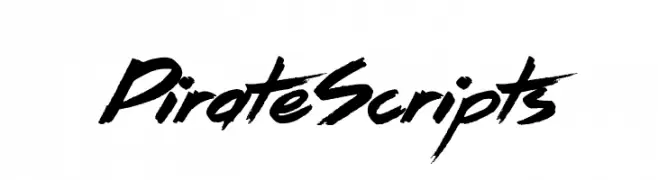
( Fonts by Jonathan S. Harris - Personal-use only. For commercial use please contact owner. )
A bold, brush-style font with an adventurous and dynamic feel.
![Pirate Scripts フリーフォントのダウンロード]() ダウンロード 57 ダウンロード数@WebFont
ダウンロード 57 ダウンロード数@WebFont -
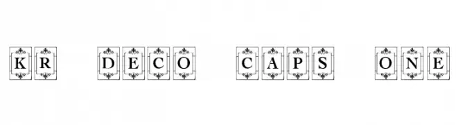
( Fonts by Kat`s Fun Fonts - Personal-use only. For commercial use please contact owner. )
An ornate, decorative font with bold uppercase letters framed by floral motifs.
![KR Deco Caps One フリーフォントのダウンロード]() ダウンロード 57 ダウンロード数@WebFont
ダウンロード 57 ダウンロード数@WebFont -
( Fonts by Helotype - Yudi Setiawan - Personal-use only. For commercial use please contact owner. )
A playful handwritten font with rounded edges and a casual style.
![Snowfun Regular フリーフォントのダウンロード]() ダウンロード 57 ダウンロード数@WebFont
ダウンロード 57 ダウンロード数@WebFont -
( Fonts by 7NTypes )
A playful dingbat set featuring educational and office-themed icons.
![Dotuku Dingbats フリーフォントのダウンロード]() ダウンロード 57 ダウンロード数@WebFont
ダウンロード 57 ダウンロード数@WebFont -
-
( Fonts by Brixdee - jack-oatley.com - Personal-use only. For commercial use please contact owner. )
Elegant cursive font with interconnected, flowing letters.
![Acta:Amour Regular フリーフォントのダウンロード]() ダウンロード 57 ダウンロード数@WebFont
ダウンロード 57 ダウンロード数@WebFont -
( Fonts by Leonard Posavec - leosupply.co - Personal-use only. For commercial use please contact owner. )
A bold, grunge-style font with splattered, irregular edges.
![DeadJohn フリーフォントのダウンロード]() ダウンロード 57 ダウンロード数@WebFont
ダウンロード 57 ダウンロード数@WebFont -
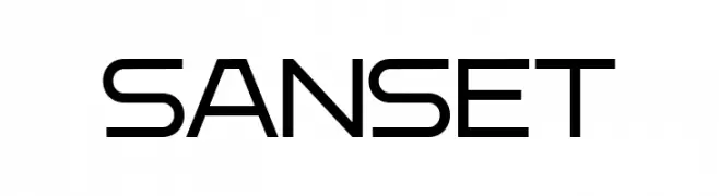
( Fonts by Syaf Rizal - Khurasan - Personal-use only. For commercial use please contact owner. )
A modern, geometric font with clean lines and a sleek design.
![Sanset フリーフォントのダウンロード]() ダウンロード 57 ダウンロード数@WebFont
ダウンロード 57 ダウンロード数@WebFont -
( Fonts by Vunira Design - Personal-use only. For commercial use please contact owner. )
A bold, expressive handwritten font with brush-like strokes and dynamic character.
![Kalled FREE フリーフォントのダウンロード]() ダウンロード 57 ダウンロード数@WebFont
ダウンロード 57 ダウンロード数@WebFont -
( Misti's Fonts - mistifonts.com/ )
A playful, rounded handwritten font with a friendly and casual style.
![WheretheLonelyOnesRoam フリーフォントのダウンロード]() ダウンロード 57 ダウンロード数@WebFont
ダウンロード 57 ダウンロード数@WebFont


今のトップフォントは?
は、クリーンな造形と広い適用範囲で支持を集めています。 ブランディングからランディングページ、ポスターまで活躍します。
ロゴで人気のフォントは?
幾何学系の サンセリフ(例: Poppins、Gotham 系のファミリー)は、スケーラブルでクリーンな印象に最適。 親しみやすさを出すなら スクリプト や手書き系も定番です。 見出しは力強く、本文はニュートラルに──この組み合わせが認知とバランスを高めます。
人気リストはどのくらいの頻度で更新される?
ダウンロード数やエンゲージメントに基づき定期的に更新します。 こまめにチェックして、次に流行るフォントを先取りしましょう。
💡 ヒント: このページをブックマークしておくと便利です。トレンドは速く、今のトップが明日のリブランディングを導くこともあります。