人気フォント セクションへようこそ。ここでは「よくダウンロードされ、よく使われている」実績ある書体をまとめています。 ロゴ、Web、SNS のどれにも使いやすい、外さない選択肢が見つかります。
どの トップフォント も、バランス・可読性・汎用性で高評価です。 モダン・サンセリフ、エレガントなスクリプト、ヴィンテージなセリフ、ミニマルなディスプレイなどを厳選しています。
-
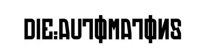
( TwoNineFive - Maximillian Limpo )
A bold, geometric font with a futuristic and mechanical design.
 ダウンロード 54 ダウンロード数@WebFont
 -
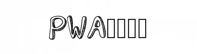
( www.peax-webdesign.com )
A playful, decorative font with bold, outlined letters and intricate dot patterns.
![PWApril フリーフォントのダウンロード]() ダウンロード 54 ダウンロード数@WebFont
ダウンロード 54 ダウンロード数@WebFont -
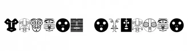
( Fonts by Vladimir Nikolic )
An abstract, decorative font with intricate geometric designs.
![Munari Regular フリーフォントのダウンロード]() ダウンロード 54 ダウンロード数@WebFont
ダウンロード 54 ダウンロード数@WebFont -
( Fonts by Daniel Zadorozny - www.iconian.com - Personal-use only. For commercial use please contact owner. )
A bold, semi-italic font with a futuristic and angular design.
![Sky Ridge Bold Semi-Italic フリーフォントのダウンロード]() ダウンロード 54 ダウンロード数@WebFont
ダウンロード 54 ダウンロード数@WebFont -
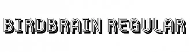
( Fonts by Vladimir Nikolic - www.creativefabrica.com/designer/vladimirnikolic/ - Personal-use only. For commercial use please contact owner. )
A bold, layered font with a 3D effect and geometric shapes.
![Birdbrain Regular フリーフォントのダウンロード]() ダウンロード 54 ダウンロード数@WebFont
ダウンロード 54 ダウンロード数@WebFont -
-
( Fonts by Zetafonts - Personal-use only. For commercial use please contact owner. )
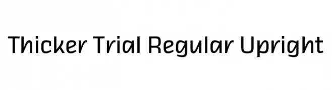
A modern sans-serif font with a clean, slightly condensed style.
![Thicker Trial Regular Upright フリーフォントのダウンロード]() ダウンロード 54 ダウンロード数@WebFont
ダウンロード 54 ダウンロード数@WebFont -
( Noto is a trademark of Google Inc. Noto fonts are open source. All Noto fonts are published under the SIL Open Font License, Version 1.1 )
Not a valid font sample for analysis.
![Noto Sans Myanmar SemiCondensed Light フリーフォントのダウンロード]() ダウンロード 54 ダウンロード数@WebFont
ダウンロード 54 ダウンロード数@WebFont -
( Fonts by Allouse Studio - Personal-use only. For commercial use please contact owner. )
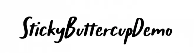
A playful, bold handwritten font with smooth, fluid strokes.
![Sticky Buttercup Demo フリーフォントのダウンロード]() ダウンロード 54 ダウンロード数@WebFont
ダウンロード 54 ダウンロード数@WebFont -
( Fonts by Mans Greback - Personal-use only. For commercial use please contact owner. )
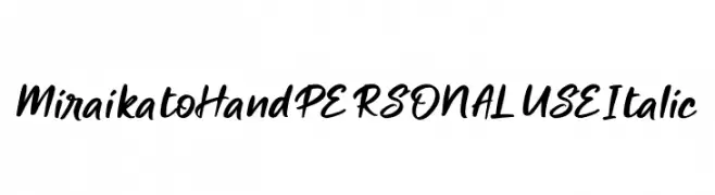
A bold, italicized handwritten font with a dynamic and artistic style.
![Miraikato Hand PERSONAL USE Italic フリーフォントのダウンロード]() ダウンロード 54 ダウンロード数@WebFont
ダウンロード 54 ダウンロード数@WebFont -
( Fonts by Omaikraf Studio - Omaikraf - Personal-use only. For commercial use please contact owner. )
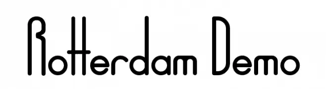
A modern, geometric font with tall, narrow uppercase letters and balanced lowercase characters.
![Rotterdam Demo フリーフォントのダウンロード]() ダウンロード 54 ダウンロード数@WebFont
ダウンロード 54 ダウンロード数@WebFont


今のトップフォントは?
は、クリーンな造形と広い適用範囲で支持を集めています。 ブランディングからランディングページ、ポスターまで活躍します。
ロゴで人気のフォントは?
幾何学系の サンセリフ(例: Poppins、Gotham 系のファミリー)は、スケーラブルでクリーンな印象に最適。 親しみやすさを出すなら スクリプト や手書き系も定番です。 見出しは力強く、本文はニュートラルに──この組み合わせが認知とバランスを高めます。
人気リストはどのくらいの頻度で更新される?
ダウンロード数やエンゲージメントに基づき定期的に更新します。 こまめにチェックして、次に流行るフォントを先取りしましょう。
💡 ヒント: このページをブックマークしておくと便利です。トレンドは速く、今のトップが明日のリブランディングを導くこともあります。