人気フォント セクションへようこそ。ここでは「よくダウンロードされ、よく使われている」実績ある書体をまとめています。 ロゴ、Web、SNS のどれにも使いやすい、外さない選択肢が見つかります。
どの トップフォント も、バランス・可読性・汎用性で高評価です。 モダン・サンセリフ、エレガントなスクリプト、ヴィンテージなセリフ、ミニマルなディスプレイなどを厳選しています。
-
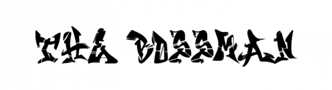
( Fonts by Si Panji )
A bold, angular font with a fragmented, dynamic style.
 ダウンロード 54 ダウンロード数@WebFont
 -
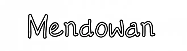
( Fonts by Mozyen Studio - Personal-use only. For commercial use please contact owner. )
A playful, hand-drawn font with a whimsical and informal style.
![Mendowan フリーフォントのダウンロード]() ダウンロード 54 ダウンロード数@WebFont
ダウンロード 54 ダウンロード数@WebFont -
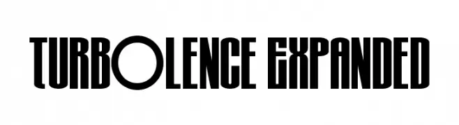
( Fonts by Iconian Fonts - Daniel Zadorozny - Personal-use only. For commercial use please contact owner. )
A bold, expanded font with a strong vertical emphasis and consistent stroke thickness.
![Turb0lence Expanded フリーフォントのダウンロード]() ダウンロード 54 ダウンロード数@WebFont
ダウンロード 54 ダウンロード数@WebFont -
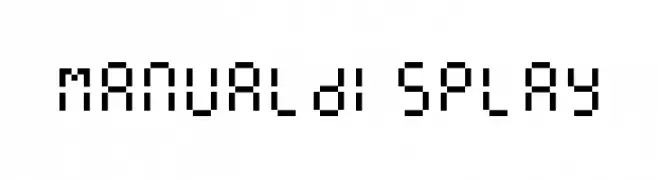
( memesbruh03 - Aaron D. Chand )
A pixelated, monospaced font with a retro digital aesthetic.
![ManualDisplay フリーフォントのダウンロード]() ダウンロード 54 ダウンロード数@WebFont
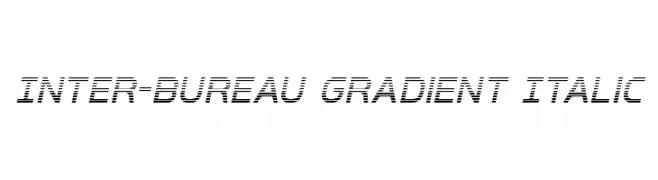
ダウンロード 54 ダウンロード数@WebFont -
![Inter-Bureau Gradient Italic フリーフォントのダウンロード]() ダウンロード 54 ダウンロード数@WebFont
ダウンロード 54 ダウンロード数@WebFont -
-
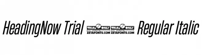
( Fonts by Zetafonts - Personal-use only. For commercial use please contact owner. )
A modern, italic font with tall, narrow characters and a sleek, contemporary style.
![HeadingNow Trial 34 Regular Italic フリーフォントのダウンロード]() ダウンロード 54 ダウンロード数@WebFont
ダウンロード 54 ダウンロード数@WebFont -
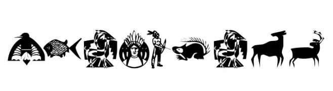
( Fonts by Kats Fun Fonts - Personal-use only. For commercial use please contact owner. )
A decorative dingbat font with Native American-inspired symbols and illustrations.
![KR NA Dings フリーフォントのダウンロード]() ダウンロード 54 ダウンロード数@WebFont
ダウンロード 54 ダウンロード数@WebFont -
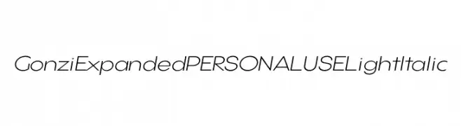
( Fonts by Mans Greback - Personal-use only. For commercial use please contact owner. )
A modern, expanded, light italic font with a sleek and elegant design.
![Gonzi Expanded PERSONAL USE Light Italic フリーフォントのダウンロード]() ダウンロード 54 ダウンロード数@WebFont
ダウンロード 54 ダウンロード数@WebFont -
( Fonts by Pete Klassen - Personal-use only. For commercial use please contact owner. )
A modern, bold font with clean lines and excellent readability.
![ThreePointSix Roentgen Caps フリーフォントのダウンロード]() ダウンロード 54 ダウンロード数@WebFont
ダウンロード 54 ダウンロード数@WebFont -
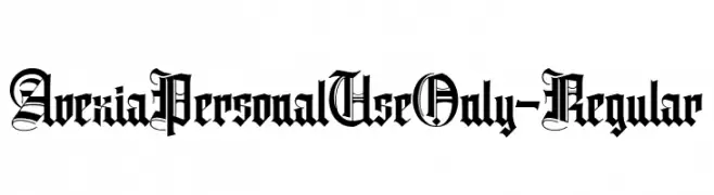
( Fonts by ilhamtaro - Personal-use only. For commercial use please contact owner. )
A bold, intricate blackletter font with gothic and medieval influences.
![AvexiaPersonalUseOnly-Regular フリーフォントのダウンロード]() ダウンロード 54 ダウンロード数@WebFont
ダウンロード 54 ダウンロード数@WebFont

今のトップフォントは?
は、クリーンな造形と広い適用範囲で支持を集めています。 ブランディングからランディングページ、ポスターまで活躍します。
ロゴで人気のフォントは?
幾何学系の サンセリフ(例: Poppins、Gotham 系のファミリー)は、スケーラブルでクリーンな印象に最適。 親しみやすさを出すなら スクリプト や手書き系も定番です。 見出しは力強く、本文はニュートラルに──この組み合わせが認知とバランスを高めます。
人気リストはどのくらいの頻度で更新される?
ダウンロード数やエンゲージメントに基づき定期的に更新します。 こまめにチェックして、次に流行るフォントを先取りしましょう。
💡 ヒント: このページをブックマークしておくと便利です。トレンドは速く、今のトップが明日のリブランディングを導くこともあります。